In Task Builder 2, you add functionality to your task by adding Objects. Objects consist of one or more components. You can combine components flexibly within an object to achieve the behaviour you want. You can also use prefabs, which are prefabricated objects with two or more components that fulfil a frequently used function.
This page lists each prefab and the components it contains, and each component and how it works. Browse the list in the menu to find the prefab or component you're interested in using.
AI components are available by request as a premium add-on to any Gorilla subscription. To get access, email subscriptions@gorilla.sc.
If you don't have a subscription but would like to inquire about access to the AI components, email info@gorilla.sc.
This prefab creates an AI chat box powered by ChatGPT.
Components: AI Chat Box, AI (ChatGPT)
AI components are available by request as a premium add-on to any Gorilla subscription. To get access, email subscriptions@gorilla.sc.
If you don't have a subscription but would like to inquire about access to the AI components, email info@gorilla.sc.
This prefab creates an AI chat box powered by Gemini.
Components: AI Chat Box, AI (Gemini)
This prefab creates a simple change blindness setup with two images presented sequentially on a loop with a mask between them.
Components: Image Sequence
This prefab creates an invisible interactive area of the screen that produces a response when clicked on.
Components: Hotspot, Click Response
This prefab creates a button that advances the screen when clicked on.
Components: Button, Click To Continue
This prefab creates a button that the participant can click on to exit the task.
Components: Button, Click Response, Early Exit
This prefab creates a fixation cross with configurable timings.
Components: Fixation Timing, Fixation Cross
This prefab creates an image with a border colour that changes when hovered over, and that produces a response when clicked on.
Components: Image, Border - Hover, Click Response
This prefab creates a paced reading setup where each segment is presented for 250 ms, presentation is cumulative, and segments are masked until presented.
Components: Reading
This prefab creates a self-paced reading setup where the participant presses the space bar to display the next segment. Presentation is cumulative, and segments are masked until presented.
Components: Reading, Keyboard Response
This prefab creates a self-paced reading setup where the participant clicks the left mouse button to display the next segment. Presentation is cumulative, and segments are masked until presented.
Components: Reading, Mouse Button Response
This prefab creates some text with a border colour that changes when hovered over, and that produes a response when clicked on.
Components: Text, Border - Hover, Click Response
The audio component allows you to play a single audio file. To set up the audio component:
To vary audio files from trial to trial, bind your audio to the spreadsheet. You can also vary audio files between conditions by binding to Manipulations, or play different audio files based on previous responses by binding to the Store.
For some information about file size and supported formats, have a look at the information in our Technical Checklist.
If your audio files don't play when you preview, check out our Troubleshooting guide.
Adding this component to your task will automatically add an audio test before the task begins. This checks whether participants are able to hear sound on their device. To turn this audio check off, go to Subsystems in the Settings tab on the left-hand sidebar and toggle the Audio subsystem off.
You can make other actions on the screen happen when your audio file starts or finishes. To do this, add a Trigger component to the same object as your Audio component, and select AudioStart or AudioFinish in the Trigger dropdown. You can see this in action in our Loop audio file example, where a Trigger - Active component is used to start playing an audio file again each time it finishes.
Samples that use this component
Auditory Sentence Predictability Task
Dot Probe - Gives the participant audio feedback. Warning: this task includes aversive images.
Audio File
The audio file to play. Use the 'choose...' button to select one specific audio file to play, or click the binding icon to have the audio file change in different trials (by binding to the Spreadsheet), in different conditions (by binding to a Manipulation), or based on previous responses (by binding to the Store).
Play Automatically
If you toggle on this setting, the audio will start playing automatically at the start of the screen. If you do not toggle on this setting, there are a few ways you can activate the audio, for example, via the Trigger Active component. This way you can trigger audio on some event rather than automatically on start. This is helpful, for example, for an audio feedback scenario.
Auto Advance
Toggle this setting on to advance the screen when the audio finishes playing. When you don't have the Auto Advance option turned on, you can advance the screen using a different component, for example, a Click to Continue or just a Click or Keyboard Response.
Always Finish
Toggle this setting on to ensure that the audio file finishes playing before the screen advances. It is helpful in scenarios when you want to ensure the whole audio clip is played, even after participant submits a response that normally advances the screen. For example, if the screen should advance when participant clicks on an object with a Click To Continue component, the 'Always Finish' setting will ensure that the screen won't immediately move on and cut the audio off, but instead wait for the audio file to finish playing in full before advancing the screen.
Show Controls
Toggle this setting on to enable the standard audio controls (allowing the participant to control play, pause, and seek). If controls are enabled, the Max Plays setting below will not apply.
Max Plays
Maximum number of times this audio clip can be played. This does not apply if the Show Controls setting is toggled on.
The Background Audio component allows you to play audio in the background of a task. Use this component to start or stop the current background audio.
To vary audio files from trial to trial, bind your audio to the spreadsheet. You can also vary audio files between conditions by binding to Manipulations, or play different audio files based on previous responses by binding to the Store.
For some information about file size and supported formats, have a look at the information in our Technical Checklist.
If your audio files don't play when you preview, check out our Troubleshooting guide.
Adding this component to your task will automatically add an audio test before the task begins. This checks whether participants are able to hear sound on their device. To turn this audio check off, go to Subsystems in the Settings tab on the left-hand sidebar and toggle the Audio subsystem off.
Samples that use this component
Digit Span Text Entry (Background Music)
Audio
The audio file to play. Use the 'choose...' button to select one specific audio file to play, or click the binding icon to have the audio file change in different trials (by binding to the Spreadsheet), in different conditions (by binding to a Manipulation), or based on previous responses (by binding to the Store).
Action
Use this setting to decide whether to start or stop the background audio. When using Stop mode, ensure the Audio setting matches the file that you used in Start mode.
Loop
Toggle this setting on to loop the background audio continuously. If Loop is toggled on, when the background audio reaches the end, it will start again from the beginning. This will continue until it is stopped.
The Display Receipt component allows you to display the "receipt" from a preceding Gorilla Shopbuilder task. It is bound to a Store Field of the same name used in the Shopbuilder task.
Tutorial that uses this component
Receipt field
The store field where the receipt has been saved. Unless specified otherwise in your shopbuilder task, this will be 'shopping_cart'
Text Size (px)
The size of the text, in pixels. By default, it is set to size 18.
Autoscale
Toggle this setting on to scale the text according to the size of the screen.
Position
Position of the center of the bounding box, relative to the center of the container. You can change the x- and y-coordinates. By default, position is set in grid coordinates. To set position in absolute pixels or as a percentage of the Gorilla stage, add an Advanced Positioning component to the object.
Size
Size of the bounding box. You can change the x- and y-coordinates. By default, size is set in grid coordinates. To set size in absolute pixels or as a percentage of the Gorilla stage, add an Advanced Positioning component to the object.
The Fixation Cross component allows you to display a pre-made fixation cross. Use a Fixation Timing component to control the timings of the fixation before, during, and after its display.
Samples that use this component
Stop Signal Task (used together with the Fixation Timing component)
Size (px)
Size of the fixation cross. By default, this is set to 120.
Autoscale
Toggle this setting on to scale the text according to the size of the screen.
Position
Position of the center of the bounding box, relative to the center of the container. You can change the x- and y-coordinates. By default, position is set in grid coordinates. To set position in absolute pixels or as a percentage of the Gorilla stage, add an Advanced Positioning component to the object.
Size
Size of the bounding box. You can change the x- and y-coordinates. By default, size is set in grid coordinates. To set size in absolute pixels or as a percentage of the Gorilla stage, add an Advanced Positioning component to the object.
With the hotspot component, you are able to make an invisible area of the screen interactable. It can be used with components like Click Response to generate responses and is useful for overlaying on top of other visual objects. It is helpful if you don't want to make an entire object (for example, text or image) interactable, but only a specific area on the screen, for example, part of an image. In most cases you'll also want to use a hotspot in conjunction with the Overlay component, so that the size and position of the hotspot is set relative to the size and position of the object it's attached to. This can be crucial when participants have different screen sizes or devices which makes an image/text appear bigger/smaller, so that you can keep the hotspot in the same location relative to the part of stimulus that should be interactable.
Sometimes, the order in which you add objects to your screen affects their functioning. Here is an example with the Hotspot component:
You want to have two Objects: Object 1) with a Text component saying 'Click here' and want to use Object 2) with a Hotspot component combined with Click Response component, to make an area where people can click and which will be marked as a response. Now, if you place your Hotspot first on the Objects list, so the most in the background, behind the 'Click here' text, and have the Text object second on the list, so in front of the hotspot, your hotspot won't work. However, it will work if it is put second on the Objects list, so in front of the Text component so that it covers the Text, you can click on the text to respond and the component will work.
Samples that use this component
Visual Search Click on Location
UI/UX Prototype Navigation Task
Position
Position of the center of the bounding box, relative to the center of the container. You can change the x- and y-coordinates. By default, position is set in grid coordinates. To set position in absolute pixels or as a percentage of the Gorilla stage, add an Advanced Positioning component to the object.
Size
Size of the bounding box. You can change the x- and y-coordinates. By default, size is set in grid coordinates. To set size in absolute pixels or as a percentage of the Gorilla stage, add an Advanced Positioning component to the object.
The HTML component is a fully customisable component which allows you to insert your own HTML content into a task. You can use it to add custom formatting to text or images, or to embed videos. For example, you can use the Embed option on a YouTube video to reveal the HTML. This can be copied and pasted into Gorilla's HTML component to present a YouTube video to your participants.
The HTML component doesn't include any default formatting from Gorilla, so text will not be automatically centered as it is in the Text component and the Markdown Text component.
Samples that use this component
Audio Transcription (HTML formatted text)
Misinformation Effect (Embedded YouTube video)
HTML
The HTML to display.
CSS
CSS to load. If you have a lot of formatting you want to apply to your HTML content, it might be best to consider adding it separately through the CSS configuration.
Position
Position of the center of the bounding box, relative to the center of the container. You can change the x- and y-coordinates. By default, position is set in grid coordinates. To set position in absolute pixels or as a percentage of the Gorilla stage, add an Advanced Positioning component to the object.
Size
Size of the bounding box. You can change the x- and y-coordinates. By default, size is set in grid coordinates. To set size in absolute pixels or as a percentage of the Gorilla stage, add an Advanced Positioning component to the object.
The Image component allows you to display an image on the screen.
First, upload your image file(s) by going to the Stimuli tab and clicking 'Add Stimuli'. On the Image component, use the 'choose...' button to select one specific image file to show on this screen, or vary images from trial to trial by binding the Image setting to the spreadsheet. You can also vary images between conditions by binding to Manipulations, or show different images based on previous responses by binding to the Store.
For information about file size and supported formats, have a look at the information in our Technical Checklist.
For guidance on Image Scaling and how to make sure your images look how you want them to, see our guide on Formatting in Gorilla.
If your image files don't appear when you preview, check out our Troubleshooting guide.
Samples that use this component
Implicit Association Test (IAT) - pictures and pictures
Image
The image to display. Use the 'choose...' button to select one specific image to display, or click the binding icon to have the image change in different trials (by binding to the Spreadsheet), in different conditions (by binding to a Manipulation), or based on previous responses (by binding to the Store).
Position
Position of the center of the bounding box, relative to the center of the container. You can change the x- and y-coordinates. By default, position is set in grid coordinates. To set position in absolute pixels or as a percentage of the Gorilla stage, add an Advanced Positioning component to the object.
Size
Size of the bounding box. You can change the x- and y-coordinates. By default, size is set in grid coordinates. To set size in absolute pixels or as a percentage of the Gorilla stage, add an Advanced Positioning component to the object.
The Image-Hover component allows you to display an image on the screen which changes when hovered over, and/or once all responses have been received.
First, upload your image file(s) by going to the Stimuli tab and clicking 'Add Stimuli'. On the Image - Hover component, use the 'choose...' buttons to select specific normal, hover, and complete image files to show on this screen, or vary images from trial to trial by binding these settings to the spreadsheet. You can also vary images between conditions by binding to Manipulations, or show different images based on previous responses by binding to the Store.
For some information about file size and supported formats, have a look at the information in our Technical Checklist.
For guidance on Image Scaling and how to make sure your images look how you want them to, see our guide on Formatting in Gorilla.
If your image files don't appear when you preview, check out our Troubleshooting guide.
Samples that use this component
Image Normal
The image to display. Use the 'choose...' button to select one specific image to display, or click the binding icon to have the image change in different trials (by binding to the Spreadsheet), in different conditions (by binding to a Manipulation), or based on previous responses (by binding to the Store).
Image Hover
The image to show when Image Normal is hovered over. As above, you can choose this directly or bind it to the Spreadsheet, a Manipulation, or the Store.
Image Complete
The image to show once the screen is complete and all responses have been received. This is useful in conjunction with Feedback to show the participant which option they chose. As above, you can choose this directly or bind it to the Spreadsheet, a Manipulation, or the Store.
Position
Position of the center of the bounding box, relative to the center of the container. You can change the x- and y-coordinates. By default, position is set in grid coordinates. To set position in absolute pixels or as a percentage of the Gorilla stage, add an Advanced Positioning component to the object.
Size
Size of the bounding box. You can change the x- and y-coordinates. By default, size is set in grid coordinates. To set size in absolute pixels or as a percentage of the Gorilla stage, add an Advanced Positioning component to the object.
The Image Sequence component allows you to display a set of images that appear in sequence at the same location on the screen. For each image in the sequence, you can select an image and then a display time for that image.
First, upload your image file(s) by going to the Stimuli tab and clicking 'Add Stimuli'. On the Image Sequence component, use the 'choose...' buttons to select one specific sequence of images to show on this screen, or vary image sequences from trial to trial by binding the Image settings to the spreadsheet. You can also vary image sequences between conditions by binding to Manipulations, or show different image sequences based on previous responses by binding to the Store.
For some information about file size and supported formats, have a look at the information in our Technical Checklist.
For guidance on Image Scaling and how to make sure your images look how you want them to, see our guide on Formatting in Gorilla.
If your image files don't appear when you preview, check out our Troubleshooting guide.
Toggling on the 'Loop sequence' setting will make the sequence of images repeat until something else advances the screen (e.g. a Click Response). This setting is useful for Change Blindness tasks. The Change Blindness prefab implements a classic Change Blindness setup, using the Image Sequence component to present two images sequentially on a loop with a mask between them.
Samples that use this component
Sequence Images
The sequence of images to display. The sequence must have at least one image and display time set. You can add as many additional images as you like by clicking the Add button.
Image
The image to display at the current position in the sequence. Use the 'choose...' button to select one specific image to display, or click the binding icon to have the image change in different trials (by binding to the Spreadsheet), in different conditions (by binding to a Manipulation), or based on previous responses (by binding to the Store).
Display time (ms)
How long to display the current image in the sequence.
Loop sequence
Toggle this setting on to loop the image sequence. When the sequence finishes, the display of images will start from the beginning again, looping repeatedly until the screen advances.
Position
Position of the center of the bounding box, relative to the center of the container. You can change the x- and y-coordinates. By default, position is set in grid coordinates. To set position in absolute pixels or as a percentage of the Gorilla stage, add an Advanced Positioning component to the object.
Size
Size of the bounding box. You can change the x- and y-coordinates. By default, size is set in grid coordinates. To set size in absolute pixels or as a percentage of the Gorilla stage, add an Advanced Positioning component to the object.
The Markdown Text component allows you to display Markdown-formatted text on the screen.
For example, you can use # before text to create a heading, or insert <br/><br/> between lines of text to create a paragraph break.
Type text directly into the Raw Text box, or vary text from trial to trial by binding the Raw Text setting to the spreadsheet. You can also vary text between conditions by binding to Manipulations, or show different text based on previous responses by binding to the Store.
You can also incorporate values from the Spreadsheet, Manipulations, or Store fields within the text you type in the Raw Text box by using the syntax ${spreadsheet:ColumnName}, ${manipulation:ManipulationName}, or ${store:FieldName}.
For more information on how to use Markdown, have a look at our Markdown Guide.
The default font in Task Builder 2 is Inter Var. You can change the font family and apply custom styling using HTML.
Samples that use this component
Other resources
Running total with live update
Raw Text
Markdown-formatted text to display.
You can enter the text you want to display directly. Alternatively, you can click the binding icon to have the text change in different trials (by binding to the Spreadsheet), in different conditions (by binding to a Manipulation), or based on previous responses (by binding to the Store). Or, you can combine both by entering text and using the syntax ${spreadsheet:ColumnName}, ${manipulation:ManipulationName}, or ${store:FieldName} to incorporate values from the Spreadsheet, Manipulations, or the Store.
In all cases, you can apply formatting to the text using Markdown.
Text Size (px)
The base size of the text, in pixels. By default, it is set to size 18.
Autoscale
Toggle this setting on to scale the text according to the size of the screen.
H Align
Horizontal alignment. Use this to align the text to the left, center, or right of its bounding box.
V Align
Vertical alignment. Use this to align the text to the top, middle, or bottom of its bounding box.
Position
Position of the center of the bounding box, relative to the center of the container. You can change the x- and y-coordinates. By default, position is set in grid coordinates. To set position in absolute pixels or as a percentage of the Gorilla stage, add an Advanced Positioning component to the object.
Size
Size of the bounding box. You can change the x- and y-coordinates. By default, size is set in grid coordinates. To set size in absolute pixels or as a percentage of the Gorilla stage, add an Advanced Positioning component to the object.
The Reading component allows you to create paced and self-paced reading tasks.
You can customise where and how segments are displayed and revealed, whether or not segments are masked until revealed, and how long segments are presented for. You can also use the Reading (Paced), Reading (Self-Paced, Keyboard), and Reading (Self-Paced, Mouse) prefabs to quickly create reading paradigms with commonly used settings.
Reaction times for the Reading component are measured from the start of the screen. This means the RTs recorded in your data for segments within a screen are cumulative. To calculate individual reaction times for each segment, subtract the previous segment's RT from the current segment's RT.
Samples that use this component
Content
The text content to be read on this screen. By default, the text you enter here will be divided into segments based on spaces - you can change this using the Delimiter setting (available under Show Additional Settings).
Presentation
Select whether you want segments of text to be presented cumulatively or individually.
Progressive = the currently displayed segments will remain on the screen when revealing the next segment.
Isolated = only one segment will be displayed at a time.
Content layout
Select whether you want the current segment to be displayed in its original position within the full text content, or in a fixed position (for example, at the centre of the screen). Both options will obey the H Align and V Align settings.
Relative = the current segment will be displayed in its original position within the full text content on the screen.
Absolute = the current segment will be displayed in the fixed position specified in the Position setting.
Mask
(Only available when 'Content Layout' is set to Relative)
Select whether you want segments that are not currently revealed to be masked.
None = no mask: the text colour of segments that are not currently revealed will match the default background colour (white), making them invisible.
Letter Mask = segments that are not currently revealed will be shown as a number of Xs matching the number of letters in the segment.
Block Mask = segments that are not currently revealed will be covered with a black block.
Block Mask (include spaces) = segments that are not currently revealed, and any spaces between them, will be covered with a black block.
Pacing Type
Select whether you want segment presentation to be paced or self-paced.
Paced = you specify how long each segment displays for.
Self-Paced = the participant manually advances to the next segment.
Pacing speed (ms)
(Only available when 'Pacing Type' is set to Paced)
Set how long you want each segment to be displayed for. After the specified time has expired, the next segment of text will be displayed.
Self-Pacing criteria
(Only available when 'Pacing Type' is set to Self-Paced)
Set the Response value that should trigger the next segment of text to display. For example, you can add a Keyboard Response or Mouse Button Response component to your task: the value you enter into this setting should then equal the Response returned by that component. You can see an example of this setup by adding a Reading (Self-Paced, Keyboard) or Reading (Self-Paced, Mouse) prefab to your task.
Minimum speed (ms)
(Only available when 'Pacing Type' is set to Self-Paced)
Set the minimum length of time a segment of text must be displayed for. Responses received before this time will not trigger the next segment to display until the minimum time has expired.
Maximum speed (ms)
(Only available when 'Pacing Type' is set to Self-Paced)
Set the maximum length of time a segment of text can be displayed for. Once this time expires, the next segment of text will be automatically displayed.
Text Size (px)
Set the size of the text, in pixels. Default: 30.
H Align
Horizontal alignment. Use this to align the text to the left, center or right of its bounding box.
V Align
Vertical alignment. Use this to align the text to the top, middle or bottom of its bounding box.
Delimiter
Select the character that marks the boundary between individual segments of the reading content. Default: space.
Finished Response
Set the response value you want to record when all reading content on the screen has been displayed. Default: content_finished.
This response value will be recorded in the Response column in your data. You can also optionally use it to make something else happen in the task once all reading content has been displayed: for example, automatically advance the screen using an Advance - Response component, or reveal a Continue Button using a Trigger - Visible component.
Font Family
Select the font family you want to use to display the reading text.
Default = Gorilla's default font (Inter var).
Monospaced = A monospaced font, where all letters occupy the same width.
The Text component allows you to display unformatted text on the screen. If you want to display formatted text, use the Markdown Text component instead.
Type text directly into the Text box, or vary text from trial to trial by binding the Text setting to the spreadsheet. You can also vary text between conditions by binding to Manipulations, or show different text based on previous responses by binding to the Store.
The default font in Task Builder 2 is Inter Var.
Samples that use this component
Text
Text to display.
You can enter the text you want to display directly. Alternatively, you can click the binding icon to have the text change in different trials (by binding to the Spreadsheet), in different conditions (by binding to a Manipulation), or based on previous responses (by binding to the Store).
Text Size (px)
The size of the text, in pixels. By default, it is set to size 18.
Autoscale
Toggle this setting on to scale the text according to the size of the screen.
H Align
Horizontal alignment. Use this to align the text to the left, center, or right of its bounding box.
V Align
Vertical alignment. Use this to align the text to the top, middle, or bottom of its bounding box.
Position
Position of the center of the bounding box, relative to the center of the container. You can change the x- and y-coordinates. By default, position is set in grid coordinates. To set position in absolute pixels or as a percentage of the Gorilla stage, add an Advanced Positioning component to the object.
Size
Size of the bounding box. You can change the x- and y-coordinates. By default, size is set in grid coordinates. To set size in absolute pixels or as a percentage of the Gorilla stage, add an Advanced Positioning component to the object.
The Video component allows you to display a video on the screen. To set up the video component:
First, upload your video file(s) by navigating to the Stimuli tab and clicking 'Add Stimuli'.
On the Video component, click the 'choose...' button to select the specific video file you want to play on this screen, or click Bind to vary video files from trial to trial.
Then, you need to decide how the video will play:
To vary video files from trial to trial, bind your video to the spreadsheet. You can also vary video files between conditions by binding to Manipulations or show different video files based on previous responses by binding to the Store.
For some information about file size and supported formats, have a look at the information in our Technical Checklist.
If your video files don't play when you preview, check out our Troubleshooting guide.
To embed a video from an external source such as YouTube, use the Embed option on the video to reveal the HTML, then copy and paste this into an HTML component.
You can make other actions on the screen happen when your video file starts or finishes. To do this, add a Trigger component to the same object as your Video component, and select VideoStart or VideoFinish in the Trigger dropdown. You can see this in action in our Loop audio file example, where a Trigger - Active component is used to start playing an audio file again each time it finishes.
Samples that use this component
Hebb Learning with Video break
Tutorials that use this component
Video
The video to display. Use the 'choose...' button to select one specific video file to display, or click the binding icon to have the video file change in different trials (by binding to the Spreadsheet), in different conditions (by binding to a Manipulation), or based on previous responses (by binding to the Store).
By default, the video is set to be inactive at the start of the screen, which means that it won't automatically start playing. To make the video play from screen start, add a Trigger - Active component to the same object as your Video component, set the Trigger to Screen Start, and the Action to Activate.
Controls
Whether or not to enable the standard video controls (allowing the participant to control play, pause, fullscreen mode and others). If controls are enabled, the Max Plays and Auto Advance settings below will not apply.
Muted
Whether to play the video muted.
Toggling this setting on can help with getting videos to autoplay successfully. Autoplay means that, when instructed to, Gorilla will try and play the video without any direct action from the participant. Usually, browsers will prevent this from happening on videos that have audio. So, if you had a video unmuted, and set to play from the start or after a fixed amount of time using Trigger - Active, the browser may block it from playing. However, if you have the video set to be muted, then Gorilla triggering the video to play (rather than the participant) should be allowed.
Max Plays
Maximum number of times this video can be played. This does not apply if Controls are active.
Auto Advance
Toggle this setting on to advance the screen when the video finishes playing. This does not apply if Controls are active.
Restart on Deactivate
If the video receives a deactivate command, it will default to pausing the video in place. When then given an activate command, it will resume where the participant left off. When this setting is switched on, it will instead restart the video from the beginning.
Position
Position of the center of the bounding box, relative to the center of the container. You can change the x- and y-coordinates. By default, position is set in grid coordinates. To set position in absolute pixels or as a percentage of the Gorilla stage, add an Advanced Positioning component to the object.
Size
Size of the bounding box. You can change the x- and y-coordinates. By default, size is set in grid coordinates. To set size in absolute pixels or as a percentage of the Gorilla stage, add an Advanced Positioning component to the object.
The Video Feed component allows you to show the participant the live feed from their webcam, without actually capturing video recordings. To record video from the participant's webcam, use the Video Recording component.
Adding this component to your task will automatically add a camera check before the task begins. The camera test shows the participant the visual feed from their camera, and allows them to select which camera they want to use. To view this setting, go to Subsystems in the Settings tab on the left-hand side of the Task Builder. The Camera subsystem must be enabled for this component to function - do not toggle it off unless you have removed all components that require it from your task!
Samples that use this component
Prisoner's Dilemma Task (with video feed)
Stream Audio
Toggle this setting on to stream audio from the participant's microphone as well as video from their webcam.
Hide Feed
Toggle this setting on to hide the video feed. The "active" light on the participant's webcam will still turn on, indicating that the camera is active.
Position
Position of the center of the bounding box, relative to the center of the container. You can change the x- and y-coordinates. By default, position is set in grid coordinates. To set position in absolute pixels or as a percentage of the Gorilla stage, add an Advanced Positioning component to the object.
Size
Size of the bounding box. You can change the x- and y-coordinates. By default, size is set in grid coordinates. To set size in absolute pixels or as a percentage of the Gorilla stage, add an Advanced Positioning component to the object.
This component is in beta. This means it has been released for public use, but we intend to make improvements to it before it is considered 'finished'. We advise thorough testing before collecting data. If you find any issues or bugs, please provide us with feedback as soon as possible via our contact form.
We are aware of issues surrounding Audio and Video recording components in two situations:
When used with the Audio, Video, or Background Audio components.
In Safari, or devices running iOS.
Using the Audio and Video Recording components in Safari or devices running iOS may lead to participants not being able to proceed past the recording check at the beginning of a task, or to recordings being lost or corrupted. While our development team investigate, here are some actions you can take:
The Audio Recording component allows you to record audio from your participants by using the participant's microphone.
Adding this component to your task will automatically add 1) a microphone check and 2) a recording check before the task begins. The microphone test shows the participant the volume of their microphone and allows them to select which microphone they want to use. The recording test records some audio from the microphone and plays it back to the participant so they can confirm the microphone is recording correctly.
To view these settings, go to Subsystems in the Settings tab on the left-hand side of the Task Builder. The Microphone and Recording subsystems must be enabled for this component to function - do not toggle them off unless you have removed all components that require them from your task!
Samples that use this component
Audio Naming Task (Audio Recording is triggered to start automatically on screen start)
Picture Naming Task (Audio Recording is triggered to start via button)
File Prefix
A custom prefix to use as part of the filename for the audio recording.
Recording Buffer (ms)
Adds additional recording time as a buffer to the end of the recording. If you find the end of a participant's response is being cut off, increase this value. Defaults to 250 ms if left empty.
Accessing audio files (in preview mode):
When previewing a task, your audio files can be accessed via a URL within the data file generated by the preview. After the preview has finished, download the data and find the URL in this file.
Accessing audio files (in full experiment):
When running a full experiment, all of the audio files can be accessed from your Experiment's Data tab. The zip folder with all your data will include an 'Uploads' folder, containing all of your audio files.
Participant audio recordings are labelled using the format: [Experiment ID]-[Experiment Version]-[Participant Private ID]-[Tree Node Key]-[Schedule ID]-[the recording file prefix]-audioRecording-[Spreadsheet Index]-[Screen Counter].[File Type]. Spreadsheet Index is the current row number in the spreadsheet (after randomisation) minus 1. More details on the other values can be found in the Data Columns Guide.
If participant audio recordings are missing or don't open, check out our Troubleshooting Guide.
Getting speech onset times:
Sometimes, you need to get the speech onset latency estimates for recorded audio files. The automated tool Chronset could help you doing this for several audio files at once.
The Button component adds a standard HTML button. You'll need to add another component to this object to make it do anything, for example, the Click To Continue component or the Click Response component. If you are just looking for a standard Continue Button, you can find it in the prefabs.
Samples that use this component
Tutorials that use this component
Other resources
Label
The label to display on the button.
Position
Position of the center of the bounding box, relative to the center of the container. You can change the x- and y-coordinates. By default, position is set in grid coordinates. To set position in absolute pixels or as a percentage of the Gorilla stage, add an Advanced Positioning component to the object.
Size
Size of the bounding box. You can change the x- and y-coordinates. By default, size is set in grid coordinates. To set size in absolute pixels or as a percentage of the Gorilla stage, add an Advanced Positioning component to the object.
The canvas painting component defines an area of the screen participants can paint on like a canvas. This could be single, or multiple, full brush strokes. You can have a single fixed colour, or add a Palette component as another object on the screen to offer a range of colour options.
You can choose to save the data as an image just containing the painting, or an image with the background element (image/video) saved as well. You can optionally choose to collect additional data with detailed time and coordinate information for each stroke.
If you want participants to be able to erase their painting and start again, you can instruct them to refresh the page. This will take them back to the same screen, but with a blank canvas.
Samples that use this component
Recording Mode
The recording mode indicates how the canvas painting data should be saved. 'Canvas' will save an image of the painted Canvas only. 'Canvas and background' will include the object specified by the Background Target setting.
Create text data file
Toggle whether or not you want to collect additional data from the Canvas Painting component. If toggled on, a text box will appear where you can specify a prefix for the filename of this additional data file.
This file will contain the following data:
| Column | Definition |
|---|---|
| Timestamp | Start and end times of each segment and stroke. |
| Type | The type of data in the current row. zone = gives the coordinates, width, and height of an object on the screen; stroke_start = gives the timestamp and coordinates at which the current stroke started; segment_end = gives the timestamp and coordinates at which the current segment ended, as well as the segment's duration and speed; stroke_end = gives the timestamp and coordinates at which the current stroke ended, as well as the stroke's duration and speed; summary = gives the stroke count and average stroke speed for the current screen. |
| Name | For zone rows only. The name of the object whose coordinates are given in this row. |
| Unique ID | For zone rows only. The ID of the object whose coordinates are given in this row. |
| X Normalised | X-coordinate normalised as a proportion of the Gorilla stage. 0 is on the left. |
| Y Normalised | Y-coordinate normalised as a proportion of the Gorilla stage. 0 is at the bottom. |
| W Normalised | For zone rows only. The width of the object in this row, normalised as a proportion of the Gorilla stage. |
| H Normalised | For zone rows only. The height of the object in this row, normalised as a proportion of the Gorilla stage. |
| X Raw | Raw X-coordinate in pixels. 0 is on the left of the screen. |
| Y Raw | Raw Y-coordinate in pixels. 0 is at the top of the screen. |
| Segment duration | Duration of the most recently completed segment in milliseconds. |
| Segment speed | Speed of the most recently completed segment, in number of pixels per millisecond. |
| Stroke duration | Duration of the most recently completed stroke in milliseconds. |
| Stroke speed | Speed of the most recently completed stroke, in number of pixels per millisecond. |
| Stroke count | Number of strokes in total in the current screen. |
| Average stroke speed | Average speed of strokes in the current screen. |
Text data file prefix
(Only available when 'Create text data file' is toggled on)
Specify a custom prefix to use as part of the filename for the text data file.
Colour Mode
Controls the colouring mode. Single means only one colour will be available and is automatically applied to the brush. Palette means a Palette component can be used to allow the participant to select from a range of colours.
Brush Width (px)
The width of the brush in pixels.
Brush Colour
(Only available when 'Colour Mode' is set to Single)
Select the colour of the brush.
Click the current colour to select a new colour. Use the colour slider to select a hue and click in the space above to select saturation and lightness, click the colour dropper to select any colour on your screen, or directly enter an RGB, HSL, or HEX code. Click RGB, HSL, or HEX to toggle between colour modes.
To vary colours from trial to trial, bind colour to the spreadsheet by clicking Bind . To specify colours in the spreadsheet, use HEX codes (with or without the # at the beginning), RGB codes in the format rgb(0,0,0), or HSL codes in the format hsl(0,0%,0%).
Brush Opacity (%)
Control how opaque or transparent the colour appears (in both Colour Modes). 0 = full transparency, 100 = full opacity.
Background Target
(Only available when 'Recording Mode' is set to Canvas and Background)
Select which background object should be included in the canvas painting image.
File Prefix
Optionally, enter a custom prefix to use as part of the filename for the canvas painting image.
Player
The player that can interact with this canvas when in Multiplayer mode.
Position
Position of the center of the bounding box, relative to the center of the container. You can change the x- and y-coordinates. By default, position is set in grid coordinates. To set position in absolute pixels or as a percentage of the Gorilla stage, add an Advanced Positioning component to the object.
Size
Size of the bounding box. You can change the x- and y-coordinates. By default, size is set in grid coordinates. To set size in absolute pixels or as a percentage of the Gorilla stage, add an Advanced Positioning component to the object.
Accessing canvas images and text data files (in preview mode):
When previewing a task, your canvas images and text data files can be accessed via a URL within the data file generated by the preview. After the preview has finished, download the data and find the URL in this file.
Accessing canvas images and text data files (in full experiment):
When running a full experiment, all of the canvas images and text data files can be accessed from your Experiment's Data tab. The zip folder with all your data will include an 'Uploads' folder, containing all of your canvas images and text data files.
Participant recordings are labelled using the format: [Experiment ID]-[Experiment Version]-[Participant Private ID]-[Tree Node Key]-[Schedule ID]-[the recording file prefix]-[Spreadsheet Index]-[Screen Counter].[File Type]. Spreadsheet Index is the current row number in the spreadsheet (after randomisation) minus 1. More details on the other values can be found in the Data Columns Guide.
The click painting component defines an area of the screen participants can place painted dots on. This could be a single dot or multiple dots. You can have a single fixed colour, or add a Palette component as another object on the screen to offer a range of colour options.
You can choose to collect the data just as x,y coordinates of the clicks, or as a full image containing the painted dots. This image can additionally include the background element (image/video) as well.
Understanding Click Painting Coordinates
When Recording Mode is set to Coordinates, the coordinates of each click will be given in the Response column of your data. Each click will generate two rows of data: one containing the raw coordinates, and one containing normalised coordinates.
Raw coordinates: These will appear in the format {"x":x-coordinate,"y":y-coordinate}. Raw coordinates represent distance in pixels from the origin, which is at the top-left corner of the click painting area (i.e., the y-axis is inverted).
Normalised coordinates: These will appear in the format Normalised: {"x":normalised-x-coordinate,"y":normalised-y-coordinate}. Normalised coordinates are bounded between 0 and 1. They represent distance from the origin as a proportion of the click painting area's width and height. The origin is the top-left corner of the click painting area (i.e., the y-axis is inverted). (0.5,0.5) is the middle of the click painting area, and (1,1) is the bottom-right of the click painting area.
Samples that use this component
Recording Mode
The recording mode indicates how the click painting data should be saved. 'Coordinates' will save only the coordinates of a click to the data - no image will be uploaded. 'Canvas' will save an image of the painted Canvas only. 'Canvas and background' will include the object specified by the background target setting below.
Colour Mode
Controls the colouring mode. Single means only one colour will be available and is automatically applied to the brush. Palette means a Palette component can be used to allow the participant to select from a range of colours.
Brush Width (px)
The width of the brush in pixels.
Brush Colour
(Only available when 'Colour Mode' is set to Single)
Select the colour of the brush.
Click the current colour to select a new colour. Use the colour slider to select a hue and click in the space above to select saturation and lightness, click the colour dropper to select any colour on your screen, or directly enter an RGB, HSL, or HEX code. Click RGB, HSL, or HEX to toggle between colour modes.
To vary colours from trial to trial, bind colour to the spreadsheet by clicking Bind . To specify colours in the spreadsheet, use HEX codes (with or without the # at the beginning), RGB codes in the format rgb(0,0,0), or HSL codes in the format hsl(0,0%,0%).
Brush Opacity (%)
Control how opaque or transparent the colour appears (in both Colour Modes). 0 = full transparency, 100 = full opacity.
Background Target
(Only available when 'Recording Mode' is set to Canvas and Background)
Select which background object should be included in the click painting image.
File Prefix
(Only available when 'Recording Mode' is set to Canvas or Canvas and Background)
Optionally, enter a custom prefix to use as part of the filename for the click painting image.
Player
The player that can interact with this canvas when in Multiplayer mode.
Position
Position of the center of the bounding box, relative to the center of the container. You can change the x- and y-coordinates. By default, position is set in grid coordinates. To set position in absolute pixels or as a percentage of the Gorilla stage, add an Advanced Positioning component to the object.
Size
Size of the bounding box. You can change the x- and y-coordinates. By default, size is set in grid coordinates. To set size in absolute pixels or as a percentage of the Gorilla stage, add an Advanced Positioning component to the object.
Accessing click painting images (in preview mode):
When previewing a task, your click painting images (either with or without the background) can be accessed via a URL within the data file generated by the preview. After the preview has finished, download the data and find the URL in this file.
Accessing click painting images (in full experiment):
When running a full experiment, all of the click painting images can be accessed from your Experiment's Data tab. The zip folder with all your data will include an 'Uploads' folder, containing all of your click painting images.
Participant recordings are labelled using the format: [Experiment ID]-[Experiment Version]-[Participant Private ID]-[Tree Node Key]-[Schedule ID]-[the recording file prefix]-[Spreadsheet Index]-[Screen Counter].[File Type]. Spreadsheet Index is the current row number in the spreadsheet (after randomisation) minus 1. More details on the other values can be found in the Data Columns Guide.
If the recording mode is set to Coordinates, it will not create an extra data file. Instead, the recorded coordinates will be an additional column in the participant's data.
The Click Response component can be added to an object and allows you to trigger a response when this object is clicked on. You can find it implemented in the prefabs Image Response and Text Button Response.
To centre the participant's mouse position at the start of each trial, simply add a screen with a centered Continue Button immediately before the main trial screen. Participants must click this button to proceed - this will ensure their mouse is positioned appropriately at the start of the trial. You can see an example of this in our Mousetracking sample.
Samples that use this component
Tutorials that use this component
Response
The response to submit when this object is clicked on. You can then optionally score participants' responses as correct or incorrect by setting a Scorer in the Screen tab.
Tag
The tag for this response.
Change cursor to pointer
If toggled on, the mouse cursor for this object will be changed to a pointer.
For more information about response tagging, check out our Response Processing Guide.
The Hold Release component is available to users on any Standard or Department subscription. Find out more about the different types of subscription in our Subscription FAQ.
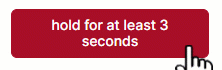
The Hold Release component adds a button that participants must hold down for the duration you specify. It can be useful for implementing bot checks.
A response is only recorded when the participant releases the button after holding it for at least the specified duration. If the participant releases the button before the specified duration has elapsed, no response is recorded.
While the participant holds down the button, they see the button visually filling up as they approach the specified duration:
Label
The label to display on the button.
Hold Duration (ms)
The minimum duration in milliseconds the button must be held. If the button is held for less than this time, no response will be recorded.
Response
The response value to record when the button is released. This response will only be recorded if the button is held for at least the specified duration before being released.
Tag
The tag for this response.
Position
Position of the center of the bounding box, relative to the center of the container. You can change the x- and y-coordinates. By default, position is set in grid coordinates. To set position in absolute pixels or as a percentage of the Gorilla stage, add an Advanced Positioning component to the object.
Size
Size of the bounding box. You can change the x- and y-coordinates. By default, size is set in grid coordinates. To set size in absolute pixels or as a percentage of the Gorilla stage, add an Advanced Positioning component to the object.
For more information about response tagging, check out our Response Processing Guide.
Add the Keyboard Response component to any screen where you want the participant to respond by pressing a key or keys on the keyboard.
The Keyboard Response component only listens for the key(s) you specify in the Mappings setting. If the participant presses any other key, it will have no effect.
Each key you specify has an optional Response setting. This affects what is recorded in the Response column of your data when the participant presses the key.
To record when the participant does not press a key, add a Time Limit component to the Screen tab and toggle on 'Treat As Response'.
Samples that use this component
Mappings
Set of Keys to listen for and Responses to record.
To add a new mapping, press + Add. Select the key you want to listen for from the Key dropdown menu. The Keyboard Response component can only listen for the keys listed in the dropdown.
The Response setting defines what response will be recorded in your data when the participant presses the selected key. If you leave the Response setting empty, the name of the key will be recorded as the response. Otherwise, what you enter in the Response setting will be recorded as the response.
Tag
Tag for this response.
Enforce Key Release
Toggle this setting on to require that target keys are released before the screen advances. While this may reduce the impact of participants holding down the key (intentionally or otherwise), it can increase the length of time that the screen is visible for. If screen timing must be tightly controlled, this setting should be left inactive.
Metric on Key Release
Toggle this setting on to trigger an additional metric (= additional row of recorded data) on key release. This metric will have _keyup appended to the existing response value.
Currently, this setting only has an effect if the keyboard response does not advance the screen. To record the _keyup metric, you will need to have another way of advancing the screen, for example a Time Limit, and use an appropriate Advance component on the Screen tab to override Gorilla's default behaviour of advancing the screen when the first response is received.
For more information about response tagging, check out our Response Processing Guide.
The Mouse Button Response component enables you to collect responses via the participant's left or right mouse buttons.
To centre the participant's mouse position at the start of each trial, simply add a screen with a centered Continue Button immediately before the main trial screen. Participants must click this button to proceed - this will ensure their mouse is positioned appropriately at the start of the trial. You can see an example of this in our Mousetracking sample.
Samples that use this component
Categorisation Task - Mouse Response
Mappings
Set of mouse buttons to listen for. Left and right mouse button can both be bound to a response you define. You can then optionally score participants' responses as correct or incorrect by setting a Scorer in the Screen tab.
Tag
Tag for this response.
For more information about response tagging, check out our Response Processing Guide.
The Palette component provides a set of colours for a user to select from. It can be used alongside either the Canvas Painting component or the Click Painting component, enabling participants to change the colour of their paintbrush.

The Palette component needs to be added to your task as a separate object. Do not add the Palette component to the same object as your Canvas Painting or Click Painting components!
Samples that use this component
Colour Options
The set of colours you want to be available to the participant. Click Add to add a colour to the palette.
Click the current colour to select a new colour. Use the colour slider to select a hue and click in the space above to select saturation and lightness, click the colour dropper to select any colour on your screen, or directly enter an RGB, HSL, or HEX code. Click RGB, HSL, or HEX to toggle between colour modes.
To vary colours from trial to trial, bind colour to the spreadsheet by clicking Bind . To specify colours in the spreadsheet, use HEX codes (with or without the # at the beginning), RGB codes in the format rgb(0,0,0), or HSL codes in the format hsl(0,0%,0%).
Painting Target
The object containing the painting component.
Position
Position of the center of the bounding box, relative to the center of the container. You can change the x- and y-coordinates. By default, position is set in grid coordinates. To set position in absolute pixels or as a percentage of the Gorilla stage, add an Advanced Positioning component to the object.
Size
Size of the bounding box. You can change the x- and y-coordinates. By default, size is set in grid coordinates. To set size in absolute pixels or as a percentage of the Gorilla stage, add an Advanced Positioning component to the object.
The Single Number Entry component allows the participant to enter a number into a text box and submit it using the Submit button.
Optionally, you can also allow participants to submit their answer by pressing the Enter key by toggling on the 'Submit on Enter Key' setting.
The Single Number Entry component only accepts whole, decimal, and/or negative numbers. Any leading 0s will be trimmed from the response to convert it to a valid number - e.g. if the participant enters 005, the response recorded will be 5. To allow non-number responses, use Single Text Entry.
You can also use the Single Number Entry component to accept multiple sequential responses. Just toggle on the 'Clear On Submit' setting, add another method of advancing the screen (e.g., a Continue Button), and add the corresponding Advance component to the Screen tab (e.g., Advance - Continue).
This component is similar to the Number Entry component. While the Single Number Entry component can submit its own response, triggering a response during the screen, the Number Entry component only has its response triggered at the end of the screen.
Samples that use this component
Other resources
Running total with live update
Label
Text to show left of the number input, for example if you want to add instructions.
Button
Text to show on the submit button.
Text Size (px)
Size (in pixels) of all text in this component.
Autoscale
Toggle this setting on to scale the text according to the size of the screen.
Tag
The tag for this response.
Use Limits
Turn this on to only allow numbers in a specific range.
Minimum
Minimum allowed value for number.
Maximum
Maximum allowed value for number.
Initial Value (Optional)
The number you want to be displayed in the input box at screen start. If left blank, the input box will start empty.
Submit On Enter Key
Toggle this setting on to submit the response when the participant presses Enter.
Clear On Submit
Toggle this setting on to clear the contents of the input box once the response is submitted.
Position
Position of the center of the bounding box, relative to the center of the container. You can change the x- and y-coordinates. By default, position is set in grid coordinates. To set position in absolute pixels or as a percentage of the Gorilla stage, add an Advanced Positioning component to the object.
Size
Size of the bounding box. You can change the x- and y-coordinates. By default, size is set in grid coordinates. To set size in absolute pixels or as a percentage of the Gorilla stage, add an Advanced Positioning component to the object.
For more information about response tagging, check out our Response Processing Guide.
The Text Entry component allows the participant to enter text into a text box and submit it using the Submit button.
Optionally, you can also allow participants to submit their answer by pressing the Enter key by toggling on the 'Submit on Enter Key' setting.
You can also use the Single Text Entry component to accept multiple sequential responses. Just toggle on the 'Clear On Submit' setting, add another method of advancing the screen (e.g., a Continue Button), and add the corresponding Advance component to the Screen tab (e.g., Advance - Continue).
This component is similar to the Text Entry component. While the Single Text Entry component can submit its own response, triggering a response during the screen, the Text Entry component only has its response triggered at the end of the screen.
Samples that use this component
Real Effort Number Counting Task
Vocabulary Learning and Testing Task
Primacy & Recency Task (using Clear on Submit to allow multiple sequential responses)
Label
Label to show next to the text input field. This can be used as reminder for participants of what they are supposed to enter.
Button
Label to show on the submit button.
Text Size (px)
Size (in px) of all text in this component, including button and label.
Autoscale
Toggle this setting on to scale the text according to the size of the screen.
Tag
The tag for this response.
Initial Text (Optional)
The text you want to be displayed in the text box at screen start. If left blank, the text box will start empty.
Submit On Enter Key
Toggle this setting on to submit the response when the participant presses Enter.
Clear On Submit
Toggle this setting on to clear the contents of the text box once the response is submitted.
Use Input Restrictions
Toggle this setting on to optionally set minimum and maximum character limits on the response entered into the component.
Min Characters (Optional)
(Only available when 'Use Input Restrictions' is toggled on)
Minimum number of characters required. If the participant tries to submit a response with fewer than the specified number of characters, the screen will not advance, and they will see the warning message 'X more characters required'.
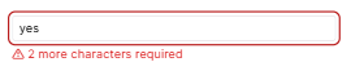
If left blank, the participant can leave the box empty and still submit their response.
Max Characters (Optional)
(Only available when 'Use Input Restrictions' is toggled on)
Maximum number of characters that can be entered. When the participant starts typing, a character count will appear showing how many characters they have typed and the maximum number.
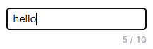
If the participant reaches the maximum number of characters and keeps typing, no further characters will appear in the text box.
If this setting is left blank, the participant can enter as many characters as they like.
Position
Position of the center of the bounding box, relative to the center of the container. You can change the x- and y-coordinates. By default, position is set in grid coordinates. To set position in absolute pixels or as a percentage of the Gorilla stage, add an Advanced Positioning component to the object.
Size
Size of the bounding box. You can change the x- and y-coordinates. By default, size is set in grid coordinates. To set size in absolute pixels or as a percentage of the Gorilla stage, add an Advanced Positioning component to the object.
For more information about response tagging, check out our Response Processing Guide.
This component is in beta. This means it has been released for public use, but we intend to make improvements to it before it is considered 'finished'. We advise thorough testing before collecting data. If you find any issues or bugs, please provide us with feedback as soon as possible via our contact form.
We are aware of issues surrounding Audio and Video recording components in two situations:
When used with the Audio, Video, or Background Audio components.
In Safari, or devices running iOS.
Using the Audio and Video Recording components in Safari or devices running iOS may lead to participants not being able to proceed past the recording check at the beginning of a task, or to recordings being lost or corrupted. While our development team investigate, here are some actions you can take:
The Video Recording component allows you to create video files of your participants, via their webcam. By default, video recordings will also include audio from the participant's microphone.
Adding this component to your task will automatically add 1) a microphone and camera check and 2) a recording check before the task begins. The microphone and camera test shows the participant the volume of their microphone and the visual feed from their camera, and allows them to select which microphone and camera they want to use. The recording test records some audio and video from the microphone and camera and plays it back to the participant so they can confirm the microphone and camera are recording correctly.
To view these settings, go to Subsystems in the Settings tab on the left-hand side of the Task Builder. If you wish to record silent video only, with no audio, you can toggle off the Microphone subsystem. The Camera and Recording subsystems, however, must be enabled for this component to function - do not toggle them off unless you have removed all components that require them from your task!
Samples that use this component
File Prefix
A custom prefix to use as part of the filename for the video recording. This is useful for identifying the different video recording files in your downloadable data.
Recording Buffer (ms)
Recording buffer - adds additional recording time as a buffer to the end of the recording. If you find the end of a participant's response is being cut off, increase this value. Defaults to 250 ms if left empty.
Accessing video files (in preview mode):
When previewing a task, your video files can be accessed via a URL within the data file generated by the preview. After the preview has finished, download the data and find the URL in this file.
Accessing video files (in full experiment):
When running a full experiment, all of the video files can be accessed from your Experiment's Data tab. The zip folder with all your data will include an 'Uploads' folder, containing all of your video files.
Participant video recordings are labelled using the format: [Experiment ID]-[Experiment Version]-[Participant Private ID]-[Tree Node Key]-[Schedule ID]-[the recording file prefix]-videoRecording-[Spreadsheet Index]-[Screen Counter].[File Type]. Spreadsheet Index is the current row number in the spreadsheet (after randomisation) minus 1. More details on the other values can be found in the Data Columns Guide.
If participant video recordings are missing or don't open, check out our Troubleshooting Guide.
The Dropdown component adds a simple dropdown menu, from which the participant can select one answer from the set of options you provide.
This component is a passive response component. This means that the response itself will not advance the screen. You will need to add another component, such as a Continue Button or a Time Limit, to submit the response and advance the screen. Passive responses are not evaluated until after the screen is ready to advance. This means you cannot use a passive response to determine which screen a participant gets sent to in a Branch component.
Tutorials that use this component
Use separate Responses and Labels
Toggle this setting on to specify separate labels (displayed to the participant) and responses (shown in your data).
Options
Set of options to show in the dropdown.
Allow 'Other'
Toggle this setting on to add an "Other" option to the dropdown. If the participant selects this option, a text box will appear for them to type a free text response.
'Other' option label
Label for your "Other" option.
Randomise Order
Toggle this setting on to randomise the order of options within the dropdown.
Required
Toggle this setting on to force the participant to select something from the dropdown.
Tag
The tag for this response.
Text Size (px)
The size of the text, in pixels.
Autoscale
Toggle this setting on to scale the text according to the size of the screen.
V Align
Vertical alignment. Use this to align the dropdown to the top, middle or bottom of its bounding box.
Position
Position of the center of the bounding box, relative to the center of the container. You can change the x- and y-coordinates. By default, position is set in grid coordinates. To set position in absolute pixels or as a percentage of the Gorilla stage, add an Advanced Positioning component to the object.
Size
Size of the bounding box. You can change the x- and y-coordinates. By default, size is set in grid coordinates. To set size in absolute pixels or as a percentage of the Gorilla stage, add an Advanced Positioning component to the object.
The Multiple Choice component allows the participant to choose from a list of pre-defined options. If multiple answers are allowed, the options will be presented as a checklist. If only one option can be chosen by participants, they will be displayed as radio buttons.
This component is a passive response component. This means that the response itself will not advance the screen. You will need to add another component, such as a Continue Button or a Time Limit, to submit the response and advance the screen. Passive responses are not evaluated until after the screen is ready to advance. This means you cannot use a passive response to determine which screen a participant gets sent to in a Branch component.
Use separate Responses and Labels
Toggle this setting on to specify separate labels (displayed to the participant) and responses (shown in your data).
Options
Add the list of options you wish to provide for this question.
Response
The response value for this option - this is the response that will actually be stored.
Label
(Only available when 'Use separate Responses and Labels' is toggled on)
The label for this option - this is what will be shown to the participant. Labels are not included in your data.
Allow multiple answers
Toggle this setting on to allow multiple answers to be selected using checkboxes. By default, only a single answer can be selected using radio buttons.
Allow 'Other'
Toggle this setting on to add an "Other" option to the list, with a conditional text box response when selected.
'Other' option label
(Only available when 'Allow "Other"' is toggled on)
Label for your "Other" option, which participants will see.
Hide text entry
(Only available when 'Allow "Other"' is toggled on)
Toggle this setting on to hide the text box that usually appears by default when the 'Other' option is selected.
Override other selections
(Only available when 'Allow "Other"' and 'Allow multiple answers' are both toggled on)
Toggle this setting on to have the 'Other' option automatically deselect all other choices when the participant selects it, even if multiple answers are allowed.
Randomise Order
Toggle this setting on to randomise the order of multiple choice options.
Required
Toggle this setting on to force the participant to select an option from the multiple choice options before continuing.
Tag
Tag for this response.
Text Size (px)
The size of the text, in pixels.
Autoscale
Toggle this setting on to scale the text according to the size of the screen.
V Align
Vertical alignment. Use this to align the multiple choice options to the top, middle or bottom of their bounding box.
Position
Position of the center of the bounding box, relative to the center of the container. You can change the x- and y-coordinates. By default, position is set in grid coordinates. To set position in absolute pixels or as a percentage of the Gorilla stage, add an Advanced Positioning component to the object.
Size
Size of the bounding box. You can change the x- and y-coordinates. By default, size is set in grid coordinates. To set size in absolute pixels or as a percentage of the Gorilla stage, add an Advanced Positioning component to the object.
The Number Entry component allows the participant to enter a number into a text box.
The Number Entry component only accepts whole, decimal, and/or negative numbers. Any leading 0s will be trimmed from the response to convert it to a valid number - e.g. if the participant enters 005, the response recorded will be 5. To allow non-number responses, use Text Entry.
This component is a passive response component. This means that the response itself will not advance the screen. You will need to add another component, such as a Continue Button or a Time Limit, to submit the response and advance the screen. Passive responses are not evaluated until after the screen is ready to advance. This means you cannot use a passive response to determine which screen a participant gets sent to in a Branch component.
For an active response alternative to the Number Entry (Passive) component, use Single Number Entry.
By default, the Number Entry component will auto-snap (i.e. place the flashing cursor in the number entry box) so that participants can start typing without having to click on the box. To disable this behaviour, add a Trigger - Active component set to deactivate the Number Entry component on Screen Start.
If you have multiple Number Entry components on a screen, the cursor will appear in the one at the bottom of the objects list. To make the cursor appear in a different Number Entry box, simply drag that object to the bottom of the objects list.
Tutorials that use this component
Use Limits
Turn this on to only allow numbers in a specific range.
Minimum
Minimum allowed value for number.
Maximum
Maximum allowed value for number.
Required
Toggle this setting on to force the participant to enter something into the text field before continuing.
Tag
Tag for this response.
Text Size (px)
The size of the text, in pixels. By default, it is set to size 18.
Autoscale
Toggle this setting on to scale the text according to the size of the screen.
V Align
Vertical alignment. Use this to align the number entry box to the top, middle or bottom of its bounding box.
Position
Position of the center of the bounding box, relative to the center of the container. You can change the x- and y-coordinates. By default, position is set in grid coordinates. To set position in absolute pixels or as a percentage of the Gorilla stage, add an Advanced Positioning component to the object.
Size
Size of the bounding box. You can change the x- and y-coordinates. By default, size is set in grid coordinates. To set size in absolute pixels or as a percentage of the Gorilla stage, add an Advanced Positioning component to the object.
The Rating Scale component adds one set of Likert-style choices, from which participants can pick a single option. Participants can change their mind and select a different option before submitting their final response.
This component is a passive response component. This means that the response itself will not advance the screen. You will need to add another component, such as a Continue Button or a Time Limit, to submit the response and advance the screen. Passive responses are not evaluated until after the screen is ready to advance. This means you cannot use a passive response to determine which screen a participant gets sent to in a Branch component.
If you need to:
Our Active Rating Scale example enables this by replicating the functionality of a Rating Scale with Text Response Buttons. Clone it to incorporate this functionality into your own tasks!
Samples using this component
Auditory Sentence Predictability Task
Tutorials that use this component
Use separate Responses and Labels
Toggle this setting on to specify separate labels (displayed to the participant) and responses (shown in your data).
Options
Set of options to show in the scale. Use label for the rating words/numbers you want participants to see and choose from. Use value to indicate what value the response will have if the participant selects that option.
Left Label
The label that will be shown to the left of the scale.
Right Label
The label that will be shown to the right of the scale.
Required
Toggle this setting on to force the participant to choose an option from the rating scale before continuing.
Tag
Tag for this response.
Text Size (px)
The size of the text, in pixels. By default, it is set to size 18.
Autoscale
Toggle this setting on to scale the text according to the size of the screen.
V Align
Vertical alignment. Use this to align the rating scale to the top, middle or bottom of its bounding box.
Position
Position of the center of the bounding box, relative to the center of the container. You can change the x- and y-coordinates. By default, position is set in grid coordinates. To set position in absolute pixels or as a percentage of the Gorilla stage, add an Advanced Positioning component to the object.
Size
Size of the bounding box. You can change the x- and y-coordinates. By default, size is set in grid coordinates. To set size in absolute pixels or as a percentage of the Gorilla stage, add an Advanced Positioning component to the object.
The Slider component lets you add a simple slider. The participant can drag the slider to a value within the range you set. The range defaults to 0 - 100.
The start position of the slider handle defaults to the middle of the slider. When using the 'Fixed Start Position' setting, the slider handle will start at the position specified by 'Starting value'. When using the 'Random Start Position' setting, the slider handle will start at a random position between the 'Starting value (min)' and 'Starting value (max)'.
To show the participant a slider without allowing them to respond -- for example, to present them with a reminder of their previous response -- use the Trigger - Enable component to disable the slider on screen start.
This component is a passive response component. This means that the response itself will not advance the screen. You will need to add another component, such as a Continue Button or a Time Limit, to submit the response and advance the screen. Passive responses are not evaluated until after the screen is ready to advance. This means you cannot use a passive response to determine which screen a participant gets sent to in a Branch component.
Samples that use this component
Tutorials that use this component
Minimum Value
Sets the minimum value on the slider. The default value is 0.
Maximum Value
Sets the maximum value on the slider. The default value is 100.
Fixed Start Position
Toggle this setting on to specify a fixed start position for the slider handle. By default, the slider handle will start in the middle of the range.
Starting value
When using Fixed Start Position, sets the start position for the slider handle.
Random Start Position
Toggle this setting on to randomise the start position for the slider handle.
Starting value (min)
When using Random Start Position, sets the minimum starting value. The actual value will be between this and the maximum starting value.
Starting value (max)
When using Random Start Position, sets the maximum starting value. The actual value will be between this and the minimum starting value.
Add Labels
Toggle this setting on to add labels to the ends of the slider.
Left-side label
When using Add Labels, defines the label to display to the left end of the slider.
Right-side label
When using Add Labels, defines the label to display to the right end of the slider.
Label Alignment
When using Add Labels, sets the horizontal alignment of the labels. Center = labels will be center-aligned; Inner = labels will be aligned to the side facing the slider; Outer = labels will be aligned to the side facing away from the slider.
Required
Toggle this setting on to force the participant to move the slider before continuing.
Tag
Tag for this response.
Text Size (px)
The size of the text, in pixels. By default, it is set to size 18.
Autoscale
Toggle this setting on to scale the text according to the size of the screen.
V Align
Vertical alignment. Use this to align the slider to the top, middle or bottom of its bounding box.
Position
Position of the center of the bounding box, relative to the center of the container. You can change the x- and y-coordinates. By default, position is set in grid coordinates. To set position in absolute pixels or as a percentage of the Gorilla stage, add an Advanced Positioning component to the object.
Size
Size of the bounding box. You can change the x- and y-coordinates. By default, size is set in grid coordinates. To set size in absolute pixels or as a percentage of the Gorilla stage, add an Advanced Positioning component to the object.
Show tooltip
Toggle this setting on to show the current value above the slider in a tooltip (speech bubble).
Hide handle until click
Toggle this setting on to hide the slider handle until the participant first clicks the slider.
Step Size
Sets the step size for the slider. You can enter a whole number or a decimal value.
Allow Keyboard controls
Toggle this setting on to allow the participant to use the left/right arrow keys on the keyboard to move the slider handle.
Continuous Polling
Toggle this setting on to allow the slider to be continuously polled. This will create a row in your data at a set interval containing the current slider value (if the value has changed since the last interval).
Polling Interval (ms)
When using Continuous Polling, sets the polling interval to be used - the time between slider values being recorded. The minimum this can be set to is 500ms.
The Text Entry component allows the participant to enter text into a text box.
This component is a passive response component. This means that the response itself will not advance the screen. You will need to add another component, such as a Continue Button or a Time Limit, to submit the response and advance the screen. Passive responses are not evaluated until after the screen is ready to advance. This means you cannot use a passive response to determine which screen a participant gets sent to in a Branch component.
For an active response alternative to the Text Entry component, use Single Text Entry.
By default, the Text Entry component will auto-snap (i.e. place the flashing cursor in the text entry box) so that participants can start typing on screen start without having to click on the box. To disable this behaviour, you will need to add a Trigger - Active component set to deactivate the Text Entry component on Screen Start.
If you have multiple Text Entry components on a screen, the cursor will appear in the one at the bottom of the objects list. To make the cursor appear in a different Text Entry box, simply drag that object to the bottom of the objects list.
Samples that use this component
UI/UX Prototype Navigation Task
Number of Rows
How many rows tall the input box should be.
Initial Text (Optional)
Initial text to be displayed in the text field. If left blank, the text field will initially be empty.
Log each keypress
Toggle this setting on to log the reaction time and the current contents of the Text Entry box each time a key is pressed. These will be included in your downloaded data as an 'Action' response type.
Use Input Restrictions
Toggle this setting on to optionally set minimum and maximum character limits on the response entered into the component.
Min Characters (Optional)
(Only available when 'Use Input Restrictions' is toggled on)
Minimum number of characters required. If the participant tries to submit a response with fewer than the specified number of characters, the screen will not advance, and they will see the warning message 'X more characters required'.
If this setting is left blank, the participant can enter only 1 character (or 0, if the Required setting is toggled off) and still submit their response.
Max Characters (Optional)
(Only available when 'Use Input Restrictions' is toggled on)
Maximum number of characters that can be entered. When the participant starts typing, a character count will appear showing how many characters they have typed and the maximum number.
If the participant reaches the maximum number of characters and keeps typing, no further characters will appear in the text box.
If this setting is left blank, the participant can enter as many characters as they like.
Required
Toggle this setting on to force the participant to enter something into the text field before continuing.
Tag
Tag for this response.
Text Size (px)
The size of the text, in pixels. By default, it is set to size 18.
Autoscale
Toggle this setting on to scale the text according to the size of the screen.
V Align
Vertical alignment. Use this to align the text to the top, middle or bottom of its bounding box.
Position
Position of the center of the bounding box, relative to the center of the container. You can change the x- and y-coordinates. By default, position is set in grid coordinates. To set position in absolute pixels or as a percentage of the Gorilla stage, add an Advanced Positioning component to the object.
Size
Size of the bounding box. You can change the x- and y-coordinates. By default, size is set in grid coordinates. To set size in absolute pixels or as a percentage of the Gorilla stage, add an Advanced Positioning component to the object.
On screens where the participant submits a response, you can use the Feedback component to show an image that indicates if the response was correct or incorrect. To set this up:
If your feedback isn't working, check out our Troubleshooting Guide.
Want to give participants audio feedback? Instead of using the Feedback component, you'll need to:
You can see an example of this setup in our Dot Probe sample. Warning: this task includes aversive images.
Samples that use this component
Vocabulary Learning and Testing Task
Alternate Task Switching - Uses custom Feedback images
Tutorials that use this component
Text Size (px)
Size of the feedback symbol.
Autoscale
Toggle this setting on to scale the text according to the size of the screen.
Duration (ms)
How long to show the feedback for. Leave empty to show until the end of the screen.
Use Images
Whether to use images instead of the standard symbols.
Correct
Image to use for a correct response.
Incorrect
Image to use for an incorrect response.
Position
Position of the center of the bounding box, relative to the center of the container. You can change the x- and y-coordinates. By default, position is set in grid coordinates. To set position in absolute pixels or as a percentage of the Gorilla stage, add an Advanced Positioning component to the object.
Size
Size of the bounding box. You can change the x- and y-coordinates. By default, size is set in grid coordinates. To set size in absolute pixels or as a percentage of the Gorilla stage, add an Advanced Positioning component to the object.
This component can be used to display the current response. This is useful for tasks like Digit Span where you want the participant to be able to see the response they have given so far.
This component is designed to be used with a Text component. Any response with a response type of Response or Action will be set as the content of the text component. You can use it in conjunction with Collate Responses or Compound Responses to show the response that the participant has entered so far.
This is a purely visual component - if you want to save a response to the store to use later, consider using Save Response.
Samples that use this component
Tutorials that use this component
Required Tags
Only responses with the set tags will be displayed. All other responses will be ignored. If unset, all responses will be shown.
Set the background colour for this object.
If you want the background colour to change when hovered over, use the Background Color - Hover component.
This component can also change the screen background colour, if you add it to an object with a blank Text component and adjust the object size to cover the entire screen. The easiest way to do this is to set both the x and y Size settings on the object to 100. This will ensure the object is much bigger than the 24 x 18 grid of the Gorilla stage, and so it will cover the screen on all devices.
To ensure it appears behind other items on the screen, place the object with the background colour component at the top of the object list. It is best to add this component during the final stages of your task design, since once you have added it, you will not be able to see the visual setup of your displays at a glance in the main Displays view.
Samples that use this component
Magnitude Comparison Task (Grey Background)
Background Color
Select the background colour.
Click the current colour to select a new colour. Use the colour slider to select a hue and click in the space above to select saturation and lightness, click the colour dropper to select any colour on your screen, or directly enter an RGB, HSL, or HEX code. Click RGB, HSL, or HEX to toggle between colour modes.
To vary colours from trial to trial, bind colour to the spreadsheet by clicking Bind . To specify colours in the spreadsheet, use HEX codes (with or without the # at the beginning), RGB codes in the format rgb(0,0,0), or HSL codes in the format hsl(0,0%,0%).
Disabled
Select the background color to show when the object has been disabled (for example, via Trigger - Enabled).
Opacity (%)
Control how opaque or transparent the colour appears. 0 = full transparency, 100 = full opacity. By using this setting on an object with a blank Text component, you can use the Background Color component to create a semi-transparent mask over your stimuli.
Set the background colour for this object and change it when hovered over.
If you don't want the background colour to change when hovered over, use the Background Color component.
Samples that use this component
Normal
Select the normal background colour, which is shown by default, before the participant moves the mouse.
Click the current colour to select a new colour. Use the colour slider to select a hue and click in the space above to select saturation and lightness, click the colour dropper to select any colour on your screen, or directly enter an RGB, HSL, or HEX code. Click RGB, HSL, or HEX to toggle between colour modes.
To vary colours from trial to trial, bind colour to the spreadsheet by clicking Bind . To specify colours in the spreadsheet, use HEX codes (with or without the # at the beginning), RGB codes in the format rgb(0,0,0), or HSL codes in the format hsl(0,0%,0%).
Hover
Select the background colour to show when hovering over the object, before the screen is completed (for example, via a Click Response).
Selected
Select the background colour to show when the object has been interacted with.
Disabled
Select the background color to show when the object has been disabled (for example, via Trigger - Enabled).
Opacity (%)
Control how opaque or transparent the colour appears. 0 = full transparency, 100 = full opacity. By using this setting on an object with a blank Text component, you can use the Background Color - Hover component to create a semi-transparent mask over your stimuli.
Display a coloured border around a visible element.
If you want the border to change dynamically with the participant's mouse movements, use the Border - Hover component.
Samples that use this component
Border Color
Select the colour of the border.
Click the current colour to select a new colour. Use the colour slider to select a hue and click in the space above to select saturation and lightness, click the colour dropper to select any colour on your screen, or directly enter an RGB, HSL, or HEX code. Click RGB, HSL, or HEX to toggle between colour modes.
To vary colours from trial to trial, bind colour to the spreadsheet by clicking Bind . To specify colours in the spreadsheet, use HEX codes (with or without the # at the beginning), RGB codes in the format rgb(0,0,0), or HSL codes in the format hsl(0,0%,0%).
Border Size (px)
How thick the border is, in pixels.
Border Radius (px)
The radius of the border. Use 0 for sharp right-angled corners. The larger the value you enter, the more rounded the corners of the border will be.
Display a coloured border around a visible element and change it when hovered over.
If you don't want the border to change when hovered over, use the Border component.
Samples that use this component
Normal
Select the normal border colour, which is shown by default, before the participant moves the mouse.
Click the current colour to select a new colour. Use the colour slider to select a hue and click in the space above to select saturation and lightness, click the colour dropper to select any colour on your screen, or directly enter an RGB, HSL, or HEX code. Click RGB, HSL, or HEX to toggle between colour modes.
To vary colours from trial to trial, bind colour to the spreadsheet by clicking Bind . To specify colours in the spreadsheet, use HEX codes (with or without the # at the beginning), RGB codes in the format rgb(0,0,0), or HSL codes in the format hsl(0,0%,0%).
Hover
Select the border colour to show when hovering over the object, before the screen is completed (for example, via a Click Response).
Selected
Select the border colour to show when the object has been interacted with.
Disabled
Select the border colour to show when the object has been disabled (for example, via Trigger - Enabled).
Border Size (px)
How thick the border is, in pixels.
Border Radius (px)
The radius of the border. Use 0 for sharp right-angled corners. The larger the value you enter, the more rounded the corners of the border will be.
Set the colour of the text of this object. Most often used with a Text or Markdown Text component.
If you want the text colour to change when the text is hovered over, use the Text Color - Hover component.
Samples that use this component
Text Color
Select the text colour.
Click the current colour to select a new colour. Use the colour slider to select a hue and click in the space above to select saturation and lightness, click the colour dropper to select any colour on your screen, or directly enter an RGB, HSL, or HEX code. Click RGB, HSL, or HEX to toggle between colour modes.
To vary colours from trial to trial, bind colour to the spreadsheet by clicking Bind . To specify colours in the spreadsheet, use HEX codes (with or without the # at the beginning), RGB codes in the format rgb(0,0,0), or HSL codes in the format hsl(0,0%,0%).
Set the colour of the text of this object and change it when hovered over. Most often used with a Text or Markdown Text component.
If you don't want the text colour to change when hovered over, use the Text Color component.
Samples that use this component
Normal
Select the normal text colour, which is shown by default, before the participant moves the mouse.
Click the current colour to select a new colour. Use the colour slider to select a hue and click in the space above to select saturation and lightness, click the colour dropper to select any colour on your screen, or directly enter an RGB, HSL, or HEX code. Click RGB, HSL, or HEX to toggle between colour modes.
To vary colours from trial to trial, bind colour to the spreadsheet by clicking Bind . To specify colours in the spreadsheet, use HEX codes (with or without the # at the beginning), RGB codes in the format rgb(0,0,0), or HSL codes in the format hsl(0,0%,0%).
Hover
Select the text colour to show when hovering over the object, before the screen is completed (for example, via a Click Response).
Complete
Select the text color to show when the screen is complete.
When you add this component to an object, the participant can click on that object to activate it. This applies to audio and video stimuli, where 'activate' means 'start playing'. Use this component when you want the participant to click to play the audio or video, rather than it playing automatically at the start of the screen. For more ways of triggering audio and video to start playing - for example, after a defined amount of time has elapsed - see the Trigger - Active component.
For a video, simply create an object with a Video component and a Click to Activate component - the participant will be able to click the still image of the video to start it playing. For an audio clip, you'll also need to add a visual component for the participant to click, such as a Button.
Samples that use this component
Tutorials that use this component
You can add the Click to Continue component to an object to be able to advance to the next screen when the object is clicked on. This can be used together with a Button component, another visual component such as an image, or a Hotspot. If you want the click to be timed and scored as a response, consider using the Click Response component instead.
Samples that use this component
The Countdown component lets you display the remaining time for the screen, in seconds. Adding a Countdown component to your screen will automatically also add a Time Limit component to the Screen tab.
Samples that use this component
Semantic Priming (Mobile Version)
Tutorials that use this component
Screen Timelimit and Countdown
Text Size (px)
The size of the text, in pixels.
Autoscale
Toggle this setting on to scale the text according to the size of the screen.
H Align
Horizontal alignment. Use this to align the text to the left, center or right of its bounding box.
V Align
Vertical alignment. Use this to align the text to the top, middle or bottom of its bounding box.
Show Partial Time Remaining (ms)
This is helpful if you only want to display the countdown towards the end of the time limit of the screen. Use this to specify the amount, in ms, of the remaining time you want to display the countdown for.
Format
Select the format you want to display the remaining time in. Choose from Seconds or Minutes:Seconds.
Position
Position of the center of the bounding box, relative to the center of the container. You can change the x- and y-coordinates. By default, position is set in grid coordinates. To set position in absolute pixels or as a percentage of the Gorilla stage, add an Advanced Positioning component to the object.
Size
Size of the bounding box. You can change the x- and y-coordinates. By default, size is set in grid coordinates. To set size in absolute pixels or as a percentage of the Gorilla stage, add an Advanced Positioning component to the object.
Allow this Object to be dragged around the screen. For full functionality, there needs to be at least one additional object on the screen with a Dropzone component to create areas that Draggable objects can be dragged onto to generate a response.
The Draggable object should be placed at the highest layer (i.e. the bottom of the list of objects), otherwise it could get dragged behind other objects and no longer be available for participants to move.
The generated response will be a concatenation of the response in the Draggable component and the response in the Dropzone component. For example, if the Draggable has the response ItemA and the Dropzone has the response ZoneB, then dragging the Draggable onto the Dropzone will generate a response with the value ItemAZoneB.
To allow participants to drag multiple objects or to let them change their mind before submitting their response, consider adding a Continue Button and an Advance - Continue screen component.
Samples that use this component
Tutorial that uses this component
Response
The response to submit when this object is dragged onto a Dropzone.
Tag
The tag for this response.
Single Use
Toggle this setting on to allow this draggable to be dragged only once.
Drop in Place
Toggle this setting on to allow this draggable to be dropped where it lands, rather than moving to the centre of the dropzone.
Store Location
Set a Field in the Store to save the object name of the Dropzone where this draggable was dropped. Use this setting if you need to retrieve and use the name of the Dropzone later in the task or the experiment.
Allow objects with the Draggable component to be dropped on this object. Draggable objects will snap to this object when dragged nearby and, when released, will submit a response. Use multiple objects with the Dropzone component to allow multiple response options.
The generated response will be a concatenation of the response in the Draggable component and the response in the Dropzone component. For example, if the Draggable has the response ItemA and the Dropzone has the response ZoneB, then dragging the Draggable onto the Dropzone will generate a response with the value ItemAZoneB.
Samples that use this component
Tutorial that uses this component
Response
The response to append to the draggable response when dropped in this dropzone.
Tag
The tag for this response.
Single Occupant
Toggle this setting on to allow only one draggable at a time to occupy this dropzone.
Restrict To Tag
Select a response tag from the dropdown menu. Only draggables with this response tag will be allowed into this dropzone.
Store Occupant
(Only available when 'Single Occupant' is toggled on)
Set a Field in the Store to save the Response of the Draggable that was dragged to this dropzone. Use this setting if you need to retrieve and use the name of the Draggable later in the task or the experiment.
When objects are dragged into or out of this dropzone, increment or decrement a field accordingly. Requires a Dropzone component on this object.
Samples that use this component
Counters
The set of counters to maintain
The Fixation Timing component controls the display of a fixation (hide, show, hide). Combine with a Fixation Cross for a quick and easy cross, or add an Image component to use a custom fixation image. The Fixation Timing component will automatically advance the screen once complete.
Samples that use this component
Stop Signal Task (used together with the Fixation Cross component)
Flanker Task (used together with the Fixation Cross component)
Pre-display Time (ms)
Time between the start of the screen and the display of the fixation.
Display Time (ms)
Time to display the fixation for.
Post-display Time (ms)
Time between the end of the fixation display and the end of the screen.
You can add the Key to Continue component to an object to be able to advance to the next screen when a certain key is pressed. If you want the key press to be timed and scored as a response, consider using the Key Response component instead.
Samples that use this component
Key
Which keyboard key to listen for. Use the words space, enter, backspace, up, down, left or right for those keys, or simply the letter of a regular key.
The Progress Bar component lets you display a visual progress bar, to indicate a participant's progress through a set of trials, a task, or experiment.
Most commonly, this component is combined with an Increase Progress component on the Screen tab. The Progress Bar component visually displays the progress, while the Increase Progress component defines when progress should increase.
Alternatively, by toggling on the 'Use Custom field' setting and setting the Progress Field to an existing field in the Store, the Progress Bar can display other measures of progress such as the number of correct responses.
By default, the Progress Bar will update once at the start of each screen. To have the Progress Bar update dynamically based on participant responses within a screen, use a Custom field and toggle on the Live Update setting.
To reset a Progress Bar, toggle on the 'Use Custom field' setting and set the name of a field where you want to save the progress. Then, on the Screen tab of the screen where you want to reset progress, add a Set Field on Start component and reset the progress field back to 0.
If your Progress Bar isn't displaying correctly, check out our Troubleshooting Guide!
Samples that use this component:
Relational Reasoning with Progress Bar
Anagram Task - shows how to make the Progress Bar selectively increase for only one of several responses on a screen
Progress Bar across multiple Tasks
Tutorials that use this component:
Progress Maximum
The maximum value the progress field can take. For example, if you want to show the participant's progress through 20 trials, you should set this to 20.
Progress Bar Colour
Select the progress bar colour.
Click the current colour to select a new colour. Use the colour slider to select a hue and click in the space above to select saturation and lightness, click the colour dropper to select any colour on your screen, or directly enter an RGB, HSL, or HEX code. Click RGB, HSL, or HEX to toggle between colour modes.
To vary colours from trial to trial, bind colour to the spreadsheet by clicking Bind . To specify colours in the spreadsheet, use HEX codes (with or without the # at the beginning), RGB codes in the format rgb(0,0,0), or HSL codes in the format hsl(0,0%,0%).
Use Custom Field
Link the Progress Bar to a custom field in the Store. As an example, you could use the Save Accuracy component to save the total number of correct answers to a field called correct, and then set the Progress Field to correct. This would make the Progress Bar correspond to the number of correct answers.
Progress Field
(Only available when 'Use Custom field' is toggled on)
Set the field in the Store you want to use to track progress.
Live Update
(Only available when 'Use Custom field' is toggled on)
Toggle this setting on to live update the progress bar in response to participant actions on the current screen, such as button or key presses.
The participant's response must cause a change in the custom field selected in the Progress Field setting above. For example, you could use a Save Data component with the Criteria set to Response Value to increment or decrement the progress field when participants submit a specific response.
Position
Position of the center of the bounding box, relative to the center of the container. You can change the x- and y-coordinates. By default, position is set in grid coordinates. To set position in absolute pixels or as a percentage of the Gorilla stage, add an Advanced Positioning component to the object.
Size
Size of the bounding box. You can change the x- and y-coordinates. By default, size is set in grid coordinates. To set size in absolute pixels or as a percentage of the Gorilla stage, add an Advanced Positioning component to the object.
The Section Countdown enables you to display the remaining time for an active Section Time Limit, in seconds or minutes:seconds. Like the Countdown component, which is used together with a Time Limit component for the Screen, the Section Countdown is used together with a Section Time Limit. The Section Time Limit can span over several screens, and its countdown can be used to indicate remaining time for the entire section.
Samples that use this component
Tutorials that use this component:
Section Time Limit with Countdown
Text Size (px)
The size of the text, in pixels.
Autoscale
Toggle this setting on to scale the text according to the size of the screen.
H Align
Horizontal alignment. Use this to align the text to the left, center, or right of its bounding box.
V Align
Vertical alignment. Use this to align the text to the top, middle, or bottom of its bounding box.
Show Partial Time Remaining (ms)
This is helpful if you only want to display the countdown towards the end of the time limit section. Use this to specify the amount, in ms, of the remaining time you want to display the countdown for.
Format
Select the format you want to display the remaining time in. Choose from Seconds or Minutes:Seconds.
Position
Position of the center of the bounding box, relative to the center of the container. You can change the x- and y-coordinates. By default, position is set in grid coordinates. To set position in absolute pixels or as a percentage of the Gorilla stage, add an Advanced Positioning component to the object.
Size
Size of the bounding box. You can change the x- and y-coordinates. By default, size is set in grid coordinates. To set size in absolute pixels or as a percentage of the Gorilla stage, add an Advanced Positioning component to the object.
You can add the Space to Continue component to an object to be able to advance to the next screen when the space bar is pressed. If you want the space bar press to be timed and scored as a response, consider using the Keyboard Response component instead.
Samples that use this component
Find another object on the screen with a name matching our target. If found, start where that object starts, otherwise start in our natural place.
This can be useful if you use it in combination with the Draggable and Dropzone. For example, you could ask a participant to drag and drop a set of items, perhaps to put them into different categories, and you can save their position to the Store. Then, you could redisplay where they placed them by using this component on a different screen.
Location
The location to start this object in.
For more on when to use Trigger components, check out our Trigger Components guide!
The Trigger - Active component lets you control when an object starts or stops its function. For example, you can:
This component relates to things that happen to the participant (e.g. audio and videos playing, recordings starting or stopping, etc.). To control things the participant can interact with (e.g. keyboard responses, buttons, etc.), use the Trigger - Enabled component instead.
You can use the Trigger - Active component to "chain" audio or video files (i.e. make one start playing only once another has finished playing), or to loop the same audio or video file repeatedly. You can see this in action in our Loop audio file example.
Samples that use this component
Dot Probe - Uses Trigger - Active to give audio feedback. Warning: this task includes aversive images.
Auditory Sentence Predictability Task
Tutorials that use this component
Trigger
The type of event or data for the trigger to monitor. When this event/data occurs, the trigger will take its action. Options:
Additional triggers are available only when the Trigger component is added to an object that includes an Audio or Video component:
Time (ms)
(When using Trigger: Time Elapsed) The length of time after screen start that must elapse before the trigger takes its action.
Response
(When using Trigger: Response) The response value that will cause the trigger to take its action. Default: (Any Response), meaning that any response value will cause the trigger to take its action.
Tag
(When using Trigger: Response Tag) The response tag that will cause the trigger to take its action.
Accuracy
(When using Triggers: Response, Response Tag, Response Accuracy) The accuracy value of the response that will cause the trigger to take its action. This can be set to "Correct", "Incorrect" or "Timed Out".
Condition
(When using Trigger: Reaction Time) The comparison operation (condition) to use when determining if the reaction time is in the desired range. This can be set to
Threshold (ms)
(When using Trigger: Reaction Time) The reaction time value to compare to (using the comparison operation defined in the Condition setting above).
Include Actions
(When using Triggers: Response, Response Accuracy, Response Tag, Reaction Time)
Toggle this setting on to include responses of the Action response type in the responses considered by the Trigger. Examples of Actions are the incremental responses logged by the Compound Responses component, or the continuously logged data from the Slider component when the 'Continuous Polling' setting is toggled on.
Filter
Toggle this setting on to run the Trigger's required event/data through additional filtering. This allows you to trigger an action only if additional criteria are satisfied. For example, you could look up the contents of a field in the Store and trigger the action only if that Field is equal to a certain value.
Field
(Only available when 'Filter' is toggled on)
The Store field to look at for the filter.
Condition
(Only available when 'Filter' is toggled on)
The comparison operation (condition) to use when determining if the store field satisfies the filtering criteria. This can be set to
Value
(Only available when 'Filter' is toggled on)
The value to compare the Store field to (using the comparison operator defined in the Filter's Condition setting above).
Self Only
(When using Trigger: Response Accuracy) Toggle this setting on to restrict the responses considered by the Trigger to the responses generated by the object the Trigger is attached to.
Target
The object that should be targeted by the Trigger's action. Default: (Self), meaning that the Trigger will target the object it is attached to. By changing the Target, you can attach a Trigger to one object, but have it activate or deactivate another object.
Include Metric
Toggle this setting on to add a metric (= additional row of recorded data) to the participant's data file when the Trigger takes its action.
Metric
(Only available when 'Include Metric' is toggled on)
The value you want to record in the Response column of the participant's data when the Trigger takes its action.
Action
Select whether you want to Activate or Deactivate the object when the specified conditions are satisfied.
For more on when to use Trigger components, check out our Trigger Components guide!
The Trigger - Enabled component lets you control whether the participant can interact with an object. For example, you can:
This component relates to things the participant can interact with (e.g. keyboard responses, buttons, etc.). To control things that happen to the participant (e.g. audio and videos playing, recordings starting or stopping, etc.), use the Trigger - Active component instead.
Samples that use this component
Posner Cueing Task - Disables Keyboard Response until a specified time has elapsed
Visual Search Click On Location - Disables each Click Response after clicked once (Task_multiple screen)
Tutorials that use this component
Trigger - Enabled (Game Builder)
Trigger
The type of event or data for the trigger to monitor. When this event/data occurs, the trigger will take its action. Options:
Additional triggers are available only when the Trigger component is added to an object that includes an Audio or Video component:
Time (ms)
(When using Trigger: Time Elapsed) The length of time after screen start that must elapse before the trigger takes its action.
Response
(When using Trigger: Response) The response value that will cause the trigger to take its action. Default: (Any Response), meaning that any response value will cause the trigger to take its action.
Tag
(When using Trigger: Response Tag) The response tag that will cause the trigger to take its action.
Accuracy
(When using Triggers: Response, Response Tag, Response Accuracy) The accuracy value of the response that will cause the trigger to take its action. This can be set to "Correct", "Incorrect" or "Timed Out".
Condition
(When using Trigger: Reaction Time) The comparison operation (condition) to use when determining if the reaction time is in the desired range. This can be set to
Threshold (ms)
(When using Trigger: Reaction Time) The reaction time value to compare to (using the comparison operation defined in the Condition setting above).
Include Actions
(When using Triggers: Response, Response Accuracy, Response Tag, Reaction Time)
Toggle this setting on to include responses of the Action response type in the responses considered by the Trigger. Examples of Actions are the incremental responses logged by the Compound Responses component, or the continuously logged data from the Slider component when the 'Continuous Polling' setting is toggled on.
Filter
Toggle this setting on to run the Trigger's required event/data through additional filtering. This allows you to trigger an action only if additional criteria are satisfied. For example, you could look up the contents of a field in the Store and trigger the action only if that Field is equal to a certain value.
Field
(Only available when 'Filter' is toggled on)
The Store field to look at for the filter.
Condition
(Only available when 'Filter' is toggled on)
The comparison operation (condition) to use when determining if the store field satisfies the filtering criteria. This can be set to
Value
(Only available when 'Filter' is toggled on)
The value to compare the Store field to (using the comparison operator defined in the Filter's Condition setting above).
Self Only
(When using Trigger: Response Accuracy) Toggle this setting on to restrict the responses considered by the Trigger to the responses generated by the object the Trigger is attached to.
Target
The object that should be targeted by the Trigger's action. Default: (Self), meaning that the Trigger will target the object it is attached to. By changing the Target, you can attach a Trigger to one object, but have it enable or disable another object.
Include Metric
Toggle this setting on to add a metric (= additional row of recorded data) to the participant's data file when the Trigger takes its action.
Metric
(Only available when 'Include Metric' is toggled on)
The value you want to record in the Response column of the participant's data when the Trigger takes its action.
Action
Select whether you want to Enable or Disable the object when the specified conditions are satisfied.
For more on when to use Trigger components, check out our Trigger Components guide!
This component allows you to produce a response for events on the screen that do not normally produce a response. For example, you can trigger a response when an Audio file finishes playing, when a certain amount of time has elapsed, or when a participant's reaction time was below or above a certain value.
Define the event that you want to produce the response by selecting an option from the Trigger dropdown. For example, to produce a response when an audio clip finishes playing, add a Trigger - Response component to the object containing your Audio component, and select AudioFinish from the Trigger dropdown. You can indicate what response should be produced in the Response field of the Trigger - Response component.
You can then use the generated response in other components, such as Jump to Row.
Samples that use this component
Visual Search Click on Location
Deary-Liewald Task (Trigger - Response)
Balloon Analogue Risk Task (BART)
Trigger
The type of event or data for the trigger to monitor. When this event/data occurs, the trigger will take its action. Options:
Additional triggers are available only when the Trigger component is added to an object that includes an Audio or Video component:
Time (ms)
(When using Trigger: Time Elapsed) The length of time after screen start that must elapse before the trigger takes its action.
Response
(When using Trigger: Response) The response value that will cause the trigger to take its action. Default: (Any Response), meaning that any response value will cause the trigger to take its action.
Tag
(When using Trigger: Response Tag) The response tag that will cause the trigger to take its action.
Accuracy
(When using Triggers: Response, Response Tag, Response Accuracy) The accuracy value of the response that will cause the trigger to take its action. This can be set to "Correct", "Incorrect" or "Timed Out".
Condition
(When using Trigger: Reaction Time) The comparison operation (condition) to use when determining if the reaction time is in the desired range. This can be set to
Threshold (ms)
(When using Trigger: Reaction Time) The reaction time value to compare to (using the comparison operation defined in the Condition setting above).
Include Actions
(When using Triggers: Response, Response Accuracy, Response Tag, Reaction Time)
Toggle this setting on to include responses of the Action response type in the responses considered by the Trigger. Examples of Actions are the incremental responses logged by the Compound Responses component, or the continuously logged data from the Slider component when the 'Continuous Polling' setting is toggled on.
Filter
Toggle this setting on to run the Trigger's required event/data through additional filtering. This allows you to trigger an action only if additional criteria are satisfied. For example, you could look up the contents of a field in the Store and trigger the action only if that Field is equal to a certain value.
Field
(Only available when 'Filter' is toggled on)
The Store field to look at for the filter.
Condition
(Only available when 'Filter' is toggled on)
The comparison operation (condition) to use when determining if the store field satisfies the filtering criteria. This can be set to
Value
(Only available when 'Filter' is toggled on)
The value to compare the Store field to (using the comparison operator defined in the Filter's Condition setting above).
Self Only
(When using Trigger: Response Accuracy) Toggle this setting on to restrict the responses considered by the Trigger to the responses generated by the object the Trigger is attached to.
Include Metric
Toggle this setting on to add a metric (= additional row of recorded data) to the participant's data file when the Trigger takes its action.
Metric
(Only available when 'Include Metric' is toggled on)
The value you want to record in the Response column of the participant's data when the Trigger takes its action.
Emit Response
The response value to emit/send out when the Trigger takes its action.
Emit Response Type
The type of response. This can be Response, Action or Info. This allows you to control what other reactions this response can trigger.
For more on when to use Trigger components, check out our Trigger Components guide!
By default, Gorilla is listening for responses as soon as the screen starts. You can use the Trigger - Response Window component to manually configure Gorilla to start listening for responses at a point you specify.
On your Screen tab, set the Screen Manager Response Window to 'Manual'. Then, in your Objects tab, use the Trigger - Response Window component to open the response window at a more suitable point in the screen. If a participant tries to respond before the response window is open, you'll still be able to see it in your data file as 'too early', but it won't count as a genuine response and won't be scored as correct/incorrect or advance the screen. This is useful if you don't want to start counting reaction times while, for example, an image or text is displayed, or until an Audio file has finished playing.
Samples that use this component
Trigger
The type of event or data for the trigger to monitor. When this event/data occurs, the trigger will take its action. Options:
Additional triggers are available only when the Trigger component is added to an object that includes an Audio or Video component:
Time (ms)
(When using Trigger: Time Elapsed) The length of time after screen start that must elapse before the trigger takes its action.
Filter
Toggle this setting on to run the Trigger's required event/data through additional filtering. This allows you to trigger an action only if additional criteria are satisfied. For example, you could look up the contents of a field in the Store and trigger the action only if that Field is equal to a certain value.
Field
(Only available when 'Filter' is toggled on)
The Store field to look at for the filter.
Condition
(Only available when 'Filter' is toggled on)
The comparison operation (condition) to use when determining if the store field satisfies the filtering criteria. This can be set to
Value
(Only available when 'Filter' is toggled on)
The value to compare the Store field to (using the comparison operator defined in the Filter's Condition setting above).
Include Metric
Toggle this setting on to add a metric (= additional row of recorded data) to the participant's data file when the Trigger takes its action.
Metric
(Only available when 'Include Metric' is toggled on)
The value you want to record in the Response column of the participant's data when the Trigger takes its action.
For more on when to use Trigger components, check out our Trigger Components guide!
The Trigger - Visible component lets you control the visiblity of an object. You can configure the object to show or hide at the start of the screen, after an amount of time, or when a response is received. It is often used for implementing feedback, but can be handy for showing timed stimuli as well.
By default, all objects will be visible on screen start. To make an object invisible on screen start, add a Trigger - Visible component to the object, set the Trigger to Screen Start, and Visibility to Invisible. You can then add additional Triggers to make the object visible under the conditions you specify.
To make an object appear when an audio or video file has finished playing, add a Trigger - Visible component to the object that contains your Audio or Video component. Under Trigger, select AudioFinish/VideoFinish. Under Target, select the object that you want to show when the audio or video finishes playing. Under Visibility, select Visible. Note that you will also need to add a trigger to set the relevant object to Invisible on screen start. You can see how to set this up in the Audio Transcription Task sample below.
Samples that use this component
Other resources
Delay feedback until next screen
Trigger
The type of event or data for the trigger to monitor. When this event/data occurs, the trigger will take its action. Options:
Additional triggers are available only when the Trigger component is added to an object that includes an Audio or Video component:
Time (ms)
(When using Trigger: Time Elapsed) The length of time after screen start that must elapse before the trigger takes its action.
Response
(When using Trigger: Response) The response value that will cause the trigger to take its action. Default: (Any Response), meaning that any response value will cause the trigger to take its action.
Tag
(When using Trigger: Response Tag) The response tag that will cause the trigger to take its action.
Accuracy
(When using Triggers: Response, Response Tag, Response Accuracy) The accuracy value of the response that will cause the trigger to take its action. This can be set to "Correct", "Incorrect" or "Timed Out".
Condition
(When using Trigger: Reaction Time) The comparison operation (condition) to use when determining if the reaction time is in the desired range. This can be set to
Threshold (ms)
(When using Trigger: Reaction Time) The reaction time value to compare to (using the comparison operation defined in the Condition setting above).
Include Actions
(When using Triggers: Response, Response Accuracy, Response Tag, Reaction Time)
Toggle this setting on to include responses of the Action response type in the responses considered by the Trigger. Examples of Actions are the incremental responses logged by the Compound Responses component, or the continuously logged data from the Slider component when the 'Continuous Polling' setting is toggled on.
Filter
Toggle this setting on to run the Trigger's required event/data through additional filtering. This allows you to trigger an action only if additional criteria are satisfied. For example, you could look up the contents of a field in the Store and trigger the action only if that Field is equal to a certain value.
Field
(Only available when 'Filter' is toggled on)
The Store field to look at for the filter.
Condition
(Only available when 'Filter' is toggled on)
The comparison operation (condition) to use when determining if the store field satisfies the filtering criteria. This can be set to
Value
(Only available when 'Filter' is toggled on)
The value to compare the Store field to (using the comparison operator defined in the Filter's Condition setting above).
Self Only
(When using Trigger: Response Accuracy) Toggle this setting on to restrict the responses considered by the Trigger to the responses generated by the object the Trigger is attached to.
Target
The object that should be targeted by the Trigger's action. Default: (Self), meaning that the Trigger will target the object it is attached to. By changing the Target, you can attach a Trigger to one object, but have it make another object visible or invisible.
Include Metric
Toggle this setting on to add a metric (= additional row of recorded data) to the participant's data file when the Trigger takes its action.
Metric
(Only available when 'Include Metric' is toggled on)
The value you want to record in the Response column of the participant's data when the Trigger takes its action.
Visibility
Select whether you want the object to become Visible or Invisible when the specified conditions are satisfied.
Duration (ms)
The length of time in milliseconds the altered visibility state should last for.
Respect Time Limit
(Only available when 'Duration' is set)
If toggled on, the screen will advance as soon as it is ready, ignoring any remaining time on the trigger's Duration. If toggled off, the task will always wait for the trigger's Duration to elapse before advancing the screen. This allows you to use Trigger Visible to show feedback for a set duration after a response or a time limit that would normally end the screen.
Use the Advanced Positioning component to define the size and position of objects in absolute pixels or as a percentage of the area within the browser window where Gorilla task content is shown. Specifically, you can define size and position:
Since the size of pixels varies across devices, the Advanced Positioning component cannot define object size in real-world units (e.g. cm). This is currently only possible using the Screen Calibration Zone in Task Builder 1.
The Advanced Positioning component only applies to the object this component is added to. If you wish to use the advanced positioning setting for multiple, or all, objects on the screen, you would need to add this component to each of the objects.
There is more information about how this component can be used in the Layout and Positioning Guide.
Samples that use this component:
Unit
The unit to define size and position in. Select from Grid, Percent, or Pixels.
Use this component to overlay this object on top of another object, and define its size and position relative to that other object, rather than the screen.
This is useful e.g. for placing Hotspots over images or videos
Samples that use this component
Visual Search Click on Location
UI/UX Prototype Navigation Task
Target
The object to define this object's size and position relative to.
The Share on Social component allows the participant to share a link and/or text you provide on a social media platform (currently LinkedIn or Facebook).
This component creates a button the participant can click. The button features the logo of your chosen platform and a customisable button label:
For this component to work, you must 1) select a platform in the Social Platform dropdown and 2) either enter a URL in the Share URL box, or enter text in the Share Text box. Otherwise, clicking the button will have no effect.
Social Platform
Select the social media platform where you want participants to share your link. Options: LinkedIn, Facebook
To allow participants to share on multiple platforms, add multiple Share on Social components to your screen and select a different platform in each one.
Share URL
Enter the link you want participants to share.
Share Text
Enter the text you want participants to use in their post. You can include values from the Store by using the syntax ${store:FieldName}.
When the participant clicks the Share on Social button, a window appears containing this text, a 'Copy Text' button, and a 'Share' button. The 'Copy Text' button copies the text to their clipboard. The 'Share' button opens the selected social media platform. They can then paste the text into their draft post.
Button Label
Custom label for the button. Default: 'Share on Social'
Position
Position of the center of the bounding box, relative to the center of the container. You can change the x- and y-coordinates. By default, position is set in grid coordinates. To set position in absolute pixels or as a percentage of the Gorilla stage, add an Advanced Positioning component to the object.
Size
Size of the bounding box. You can change the x- and y-coordinates. By default, size is set in grid coordinates. To set size in absolute pixels or as a percentage of the Gorilla stage, add an Advanced Positioning component to the object.
By default, a task will advance to the next screen when the first response is received. Advance components (Advance - Accuracy, Advance - Continue, Advance - Response, and Advance - Time Limit) override this default behaviour, allowing you to decide which criteria you want to advance the screen.
Advance components can be "stacked" to specify multiple ways of advancing the screen. For example, add both an Advance - Continue and an Advance - Time Limit component to advance the screen either when the participant presses Continue or when the time limit is reached, whichever happens first.
Add an Advance - Accuracy component to the Screen tab to selectively advance the screen based on whether the participant's response was correct or incorrect. For this to work, you will need to add a Scorer component to the Screen tab first.
The Relational Reasoning sample linked below shows how to allow the participant multiple attempts at the same trial.
Samples that use this component:
Advance On
The response accuracy to advance the screen on.
First Correct Response: the screen will advance the first time the participant submits a correct response.
First Incorrect Response: the screen will advance the first time the participant submits an incorrect response.
By default, a task will advance to the next screen when the first response is received. Advance components (Advance - Accuracy, Advance - Continue, Advance - Response, and Advance - Time Limit) override this default behaviour, allowing you to decide which criteria you want to advance the screen.
Advance components can be "stacked" to specify multiple ways of advancing the screen. For example, add both an Advance - Continue and an Advance - Time Limit component to advance the screen either when the participant presses Continue or when the time limit is reached, whichever happens first.
Add an Advance - Continue component to the Screen tab to selectively advance the screen when the participant presses a Continue button, or otherwise triggers a Click to Continue action.
The Drag-and-Drop sample linked below shows how to allow the participant to submit multiple responses on the same screen before pressing Continue to indicate that they have finished.
Samples that use this component
By default, a task will advance to the next screen when the first response is received. Advance components (Advance - Accuracy, Advance - Continue, Advance - Response, and Advance - Time Limit) override this default behaviour, allowing you to decide which criteria you want to advance the screen.
Advance components can be "stacked" to specify multiple ways of advancing the screen. For example, add both an Advance - Continue and an Advance - Time Limit component to advance the screen either when the participant presses Continue or when the time limit is reached, whichever happens first.
Add an Advance - Response component to the Screen tab to selectively advance the screen when the participant submits a specific response, and/or a response with a specific tag.
You can do either or both of the following:
If you want the response or tag that advances the screen to vary trial by trial, bind the Response or Tag settings to the spreadsheet.
This component only inhibits other responses from advancing the screen - it will not prevent a Continue Button from advancing the screen, or a Time Limit (unless 'Treat as Response' is toggled on in the Time Limit settings).
Samples that use this component:
Visual Search Click on Location (only advance the screen once all items have been found)
Primacy & Recency Task (allow participant to submit multiple responses before continuing)
Self-Paced Reading (advances the screen once the whole sentence has been revealed)
Response
Enter the specific response that will trigger the screen to advance.
Tag
Select the response tag that will trigger the screen to advance.
By default, a task will advance to the next screen when the first response is received. Advance components (Advance - Accuracy, Advance - Continue, Advance - Response, and Advance - Time Limit) override this default behaviour, allowing you to decide which criteria you want to advance the screen.
Advance components can be "stacked" to specify multiple ways of advancing the screen. For example, add both an Advance - Continue and an Advance - Time Limit component to advance the screen either when the participant presses Continue or when the time limit is reached, whichever happens first.
Add an Advance - Time Limit component to the Screen tab to selectively advance the screen when the time limit is reached, preventing responses from advancing the screen. For this to work, you will need to add a Time Limit component to the Screen tab first.
If you only want the participant to be able to submit one response before the time limit advances the screen, use the Wait for Time Limit component, which is specifically designed for Go/No Go tasks.
The Branch component sends participants to different screens within a display based on their response, the accuracy of their response, and/or the value of a field in the Store.
By default, the Branch component acts based on responses from the current screen. To branch based on a response from a previous screen, save that response to the Store. Then toggle on the Filter setting within the Branch component to send participants to different screens based on the value of that saved response.
This is also necessary if you are branching based on a response from a passive response component (Dropdown, Multiple Choice, Number Entry, Rating Scale, Slider, or Text Entry), since these responses are not evaluated until after the screen is ready to advance. In this case, place the Branch component on a blank screen with a short Time Limit directly after your response screen.
If your screen branching isn't working correctly, check out our Troubleshooting Guide!
If a participant's answers meet the criteria for multiple branching Destinations, they will be sent to the first specified Destination for which they meet the criteria. You can reorder Destinations by dragging them up and down in the Destinations list within the Branch component to ensure your participants are branched to the appropriate screen.
Samples that use this component
UI/UX Prototype Navigation Task
Real Effort Number Counting Task
Tutorials that use this component
Other resources
Destinations
List of locations to branch participants to.
Include Actions: Toggle this setting on to include responses of the Action response type in your criteria for branching. Examples of Actions are the incremental responses logged by the Compound Responses component, or the continuously logged data from the Slider component when the 'Continuous Polling' setting is toggled on.
Filter: Use this toggle to create more complex logic using the additional Field, Condition, and Value settings.
Response: Only shown if Criteria = Response Value The value (= actual response content) of the responses you want to trigger branching. This can be entered directly into the component, or bound to the spreadsheet, a manipulation or the Store.
Accuracy: Only shown if Criteria = Response Value/Response Accuracy Choose whether you want only correct, only incorrect, only timed out, or all responses to trigger branching.
Response Tag: Only shown if Criteria = Response Tag Choose the tag of the responses you want to trigger branching. This can be entered directly into the component, or bound to the spreadsheet, a manipulation or the Store.
Screen: Choose the screen within the display to branch participants to if the criteria are met. If you want participants to be branched to the next row in the spreadsheet, set this to 'End Display'.
Use this component to change the difficulty of a task by switching to a different spreadsheet based on a set criteria. You can set conditions for when you would like the difficulty to increase or decrease, reset the accumulated 'score' when the difficulty changes, and whether you would like to preserve the participant's position within the spreadsheet or not.
In your data output, the Spreadsheet column will contain the name of the spreadsheet set at the experiment tree level (for example, by a manipulation). The spreadsheet name in this column will not change as the spreadsheet changes throughout the task. The Current Spreadsheet column will contain the name of the spreadsheet used for the current trial, and will change depending on what spreadsheet the participant is currently on.
Samples that use this component:
Memory Intrusion with Change Difficulty (Spreadsheet)
Tutorials that use this component:
Change Difficulty (Spreadsheet)
Other resources
Minimum Trials
Use this to set how many trials a participant should complete before switching to another spreadsheet. Leave blank if Gorilla should start testing the switching conditions straight away and on each trial.
Conditions
An array of conditions to test in order to adjust the difficulty, by making the task harder or easier. You can add multiple conditions.
Value: Which value to use for comparison. This will usually be a field from the store e.g. using the Save Accuracy component to save Correct and Incorrect answers to a field in the store, and then using the name of that field here.
Condition: How to compare the store field to the threshold value. Choose the condition logic from the dropdown menu.
Threshold: The value that is tested according to the condition logic to change the difficulty.
Direction: If the condition is met, choose whether the difficulty should change to Easier or Harder.
Spreadsheets (easier to harder)
All spreadsheets for this task need to be added here, ordered from easiest to hardest.
When Changing Spreadsheet
A list of fields to update when changing spreadsheet. We often want to change difficulty based on accumulated scores, e.g. number of correct answers. When changing to a new difficulty, we often want to reset these values, as they now pertain to the previous difficulty level we were on.
Currently, you cannot use this setting to reset percentage correct/incorrect. Instead, add a Reset Accuracy component to the screen and set up the criteria to be the same as those for changing spreadsheet.
Set Field: Choose which field to update. This will often be the field which stores the score.
To Value: State the value which you would like the field to be set to when changing spreadsheets.
Spreadsheet Mode
When changing spreadsheet, Linked mode will preserve the row index between spreadsheets (so if you're on row 6 of SpreadsheetA, and need to go up to SpreadsheetB, you will jump to row 7 of SpreadsheetB). This is useful if you want to maintain a fixed length of trials, and all your difficulty spreadsheets are the same length. Alternatively, Separate mode will keep each spreadsheet's index separate, so if you're on row 6 of SpreadsheetA and need to go up to SpreadsheetB, you will start on row 1.
Change Difficulty On Spreadsheet Complete
This setting controls what happens if the participant reaches the end of the current spreadsheet without triggering any conditions for switching to another spreadsheet.
If this setting is toggled on, the participant will automatically switch to a harder spreadsheet. If this setting is toggled off, the task will end.
Change the difficulty by "Staircasing" a field (or set of fields). Define start values, minimums, and maximums as well as step up and step down values for the fields. Different conditions can be defined for when the field should be adjusted and in which direction.
For example, you might want to adjust the time between two stimuli based on a participant's response time on the previous trial.
Samples that use this component:
Other resources
Staircase with number of reversals
Minimum Trials
Use this to set how many trials that this instance of the staircasing component needs to run before the staircasing implements. Leave blank if Gorilla should start testing the staircasing conditions straight away and on each trial.
For example if you want to step up/down based on the combined accuracy of the previous five trials you would set this to '5'. Then, every five trials, the staircase conditions will be tested.
Conditions
An array of conditions to test in order to adjust the staircase up or down. You can add multiple conditions.
Step Parameters
Specify an array of step parameters with details on how to step them if the staircasing conditions are met. You can add multiple instances of Step Parameters.
When Changing Step
List of fields to update when stepping up or down. We often want to change difficulty based on accumulated scores, e.g. number of correct answers. When changing to a new difficulty, we often want to reset these values, as they now pertain to the previously difficulty level we were on. You can add multiple instances of this setting.
Currently, you cannot use this setting to reset percentage correct/incorrect. Instead, add a Reset Accuracy component to the screen and set up the criteria to be the same as those for changing step.
This component listens for individual responses and combines them together into a single response. You can set how many responses you would like to collate into a single response, and define the type of responses you would like the component to listen for. For example, if you have a series of Click Responses and a Keyboard Response, you might only want the Collate Responses component to listen for the Click Response tags. To advance the screen, a Time Limit or a Button with a Click to Continue component must also be added.
Collating responses is useful for trials where you want the participant to enter a sequence of responses (e.g. Digit Span, Trail Making) and, unlike Compound Responses, only capture the final one when they are finished.
Samples that use this component:
Tutorials that use this component:
Collating Responses (Task Builder 2)
Required Tags
Only responses with the set tags will be combined. All other responses will pass through (and be processed by other screen components normally). If unset, all responses will be combined.
Response Count
How many individual responses should make up a single response. Once the combined response incorporates this many responses, further responses will not be added (but the backspace option can be used to remove responses). If zero or blank, will allow any number of responses to be combined.
Joining Character
When combining responses, will join them using this character (e.g. if using a comma, the responses A and B will be combined as A,B). You can type in the character you want Gorilla to use when separating responses.
Backspace Response
Treat this response as a backspace character, and remove the most recent response from the list. Whenever this response is triggered, instead of that response being added to the collated response, the most recent response is removed. You could trigger this using the backspace key by adding a Keyboard Response Component and choosing the backspace key. Then, set the response of this key, for example 'back', and then set the Backspace Response in the Collate Response component to match this. You could set this up in the same way using clickable images, too, ensuring the click response matches the Backspace Response.
Tag
Tag for the final response that is submitted.
This component will combine individual responses into a single, combined response. You can set how many responses you would like to combine, and define the type of responses you would like the component to listen for. For example, if you have a series of Click Responses and a Keyboard Response, you might only want the Collate Responses component to listen for the Click Response tags. Compound Responses, unlike Collate Responses, captures all responses you have defined. Once the Response Count has been reached, by default the screen will automatically advance.
The Compound Response component is useful for trail-making tasks and creating on-screen keyboards, for example.
Samples that use this component:
Required Tags
Only responses with the set tags will be combined. All other responses will pass through (and be processed by other screen components normally). If unset, all responses will be combined.
Response Length
The maximum number of responses that can be combined together into a single response. Once this maximum is reached, no further responses will be added.
Joining Character
When combining responses, will join them using this character (e.g. if using a comma, the responses A and B will be combined as A,B). You can type in the character you want Gorilla to use when separating responses.
Backspace Response
Treat this response as a backspace character, and remove the most recent response from the list. Whenever this response is triggered, instead of that response being added to the compound response, the most recent response is removed. You could trigger this using the backspace key by adding a Keyboard Response Component and choosing the backspace key. Then, set the response of this key, for example 'back', and then set the Backspace Response in the Compound Response component to match this. You could set this up in the same way using clickable images, too, ensuring the click response matches the Backspace Response.
The Early Exit component allows you to break the normal flow of the task spreadsheet by allowing the task to end immediately when certain criteria are satisfied. For example, this can be used in combination with a Text Button Response, and when participants press this button, they will exit the task and progress to the next Node in the Experiment Tree.
Ending the entire experiment using Early Exit
The default behaviour of the Early Exit component will end the current node that the participant is in. Often, researchers want the Early Exit criteria to end the entire experiment for the participant. To do this, a Branch node needs to be added to the experiment after each task where the Early Exit component has been added. In each Branch node, you can then evaluate whether or not participants fulfilled the Early Exit criteria in each task. Have a look at this example experiment to see how this can be configured. In this example, participants are branched to a Reject node, where the experiment will end if they exit at any point.
Samples that use this component
Other resources
Ending tasks after incorrect responses
Early Exit Conditions
List of criteria to trigger an early exit.
Include Actions: Toggle this setting on to include responses of the Action response type in your criteria for an early exit. Examples of Actions are the incremental responses logged by the Compound Responses component, or the continuously logged data from the Slider component when the 'Continuous Polling' setting is toggled on.
Filter: Use this toggle to create more complex logic using the additional Field, Condition, and Value settings.
Response: Only shown if Criteria = Response Value The value (= actual response content) of the responses you want to trigger an early exit. This can be entered directly into the component, or bound to the spreadsheet, a manipulation or the Store.
Accuracy: Only shown if Criteria = Response Value/Response Accuracy Choose whether you want only correct, only incorrect, only timed out, or all responses to trigger an early exit.
Response Tag: Only shown if Criteria = Response Tag Choose the tag of the responses you want to trigger an early exit. This can be entered directly into the component, or bound to the spreadsheet, a manipulation or the Store.
Exit Field
Set the name of a Field in the Store to optionally save a value in the event of an early exit. You can then use this value later in the experiment, for example, to branch participants who exited the task early to a different node in the Experiment Tree.
Exit Value
The value to save in the Exit Field in the event of an early exit.
By using the Effort component, participants responses or actions can be collated into a measure of effort. Have a look at the example of the Effort Button in Task Builder 1, which works in the same way. In Task Builder 2, any response mechanism (Keyboard Response, Mouse Button Response, Click Response, etc.) can be used as a measure of effort. Set a threshold for the desired level of effort. When this threshold has been reached, the effort is marked as complete. The response given when effort is satisfed can be used in other components, such as Trigger - Active.
Samples that use this component:
Effort
The number of responses required before the effort is satisfied.
Field
A field in the store that should be used to hold the current effort value. This allows you to use the effort value elsewhere or link it to other components. If unset, the component will store the effort value temporarily only
Response
The value to set for the response when the effort threshold is reached. This will appear in the participant's data. This could also be used as a trigger for other actions e.g. disabling a response component using Trigger - Enabled
Tag
The tag for the submitted response
The Eye Tracking (Webgazer) component allows you to add basic eye tracking functionality to your task using a participant's webcam. The webcam is only used to track participants' eye movements and translate them into coordinates; no video or audio data is uploaded. The video from the webcam is only ever stored on the participant's local machine. Gorilla calculates the gaze estimations from this video locally, on the client side, and the numerical coordinates that are produced are then streamed to Gorilla's servers incrementally.
First, add an Eye Tracking component in Calibrate mode to the Screen tab of a screen at the beginning of your task (see 'Calibration' section below). Then, add an Eye Tracking component in Record mode to the Screen tab of any screen(s) within the task where you want to track participants' eye movements. Calibration and recording must take place within the same task.
Adding an Eye Tracking component to your task will automatically add a camera check before the task begins. The camera test shows the participant the visual feed from their camera, and allows them to select which camera they want to use.
The Eye Tracking (Webgazer) component is built using Webgazer.js. It works by using a participant's webcam to detect a participant's face. It then uses prediction models to infer the participant's eye-gaze locations on the screen in real time. Please see the Webgazer team's publication page for advice on how to cite them.
To run Webgazer within Gorilla without disrupting display timing, we've needed to make some changes to the underlying code. (jsPsych identified the same issue and implemented a similar solution!) The Eyetracking (Webgazer) component is therefore based on a modified version of Webgazer, which we have made publically accessible on Github.
Before recording eye tracking data, you need to calibrate the Eye Tracking component. To do this, add an Eye Tracking component in Calibrate mode to the Screen tab of an otherwise blank screen. Select the calibration settings you want to use. Then, insert the display containing this screen in your spreadsheet at the point(s) in the task where you want calibration to take place. It can be helpful to add a screen with video or text instructions before the calibration screen so the participant knows what to expect.
Calibration Tips
Eye tracking via the browser is much more sensitive to changes in environment/positioning than lab-based eye tracking. To increase the chances of successful calibration, instruct your participants to ensure they are in a well-lit environment, to ensure that just one face is present in the central box on the screen, and to avoid moving their head during the calibration.
The eye tracking component decides if a calibration point was successful by looking at the centroid of the predicted gaze locations during the validation phase for that point. If the centroid is closer to another point than to its own point, this calibration point is marked as failed. You can set how many calibration points you allow to be failed using the 'Failed Points Threshold' setting (see Configuration below).
When previewing/testing your own task, you can get more insight into why calibration failures might be happening by toggling on the 'Show Predicted Gaze Dot' and 'Show Validation Plot' settings. This will show a dot throughout calibration that indicates where the Eye Tracking component thinks you're looking, and a plot at the end showing the distribution of points it thought you were looking at during the validation phase for each calibration point.
The calibration check first shows the participant the feed from their camera with a black dashed box superimposed on it, and asks the participant to move their face to the centre of the box. Once Webgazer recognises the participant's face, the box will turn solid blue:
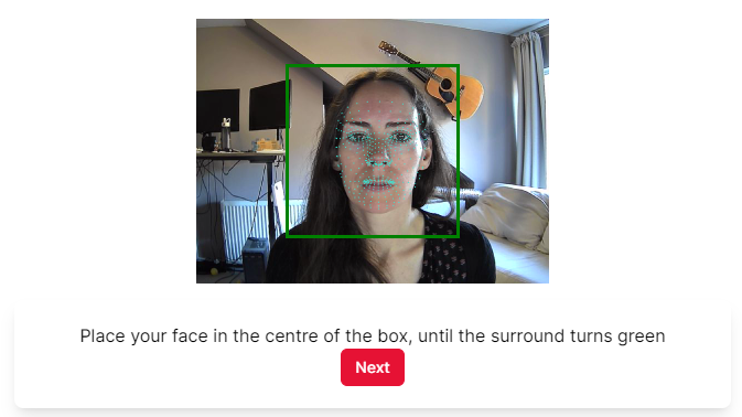
The participant will then be shown a series of red dots to fixate (calibration), then a series of green dots to fixate (validation). You can customise the colour of these dots in the calibration settings. If calibration is unsuccessful, the participant will see the message 'Calibration Unsuccessful' and a button allowing them to retry (until they reach the maximum number of failures you allow). If calibration is successful, the participant will see the message 'Calibration Successful' and a Next button taking them on to the task.
If you wish, instead of setting up your own calibration, you can have Gorilla automatically run a default calibration at the beginning of the task. To do this, go to Subsystems in the Settings tab on the left-hand sidebar and toggle on 'Enable Auto Calibrate'.
We recommend that you re-calibrate approximately every 10 trials or 3 minutes. This will help you to account for participant 'head-drift' or body repositioning which could affect gaze detection performance. Every task that uses the Eye Tracking component in Record mode must also have an Eye Tracking component in Calibrate mode within the same task.
Eye tracking with Webgazer does not provide data with which you can reliably detect fixations, saccades, scan paths and blinks. Instead it provides estimates of gaze locations, with an associated confidence -- these can be used to create heatmaps of images, or percentage occupancy of areas of interest. To make this easier, edit the names of objects that correspond to AOIs to help you identify them in your data. We are unable to give support for data analysis, beyond identifying what the output data represents. You can find more information about eye tracking in Gorilla in our Eye Tracking Guide.
For more details on the data you can obtain from the Eye Tracking (Webgazer) component, see our full guide to eye tracking in Task Builder 2.
Samples that use this component:
Visual World Paradigm (Eye Tracking)
Mode
Select 'Calibrate' on screens where you want to calibrate the eye tracking component. Select 'Record' on screens where you want to collect eye tracking data.
Collect Raw XY Data
Toggle this setting on to collect an additional data file containing the predicted gaze coordinates. For more information about the data contained in this file, see the Analysis section of the TB2 eye tracking guide.
This setting is on by default; if you do not require the raw eye tracking data, you can toggle it off. You will then only receive the main task data file, which includes information on the absolute and proportional time participants spent looking at each quadrant of the screen. You can find more details about this in the Data section of the TB2 eye tracking guide.
File Prefix
A custom prefix to use at the beginning of the filename for the detailed eye tracking file for this screen. This can make it easier to identify files from specific screens or trials.
If you leave the File Prefix setting blank, the data file will be named [calibration/collection]-[Spreadsheet Index]-[Screen Counter]. Spreadsheet Index is the current row number in the spreadsheet (after randomisation) minus 1. Screen Counter is the number of the current screen within the current display.
Calibration Targets
(Only available in Calibrate mode) The number of calibration points to use. Selecting 'Custom' allows you to define the coordinates of your own set of calibration points.
Custom Target Coordinates
(Only available in Calibrate mode when Calibration Targets is set to Custom) Enter the x and y coordinates of the calibration points you want to use. Coordinates should be entered as a percentage of screen width and height. The top left of the screen is 0,0. Note: coordinates as you define them here will not match the coordinates reported in the detailed eye tracking data file from calibration, where 0,0 is at the bottom left. For more information, see the Analysis section of the TB2 eye tracking guide.
Show Predicted Gaze Dot
(Only available in Calibrate mode) Toggle this setting on to show a red dot on the screen indicating the current predicted gaze location during calibration.
Show Validation Plot
(Only available in Calibrate mode) Toggle this setting on to show the validation plot after calibration. An example validation plot is shown below. The squares represent the points used for calibration, and the circles represent the variation in the detected gaze location for each point. The calibration data for each participant will also be included in your detailed eye tracking data, and you can use it to get an idea of the accuracy and reliability of your eye tracking data.
Failed Points Threshold
(Only available in Calibrate mode) Set the number of calibration points participants can fail and still pass calibration. For example, if you set this to 1, participants can fail 1 calibration point and still pass the overall calibration. If they fail more than 1 calibration point, overall calibration will fail and they will be prompted to retry (until reaching the maximum number of attempts you specify).
Max Calibration Attempts
(Only available in Calibrate mode) Set the maximum number of times calibration can be retried. If a participant fails calibration this number of times, they will be prompted to press a 'Finish' button. You can then use the Filter setting in a Branch, Jump to Row, or Early Exit component to direct them out of the task based on the Calibration Failure Store Value (see below).
Calibration Failure Store Value
(Only available in Calibrate mode) Set the name of a Field in the Store. If the participant fails the maximum number of calibration attempts, the field you specify will be set to the value true. You can then optionally use this Field and value in a Branch component in the task, or a Branch node in the experiment, to send participants down different paths conditional on calibration failure.
Enable Localisation
(Only available in Calibrate mode) Toggle this on if you want to display the default calibration messages in a language other than English.
Calibration successful localisation
(Only available in Calibrate mode when Enable Localisation is toggled on) Enter the text you want to show participants when their calibration is successful.
Calibration failed localisation
(Only available in Calibrate mode when Enable Localisation is toggled on) Enter the text you want to show participants when their calibration failed.
Calibration retry localisation
(Only available in Calibrate mode when Enable Localisation is toggled on) Enter the text you want to show participants on the button to retry calibration.
Calibration finish localisation
(Only available in Calibrate mode when Enable Localisation is toggled on) Enter the text you want to show participants on the button that appears when they have failed calibration the maximum number of times (as specified in the Max Calibration Attempts setting).
Calibration colour
(Only available in Calibrate mode) Select the colour you want to use for calibration points.
Click the current colour to select a new colour. Use the colour slider to select a hue and click in the space above to select saturation and lightness, click the colour dropper to select any colour on your screen, or directly enter an RGB, HSL, or HEX code. Click RGB, HSL, or HEX to toggle between colour modes.
To vary colours from trial to trial, bind colour to the spreadsheet by clicking Bind . To specify colours in the spreadsheet, use HEX codes (with or without the # at the beginning), RGB codes in the format rgb(0,0,0), or HSL codes in the format hsl(0,0%,0%).
Validation colour
(Only available in Calibrate mode) Select the colour you want to use for validation points.
Gaze transition time (ms)
(Only available in Calibrate mode) Set the amount of time, in milliseconds, that the participant has to move their gaze to the next point before we start counting. Default: 1000 ms
Prediction frequency (ms)
(Only available in Calibrate mode) The interval of time, in milliseconds, between processed gaze prediction events while focused on a calibration/validation point. Default: 200 ms
Predictions per point
(Only available in Calibrate mode) The number of gaze predictions to collect on each calibration/validation point. Default: 10
Accessing detailed eye tracking data files (in preview mode):
When previewing a task, your eye tracking data files can be accessed via a URL within the data file generated by the preview. After the preview has finished, download the data and find the URL in this file.
Accessing detailed eye tracking data files (in full experiment):
When running a full experiment, all of the eye tracking data files can be accessed from your Experiment's Data tab. The zip folder with all your data will include an 'Uploads' folder, containing all of your eye tracking data files.
Eye tracking data files are labelled using the format: [Experiment ID]-[Experiment Version]-[Participant Private ID]-[Tree Node Key]-[Schedule ID]-[the file prefix]-[calibration/collection]-[Spreadsheet Index]-[Screen Counter].[File Type]. Spreadsheet Index is the current row number in the spreadsheet (after randomisation) minus 1. More details on the other values can be found in the Data Columns Guide.
The Jump to Row component is used to control the flow of participants through the spreadsheet. At the end of the current display, instead of progressing to the next row, participants will jump to a different row in the spreadsheet depending on their response or response accuracy. You can also optionally filter by the value of a field in the store.
The row that participants jump to can either be a specific, absolute row or a row relative to the current position i.e. going forward or back X rows.
The Jump to Row component only takes effect on the final screen of the display. If you need to jump participants from a screen that is not the final screen, you will need to first use a Branch component to branch them to the final screen in the display. Then, add a Jump to Row component to that final screen to send them where you want them to go. You can see how to set this up in example 2 ('Returning to a previous trial in the spreadsheet') of our Adding a Back Button walkthrough.
Samples that use this component:
Real Effort Number Counting Task
Other resources
Store and re-display multiple responses from a single screen
Destinations
List of criteria and rows to jump participants to.
Include Actions: Toggle this setting on to include responses of the Action response type in your criteria for jumping to row. Examples of Actions are the incremental responses logged by the Compound Responses component, or the continuously logged data from the Slider component when the 'Continuous Polling' setting is toggled on.
Filter: Use this toggle to create more complex logic using the additional Field, Condition, and Value settings.
Response: Only shown if Criteria = Response Value The value (= actual response content) of the responses you want to trigger jumping to row. This can be entered directly into the component, or bound to the spreadsheet, a manipulation or the Store.
Accuracy: Only shown if Criteria = Response Value/Response Accuracy Choose whether you want only correct, only incorrect, only timed out, or all responses to trigger jumping to row.
Response Tag: Only shown if Criteria = Response Tag Choose the tag of the responses you want to trigger jumping to row. This can be entered directly into the component, or bound to the spreadsheet, a manipulation or the Store.
Row Index: The row index to jump to. This can be absolute or relative i.e. +10 to go ten rows forward, or -10 to go ten rows back.
Relative to current row: Sets whether the row index should be interpreted as relative to the current row or not.
Use the Jump to Spreadsheet component to change the spreadsheet within a task. Instead of participants progressing to the next row in the current spreadsheet, they can change to a different spreadsheet depending on their response or response accuracy. You can also optionally filter by the value of a field in the store.
By default, progress in each spreadsheet is stored independently. When a participant switches to a spreadsheet they've never visited before, they will begin on the first row of that spreadsheet. If they switch to a spreadsheet they have been to before, they will continue on the next row of that spreadsheet. This behaviour can be overridden using the Always Return to Start or Match Current Row settings.
In your data output, the Spreadsheet column will contain the name of the spreadsheet set at the experiment tree level (for example, by a manipulation). The spreadsheet name in this column will not change as the spreadsheet changes throughout the task. The Current Spreadsheet column will contain the name of the spreadsheet used for the current trial, and will change depending on what spreadsheet the participant is currently on.
Tutorials that use this component:
Destinations
List of criteria and spreadsheets to jump participants to.
Include Actions: Toggle this setting on to include responses of the Action response type in your criteria for jumping to spreadsheet. Examples of Actions are the incremental responses logged by the Compound Responses component, or the continuously logged data from the Slider component when the 'Continuous Polling' setting is toggled on.
Filter: Use this toggle to create more complex logic using the additional Field, Condition, and Value settings.
Response: Only shown if Criteria = Response Value The value (= actual response content) of the responses you want to trigger jumping to spreadsheet. This can be entered directly into the component, or bound to the spreadsheet, a manipulation or the Store.
Accuracy: Only shown if Criteria = Response Value/Response Accuracy Choose whether you want only correct, only incorrect, only timed out, or all responses to trigger jumping to spreadsheet.
Response Tag: Only shown if Criteria = Response Tag Choose the tag of the responses you want to trigger jumping to spreadsheet. This can be entered directly into the component, or bound to the spreadsheet, a manipulation or the Store.
Spreadsheet: The spreadsheet to jump to. By default, the participant will jump to the current progress they have in that spreadsheet. If they have never visited the spreadsheet before, that will be the first row.
Match Current Row: Whether to match the row of the current spreadsheet in the spreadsheet we are moving to. This will overwrite the current progress we have in the new spreadsheet. As this setting is incompatible with Always Return to Start (below), it will be hidden when that setting is on.
Always Return To Start: Whether to always return to the start of this spreadsheet. This will overwrite the current progress we have in the new spreadsheet. As this setting is incompatible with Match Current Row (above), it will be hidden when that setting is on.
Track mouse coordinates throughout the screen.
A possible use case could be that you want to measure how much time participants spent with their mouse on image stimuli that were displayed on the screen. You can find an example of this situation in our Mousetracking tutorial. If you don't record coordinates (see setting below), Gorilla will provide the percentage and the exact time participants spent with their mouse on your object components (e.g. images, videos, buttons, etc.).
To centre the participant's mouse position at the start of each trial, simply add a screen with a centered Continue Button immediately before the main trial screen. Participants must click this button to proceed - this will ensure their mouse is positioned appropriately at the start of the trial. You can see an example of this in our Mousetracking sample.
Samples that use this component
Tutorials that use this component
Record Coordinates
Whether to record a stream of all mouse coordinates in a separate file. This stores X,Y positions every time the mouse moves, and thus generates a lot of data. If you're only interested in which zones the mouse was over, or which quadrants of the screen the mouse was in, then you may not need this.
If Record Coordinates is toggled on
Accessing coordinate recording files (in preview mode): When previewing a task, your coordinate recording files can be accessed via a URL within the data file generated by the preview. After the preview has finished, download the data and find the URL in this file.
Accessing screen recording files (in full experiment): When running a full experiment, all of the coordinate recording files can be accessed from your Experiment's Data tab. The zip folder with all your data will include an 'Uploads' folder, containing all of your coordinate recording files.
Participant mousetracking coordinate files are labelled using the format: [Experiment ID]-[Experiment Version]-[Participant Private ID]-[Tree Node Key]-[Schedule ID]-mousetracking-[Spreadsheet Index]-[Screen Counter].[File Type]. Spreadsheet Index is the current row number in the spreadsheet (after randomisation) minus 1. More details on the other values can be found in the Data Columns Guide.
Use the Increase Progress component to increment participants' progress based on participants' response or response accuracy. The progress can be displayed to participants by using a Progress Bar component component.
Use the Criteria setting to set the conditions under which progress should increase. The 'Any Response' setting includes responses from timeouts and Continue buttons. If you have multiple response on your screen, but only want the Progress Bar to increase once per trial, give the responses tags and set the Criteria on the Increase Progress component to Response Tag (as shown in the Anagram Task sample below).
If your Progress isn't displaying correctly, check out our Troubleshooting Guide!
Samples that use this component:
Relational Reasoning with Progress Bar
Anagram Task - shows how to make Progress selectively increase for only one of several responses on a screen
Progress Bar across Multiple Tasks
Tutorials that use this component:
Include Actions: Toggle this setting on to include responses of the Action response type in your criteria for increasing progress. Examples of Actions are the incremental responses logged by the Compound Responses component, or the continuously logged data from the Slider component when the 'Continuous Polling' setting is toggled on.
Filter: Use this toggle to create more complex logic using the additional Field, Condition, and Value settings.
Response: Only shown if Criteria = Response Value The value (= actual response content) of the responses you want to increase progress. This can be entered directly into the component, or bound to the spreadsheet, a manipulation or the Store.
Accuracy: Only shown if Criteria = Response Value/Response Accuracy Choose whether you want only correct, only incorrect, only timed out, or all responses to increase progress.
Response Tag: Only shown if Criteria = Response Tag Choose the tag of the responses you want to increase progress. This can be entered directly into the component, or bound to the spreadsheet, a manipulation or the Store.
Use Custom field
Set up a custom field in the Store for accessing the progress data. If used, make sure to use the equivalent setting in the progress bar component you want to display the progress in.
By default, progress accumulates throughout the entire experiment (i.e., across tasks). To have progress reset between tasks, you will need to toggle on 'Use Custom Field' on each Progress Bar and Increase Progress component that you have in your tasks and set this to a different Field for each task. This will ensure progress is tracked separately within each task.
If you want to track progress across the whole experiment, just use one Custom Field or toggle this off, but increase the Progress Maximum on the Progress Bar settings in every task to the total number of trials in the experiment. You can see how to set this up in the Progress Bar across Multiple Tasks sample linked above.
Progress Field
Set the field in the Store you want to use to track progress.
If you're using Save Accuracy to save participants' accuracy to the Store, you can use Reset Accuracy to set the accuracy back to zero.
Add the Reset Accuracy component to the Screen tab of the screen where you want to reset accuracy. This could be on a break screen between blocks, or at the very beginning of the task if you are using a Repeat Node to have participants do a task several times.
Use the remaining settings to define the conditions under which you want accuracy to reset.
Destinations
List of accuracy fields you want to reset.
Use this component to save a variety of measures of accuracy to specific fields in the store. For example, you can save the number or percentage of correct and incorrect responses, or the number of consecutively correct or incorrect responses. You can also save the total number of trials by selecting Criteria = Any Response and Attribute = Total. You can then, for example, show participants their accuracy at the end of the task by binding a Text component to the same field in the store, or control the flow of the task with Change Difficulty - Staircase.
Samples that use this component
Wason Selection Task (Four Card Problem)
Tutorials that use this component
Other resources
Ending tasks after incorrect responses
Destinations
List of locations to save accuracy measures to.
The Save Data component can be used to add or update a value in the Store when specific criteria are satisfied. This could be based on receiving a specific response, the accuracy of that response, or other fields within the Store.
For example, this can be used to award points for correct answers, and subtract points for incorrect answers. To award points based on response accuracy, a Scorer component will also be needed.
If you set up multiple Destinations within a single Save Data component, the order of these Destinations are important. Gorilla will run the Save Data logic from top to bottom. Therefore, you will need to make sure the Destinations that should be executed first are dragged to the top of the list in the component. You can see this in action in our Play multiple audio files example where we evaluate if all three audio files have been played before advancing the screen.
This component replaces the previous Save Data on Response component.
Samples that use this component
Visual Search Click on Location
Learning with Dropout (repeat incorrect trials)
Tutorials that use this component
Displaying Score (Task Builder 2)
Delayed Reward (Go / No Go) (Game Builder)
Trigger - Enabled (Game Builder)
Other resources
Delay feedback until next screen
Ending tasks after incorrect responses
Running total with live update
Store and re-display multiple responses from a single screen
Destinations
List of locations to save data to.
Operation: Select whether the value should be set, added or subtracted.
Value: Set the value to be added or subtracted. This can be entered directly into the component, bound to the spreadsheet or retrieved from the store.
Clamp: If the operation is 'Add' or 'Subtract', toggle this on to set an upper and/or lower limit for the updated value.
Min: If Clamp is toggled on, you can set a minimum limit for the value.
Max: If Clamp is toggled on, you can set a maximum limit for the value.
Reaction times are recorded to your data by default. You only need to use the Save Reaction Time component if you want to display reaction time information to your participants, or send participants down different paths in the experiment based on their reaction times.
Use this component to save participants' reaction time to specific fields in the Store. You can store the current, average, or total reaction time for all or selected responses.
Reaction time is measured from the start of the current screen, unless using the Trigger - Response Window component with a Manual Response Window, in which case reaction time is measured from when the Response Window opens.
You can display the stored reaction time to participants by binding a Text component to the field in the Store. Alternatively, you can send participants down different paths based on their reaction time by using the stored reaction time in a Branch or Jump to Row component in the task, or a Branch Node in the experiment.
Samples that use this component:
Dot Probe - Redisplaying RT Warning: this task includes aversive images.
Destinations
List of locations to save reaction time measures to.
Using this component, you can save a particular response to the store. This stored response can be retrieved later on within the same task, or within a different task later on in the experiment tree. Responses saved to the store using this component can be shown to participants later on. If there are several responses recorded on one screen, you can save all of them or individual ones, but you will need to save them to different Fields in the Store.
Samples that use this component:
Tutorials that use this component:
Response Recap (Task Builder 2)
Other resources
Running total with live update
Store and re-display multiple responses from a single screen
Destinations
List of locations to save responses to.
The Section Time Limit component allows you to set a time limit for a section of a task or game. For example, this could be for a series of screens in a display, scenes in a game, or trials in a task.
Set the mode to 'Start' to begin the Section Time Limit. The duration of the time limit will be set here.
On another screen, add a Section Time Limit and set the mode to 'Check'. This will review the remaining time on the Section Time Limit. If the time limit expires, it will emit the set response with the chosen tag. This response can then be used in other screen components, such as Jump to Row, to control how the task behaves when the time limit expires.
Use the 'Pause' mode to pause the time limit on a screen. The time spent on this screen won't count towards the participant's time in the section.
You can use a Section Countdown component, in conjunction with a Section Time Limit in Check mode, to display the time remaining in the Section Time Limit.
If you use section time limits for multiple tasks in your experiment, make sure to set each section time limit to 'Stop Mode' at the end of each task. Otherwise, the section time limits may not function correctly!
Samples that use this component:
Real Effort Number Counting Task
Tutorials that use this component:
Section Time Limit with Countdown
Screen Timelimit Actions
The set of screen timelimit actions to run on this screen. These should be placed in the order you want them to run.
Mode
The Mode of operation for the component. Set to Start for a screen where the Section Timelimit should start running, Pause if you want to pause the timer, Check if you want to check if the timer has expired, and Stop if you want to stop the current section timelimit completely.
Time Limit (ms)
When using Start mode, how long the section will last in milliseconds.
Response
When using Check mode, the response value that should be generated when the Section Time Limit expires. Other components (such as Jump to Row) can listen for this response, triggering the desired behaviour for a Section Time Limit expiring.
Tag
When using Check mode, the tag for the response generated when the Section Time Limit expires.
Strict
When using Check mode, toggle this setting on to make the section time limit resolve as soon as the time limit expires. Otherwise, it will wait until the end of the current screen.
Initialise a field in the store on screen start. Allows you to give one or more fields in the store a value at the beginning of the screen. This is useful for setting a store field to a starting value before using it in staircasing with the Change Difficulty - Staircase component, for example. You can additionally control the starting value of the field with a spreadsheet or manipulation, for example.
Samples that use this component
Visual Search Click on Location
Other resources
Running total with live update
Store and re-display multiple responses from a single screen
Field
The field to set.
Value
The value to set it to.
The Scorer component is used to record participant responses as correct or incorrect. The accuracy of responses given via Click Response, Keyboard Response and other Response components can be recorded using the Scorer.
The correct answer can be entered directly into the Correct Answer field of the component. If the correct answer changes trial by trial, then the component can be bound to the spreadsheet. Once you have added scoring, you can use a Feedback component to present a green tick when correct, or red cross when incorrect.
By default, scoring is case-sensitive. To ignore case when scoring correct answers, toggle off the 'Case-sensitive' setting.
If you have multiple answers that are considered correct, use the Scorer (Multi) component instead.
If your scoring isn't working, check out our Troubleshooting Guide!
Samples that use this component:
Tutorials that use this component:
Scoring Tutorial (Task Builder 2)
Other resources
Delay feedback until next screen
Ending tasks after incorrect responses
Correct Answer
Correct answer. Responses matching this will be considered correct.
Case-sensitive
Toggle this setting off to ignore case when marking answers as correct or incorrect. By default, this setting is toggled on, meaning that only answers that match the content and case of the correct answer will be scored as correct.
The Scorer (Multi) component allows you define multiple correct answers. This could allow participants to choose one of multiple possible correct answers, or choose all correct answers presented on a screen, for example using Click Response components. On screens where you collect more than one response, it also allows you to define correct answers separately for different responses by using the 'And includes Tag' setting.
The correct answers can be entered directly into the Correct Answers field, where you can add as many as you want, or bound to the spreadsheet if the correct answers change trial by trial. Once you have added scoring, you can use a Feedback component to present a green tick when correct, or red cross when incorrect.
By default, scoring is case-sensitive. To ignore case when scoring correct answers, toggle off the 'Case-sensitive' setting. You can configure this separately for each defined correct answer.
If you only have one response on the screen, with only one answer that is considered correct, use the Scorer component instead.
If your scoring isn't working, check out our Troubleshooting Guide!
Samples that use this component:
Sentence Generation Task (one response per screen, multiple correct answers)
Cloze Task (multiple responses on one screen, each with their own correct answer)
Correct Answers
Correct answers. Responses matching any of these will be considered correct.
Case-sensitive
Toggle this setting off to ignore case when marking answers as correct or incorrect. By default, this setting is toggled on, meaning that only answers that match the content and case of the correct answer will be scored as correct.
And includes Tag
Select a response tag from the dropdown. The current Correct Answer will be defined as correct only for responses that have this tag.
Use this setting together with response tags to define different correct answers for different responses on the screen. You can see how to set this up in the Cloze Task sample linked above. Find out more about response tagging in our Response Processing Guide.
Adds an amount of time at the end of the screen (once all responses have been received and the screen is ready to advance). This is normally to allow any feedback to show for a bit longer, and avoid snap transitions to the next screen.
Samples that use this component
Simon Task (Stimulus-Response Compatibility)
Feedback Time (ms)
The amount of time to allow for feedback to display
This component is in beta. This means it has been released for public use, but we intend to make improvements to it before it is considered 'finished'. We advise thorough testing before collecting data. If you find any issues or bugs, please provide us with feedback as soon as possible via our contact form.
The Screen Recording component only works for participants using Chromium-based browsers - Chrome, Opera, and Edge - on desktops or laptops only. This is due to restrictions implemented by the other browser vendors. You can use Recruitment Requirements to restrict access to your experiment based on participants' browser and/or device.
The Screen Recording component allows you to record the whole content of a participant's screen as a video file. Add the Screen Recording component on the Screen tab of the screen(s) within your task where you want to record the participant's screen.
By default, the video will be silent. If you want the screen recording to include audio from the participant's microphone, go to Subsystems in the Settings tab on the left-hand side of the Task Builder and toggle on the Microphone subsystem.
Adding this component to your task will automatically add a screen recording test before the task begins. For more information on how this test appears to your participants, open the expandable section below.
Adding a Screen Recording component to your task automatically toggles on the Screen Recording (Beta) subsystem. To view this setting, go to Subsystems in the Settings tab on the left-hand side of the Task Builder. The Screen Recording (Beta) subsystem must be enabled for this component to function - do not toggle it off unless you have removed all components that require it from your task!
This subsystem activates an automatic screen recording test at the beginning of the task. First, the participant will see a popup window requesting permission to share their screen with Gorilla. The participant will be asked to select a tab or window to record. This menu is generated by the browser; it isn't currently possible to alter it or automatically select the correct screen.
Then, Gorilla will check whether the screen recording is working, first by showing the participant a live feed of their screen:

If the participant clicks 'Yes, I Can', Gorilla will then make a short screen recording and play it back to the user in a box at the centre of the screen:

If the participant clicks 'Yes, I Can', they will proceed to the task.
Screen sharing in this way adds a border to the browser window. There will continually be a "Sharing this tab to app.gorilla.sc/research.sc" message at the top of the window, with the option to Stop Sharing:

It isn't possible to dismiss this message or border - this is a security feature controlled by the browser that Gorilla cannot override.
Though the screen will be shared throughout the whole task, the screen will only actually be recorded on screens that have the Screen Recording component. You may want to consider placing a visual indicator on these screens, so that the participant knows when their screen is being recorded.
If the participant chooses to stop screen sharing at any point, the recording will fail. Currently, there is no way for the Screen Recording component to check whether or not the participant is still screen sharing.
The recording will include the visual content of the screen and any interactions with it. The recording will end when the task advances to the next screen or the maximum recording time of 10 minutes is reached, whichever happens sooner.
Samples that use this component
Visual-Motor Drawing Task (with Screen Recording)
File Prefix
A custom prefix to use as part of the filename for the screen recording.
Recording Buffer (ms)
Adds additional recording time as a buffer to the end of the recording. If you find the end of a participant's response is being cut off, increase this value. Defaults to 250 ms if left empty.
Accessing screen recording files (in preview mode): When previewing a task, your screen recording files can be accessed via a URL within the data file generated by the preview. After the preview has finished, download the data and find the URL in this file.
Accessing screen recording files (in full experiment): When running a full experiment, all of the screen recording files can be accessed from your Experiment's Data tab. The zip folder with all your data will include an 'Uploads' folder, containing all of your screen recording files.
Participant screen recordings are labelled using the format: [Experiment ID]-[Experiment Version]-[Participant Private ID]-[Tree Node Key]-[Schedule ID]-[the recording file prefix]-screenRecording-[Spreadsheet Index]-[Screen Counter].[File Type]. Spreadsheet Index is the current row number in the spreadsheet (after randomisation) minus 1. More details on the other values can be found in the Data Columns Guide.
The Switch component allows the participant to switch to the corresponding Switch Node Task or Questionnaire in the experiment. You will need to include a Switch component (like this one) or a Switch Button in both the Tasks / Questionnaires tethered to the Switch Node, if you wish participants to be able to switch between the two.
You can set specific criteria in the Switch component, so that participants can only switch when certain conditions are met.
Samples that use this component:
Switching between Informational Website and Questionnaire
Tutorials that use this component
Switch Conditions
List of criteria to trigger switching.
Include Actions: Toggle this setting on to include responses of the Action response type in your criteria for switching. Examples of Actions are the incremental responses logged by the Compound Responses component, or the continuously logged data from the Slider component when the 'Continuous Polling' setting is toggled on.
Filter: Use this toggle to create more complex logic using the additional Field, Condition, and Value settings.
Response: Only shown if Criteria = Response Value The value (= actual response content) of the responses you want to trigger switching. This can be entered directly into the component, or bound to the spreadsheet, a manipulation or the Store.
Accuracy: Only shown if Criteria = Response Value/Response Accuracy Choose whether you want only correct, only incorrect, only timed out, or all responses to trigger switching.
Response Tag: Only shown if Criteria = Response Tag Choose the tag of the responses you want to trigger switching. This can be entered directly into the component, or bound to the spreadsheet, a manipulation or the Store.
The Time Limit component allows you to add a time limit to your screen which will automatically advance a participant to the next screen in your display after a set amount of time. This can be used to limit the presentation time of stimuli, or control how long participants have to provide a response. You can show participants how long is left of the time limit by also adding a Countdown component.
You can also set up the Time Limit component to produce a response when the time limit is reached, using the 'Treat As Response' setting. This is useful for recording and scoring non-responses in Go/No Go tasks.
Controlling Screen Advancement
By default, the screen will automatically advance as soon as a response is received. If no response is received, the screen will advance when the Time Limit is reached. If you would like the screen to only advance when the Time Limit has elapsed, even when other responses are received, add either the Wait for Time Limit or Advance - Time Limit component.
Samples that use this component
Tutorials that use this component
Screen Timelimit and Countdown
Time Limit (ms)
How long the screen will last before advancing automatically.
Treat As Response
Toggle this setting on to trigger a response when the time limit is reached, rather than just a TimedOut response.
Response
The response to send when the time limit is reached. Use for e.g. go/no-go paradigms to define the 'no-go' response.
Response Tag
Tag for non-response / no-go response.
The Wait For Time Limit component is designed to be used in combination with a Time Limit component to enable Go/No Go tasks. Only one (the first) response will be received and recorded. A participant will not be able to enter multiple responses.
The screen will not advance automatically as soon as the first response is received. Instead, it will wait for the remainder of the time limit, before advancing the screen. This makes sure each trial has the same duration.
If you need a participant to submit multiple responses within one screen, use the Advance - Time Limit component instead.
Samples that use this component
This randomisation component allows you to assign participants to spreadsheets by entering rules for matching participant Public IDs to spreadsheets.
To map or not to map?
The Choose Spreadsheet - Public ID component and the Choose Spreadsheet - Public ID (Map) component both assign specific participants to specific spreadsheets, but they work in different ways. Here's our quick guide to which to use for your study:
To use this component, the task must have multiple spreadsheets, and you must use a recruitment policy where you define a set of Public IDs. For example, Email Shot, Email ID and Supervised policies are ideal policies for this randomisation.
For further information on how to set up this randomisation, see our Advanced Spreadsheet randomisation guide.
For a step-by-step walkthrough of types of spreadsheet randomisation, try our Randomisation Walkthrough.
And if your spreadsheet randomisation isn't working, check out our Troubleshooting Guide!
Samples that use this component
Prisoner's Dilemma (Public ID)
Tutorials that use this component
Choose Spreadsheet (Public ID)
Spreadsheets
Match
Enter the stem of the ID to match on. If any part of this is present in the Public ID, then participants will be assigned to the spreadsheet selected in the Spreadsheet dropdown.
Spreadsheet
Choose from the dropdown which spreadsheet participants should be assigned to for this Match condition.
This randomisation component allows you to assign participants to spreadsheets by uploading a list of mappings between participant Public IDs and spreadsheet names.
To map or not to map?
The Choose Spreadsheet - Public ID component and the Choose Spreadsheet - Public ID (Map) component both assign specific participants to specific spreadsheets, but they work in different ways. Here's our quick guide to which to use for your study:
To use this component, the task must have multiple spreadsheets, and you must use a recruitment policy where you define a set of Public IDs. For example, Email Shot, Email ID and Supervised policies are ideal policies for this randomisation.
For further information on how to set up this randomisation, see our Advanced Spreadsheet randomisation guide.
For a step-by-step walkthrough of types of spreadsheet randomisation, try our Randomisation Walkthrough.
And if your spreadsheet randomisation isn't working, check out our Troubleshooting Guide!
Mapping Spreadsheet
Choose from the dropdown which of your uploaded spreadsheets contains the mappings between participant Public IDs and spreadsheets. An example of a mapping spreadsheet is shown below.
Participant Column
Choose from the dropdown which column in your mapping spreadsheet contains the participant Public IDs. In the example screenshot above, this would be 'participant'.
Spreadsheet Column
Choose from the dropdown which column in your mapping spreadsheet contains the spreadsheet names. In the example screenshot above, this would be 'spreadsheet'.
Randomly assign values to the cells in a column or columns, based on set of probabilities (expressed as percentages). This could allow you to populate the Win/Lose distribution in a probablistic learning game, for example.
Assignment of values using Random Assignment Per Trial is probabilistic - the exact number of cells that contain each value will vary between participants, around the percentage you define. If you need an exact number of cells in a column to contain each value, enter the values directly and use Randomise Within Column to shuffle them between trials.
For further information on how to set up this randomisation, see our Advanced Spreadsheet randomisation guide.
For a step-by-step walkthrough of types of spreadsheet randomisation, try our Randomisation Walkthrough.
And if your spreadsheet randomisation isn't working, check out our Troubleshooting Guide!
Samples that use this component
Assignment Sets
A group of settings which indicate a unique assignment.
Condition Column
The column we should view when deciding if this row should be subject to a random assignment.
Condition Method
The method we should use. Not Empty indicates that the current cell of the Condition Column must have at least a value. Matches indicates it must have a specific value.
Condition Value
(Only available when 'Condition Method' is set to Matches)
The specific value the cell must have if this row should be subject to a random assignment.
Assignment Column
The column we'll make random assignments to.
Assignments
The group of assignments: pairs of value/percentage data.
Value
The value to assign.
Ratio
The percentage of the time that a row will be assigned the current value.
Randomise individual rows within a spreadsheet. This is the most common randomisation to make sure individual trials appear in a different order for each participant. A column is chosen, and all rows with matching values for that column are then randomised between each other.
For further information on how to set up this randomisation, see our Simple Spreadsheet randomisation guide.
For a step-by-step walkthrough of types of spreadsheet randomisation, try our Randomisation Walkthrough.
And if your spreadsheet randomisation isn't working, check out our Troubleshooting Guide!
Samples that use this component
Column
Which column to randomise on.
Randomise whole blocks of trials within the spreadsheet. This can be useful for counterbalancing blocks of trials, so that one block of trials is not always the first one to be shown to participants.
A single column is chosen, and all continuous rows with the same value are considered to be a single block. The order of the blocks is then randomised.
For further information on how to set up this randomisation, see our Simple Spreadsheet randomisation guide.
For a step-by-step walkthrough of types of spreadsheet randomisation, try our Randomisation Walkthrough.
And if your spreadsheet randomisation isn't working, check out our Troubleshooting Guide!
Samples that use this component
Column
Which column to randomise on.
Randomise content between spreadsheet columns. When selecting two or more spreadsheet columns, the non-empty values between those columns will be randomised on a trial by trial basis. This can be useful when you have, for example, two images as stimuli, but you want them to appear simultaneously and randomly on the right or the left side of the screen.
For further information on how to set up this randomisation, see our Simple Spreadsheet randomisation guide.
For a step-by-step walkthrough of types of spreadsheet randomisation, try our Randomisation Walkthrough.
And if your spreadsheet randomisation isn't working, check out our Troubleshooting Guide!
Samples that use this component
Other resources
Column
Column containing content to be shuffled between other columns.
Randomise content between multiple sets of spreadsheet columns. Similar to the Randomise Between Columns component but allows you to define multiple sets of columns to randomise content between. For an individual set, when selecting two or more spreadsheet columns, the non-empty values between those columns will be randomised on a trial by trial basis.
For further information on how to set up this randomisation, see our Simple Spreadsheet randomisation guide.
For a step-by-step walkthrough of types of spreadsheet randomisation, try our Randomisation Walkthrough.
And if your spreadsheet randomisation isn't working, check out our Troubleshooting Guide!
Samples that use this component
There are currently no samples using this component.
Chosen Columns
Set of columns containing content to be shuffled between other columns.
Randomise the content of an individual spreadsheet column. Multiple spreadsheet columns can be selected. For each column selected, all the non-empty contents of this column will be randomised between each other.
For further information on how to set up this randomisation, see our Simple Spreadsheet randomisation guide.
For a step-by-step walkthrough of types of spreadsheet randomisation, try our Randomisation Walkthrough.
And if your spreadsheet randomisation isn't working, check out our Troubleshooting Guide!
Samples that use this component
Columns to Randomise
A set of columns whose contents should be randomised, independently.
Column
A column to randomise the contents of.
Select a randomised subset of a group of trials. Define a column and a value, that are used to indicate the set of trials to draw from and then a number to indicate the number of trials to select for the subset. For example, if you chose the column 'Display', the value 'trial' and the number 10, the script will collect all of the rows with the value 'trial' in the 'Display' column, shuffle them and then pick 10 and read them back into the spreadsheet. You can select multiple subsets by using the + symbol to add another set of options. Each subset must be contiguous and each subset must be distinct from other subsets.
For further information on how to set up this randomisation, see our Advanced Spreadsheet randomisation guide.
For a step-by-step walkthrough of types of spreadsheet randomisation, try our Randomisation Walkthrough.
And if your spreadsheet randomisation isn't working, check out our Troubleshooting Guide!
Samples that use this component
Column
Which column contains the target value defining the trial set.
Value
The value from the column that defines the trial set.
Number
The number of trials to be chosen for the subset.
This component allows multiple players to communicate with each other. Text one player sends via the chat box will appear to players in the same room.
To set this up, create a network data field in which to store the chat data.
Each response the participant gives will create a new line in their data, with the reaction time that their message is sent. The Response column will contain the text of that message.
To see the full conversation so far, look to the Network Store column.
In your Network Store column, you will see something like the following:
[{"speaker":6746720,"message":"text"}]
[{"speaker":6746720,"message":"text"},{"speaker":6746719,"message":"word"},{"speaker":6746720,"message":"text2"}]
For each message, first you will see the participant private ID, then, after the word “message” you will see the text the participant entered into the chat box. Messages will be displayed in order they were entered, with the most recent message (the one from the participant that entered the data row) coming last.
Samples that use this component
Our multiplayer preview guide provides more information on how to preview multiplayer tasks.
Network Data Field
The network data field to store this chat log in.
Tag
The tag for this response.
Input Box Lines
Size of the chat box in number of lines of text.
Enable Reactions
Whether to allow participants to react to other participants' chat messages.
Thumbs Up
(Only available when 'Enable Reactions' is toggled on)
Allow participants to send a thumbs-up reaction to other participants' chat messages.
Thumbs Down
(Only available when 'Enable Reactions' is toggled on)
Allow participants to send a thumbs-down reaction to other participants' chat messages.
Position
Position of the center of the bounding box, relative to the center of the container. You can change the x- and y-coordinates. By default, position is set in grid coordinates. To set position in absolute pixels or as a percentage of the Gorilla stage, add an Advanced Positioning component to the object.
Size
Size of the bounding box. You can change the x- and y-coordinates. By default, size is set in grid coordinates. To set size in absolute pixels or as a percentage of the Gorilla stage, add an Advanced Positioning component to the object.
This component, when added to an object, allows you to show the object to one of your players, but not the others. This is useful e.g. for response buttons where only one player is supposed to respond, and the other players are supposed to wait.
Note: This component alone doesn't allow one player to advance the screen. You would also need to add a screen component Advance - Multiplayer which allows you to determine who has control over advancing the screen. For example, you would set this component to Player A. Why we need it: As a default, multiplayer tasks will wait for a response from each Player before advancing the screen, therefore if you don't have the Advance - Multiplayer component, the screen will wait for Player B to also press something before the screen continues, and unless you have a continue button or another way to progress the screen for Player B, the Players will get stuck. You want Player A to control advancement so adding this component will ensure that action.
Samples that use this component
Our multiplayer preview guide provides more information on how to preview multiplayer tasks.
Player
The player to show this object for.
Control whether one player can advance the screen for all players, or whether all players need to complete the screen to advance. This component is added to the Screen.
Samples that use this component
Our multiplayer preview guide provides more information on how to preview multiplayer tasks.
Required Players
Specify whether all players need to complete to advance ('All') or just one player ('First')
Allow only a specific player to advance the screen. This component is added to the Screen.
Samples that use this component
Our multiplayer preview guide provides more information on how to preview multiplayer tasks.
Player
Which player should advance the screen
This component is in beta. This means it has been released for public use, but we intend to make improvements to it before it is considered 'finished'. We advise thorough testing before collecting data. If you find any issues or bugs, please provide us with feedback as soon as possible via our contact form.
Display video chat on the screen. This will broadcast the current player's video to other players, and show the video stream from other players. To record the video from each participant's webcam, you can use the Video Recording component, or if you want to record multiple video feeds displayed on the screen, you can add the Screen Recording component.
By default, audio from participants' microphones will be broadcast as well as their video. If you want only muted video to be broadcast, go to Subsystems in the Settings tab on the left-hand side of the Task Builder and toggle off the Microphone subsystem. Do not toggle off the Camera subsystem - it must be enabled for this component to function.
Samples that use this component
Video Chat task (Fruit Guessing) - 2 players
Our multiplayer preview guide provides more information on how to preview multiplayer tasks.
Hide Current Player
Whether to hide the current player (so only the other players are shown).
Preserve Room Order
If toggled off, the participant's own video will appear first in order. If toggled on, videos will be displayed in an order that matches the order of players within the room.
Position
Position of the center of the bounding box, relative to the center of the container. You can change the x- and y-coordinates. By default, position is set in grid coordinates. To set position in absolute pixels or as a percentage of the Gorilla stage, add an Advanced Positioning component to the object.
Size
Size of the bounding box. You can change the x- and y-coordinates. By default, size is set in grid coordinates. To set size in absolute pixels or as a percentage of the Gorilla stage, add an Advanced Positioning component to the object.
AI components are available by request as a premium add-on to any Gorilla subscription. To get access, email subscriptions@gorilla.sc.
If you don't have a subscription but would like to inquire about access to the AI components, email info@gorilla.sc.
The AI Chat Box component displays a chat window with a text entry field and a Send button. When combined with the AI (ChatGPT) or AI (Gemini) components, this allows you to integrate an external AI-powered chatbot into your task for your participants to interact with.
You can also use a disabled AI Chat Box to show a participant their chat history without allowing them to add more responses. To do this:
This will show the participant their chat history without allowing them to add further responses.
Using AI components in screen and Task previews or live experiments consumes credits from your OpenAI or Gemini subscription.
Some AI plans have a limit on the number of credits you can use. If you use all of your credits the AI model will stop producing any output and your Task will not work as hoped. If this happens, you will see an error message.
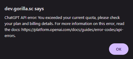
To fix this, please add more credits to your AI subscription directly with OpenAI or Gemini.
Please make sure you have enough credits on your subscription before launching your experiment on Gorilla!
Samples that use this component:
These samples will not work in preview - they are provided only to demonstrate how to set up a basic AI chat box. A GIF of how the ChatGPT version looks when working is shown below.
To get access to the AI components, email subscriptions@gorilla.sc.
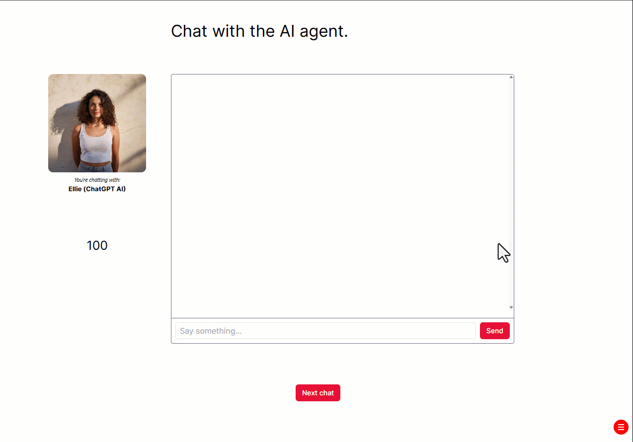
Initiate
Toggle this setting on if you want the chatbot to initiate the conversation. You must enter something in the 'Initiate Prompt' setting below.
If toggled off, the chatbot will wait for the participant to say something first.
Initiate Prompt
(Only available when 'Initiate' is toggled on)
Enter the text prompt describing how you want the chatbot to initiate the conversation.
You can incorporate values from the spreadsheet or the Store into your prompt by using the syntax ${spreadsheet:column} or ${store:field}. For example, 'Ask whatever is listed in ${spreadsheet:question}'.
Word By Word
Toggle this setting on to reveal the AI's response word-by-word, rather than all at once.
Words Per Second
(Only available when 'Word By Word' is toggled on)
Enter how many words of the AI's response to reveal per second. Default: 5
AI Name
Enter the name you want to display above the AI's responses in the chat window. Default: AI
Position
Position of the center of the bounding box, relative to the center of the container. You can change the x- and y-coordinates. By default, position is set in grid coordinates. To set position in absolute pixels or as a percentage of the Gorilla stage, add an Advanced Positioning component to the object.
Size
Size of the bounding box. You can change the x- and y-coordinates. By default, size is set in grid coordinates. To set size in absolute pixels or as a percentage of the Gorilla stage, add an Advanced Positioning component to the object.
Reply Delay (ms)
Enter a time in milliseconds. The AI's reply will appear after this many milliseconds have elapsed since the participant sent their last message.
The entered delay will also apply to the AI's initial message if 'Initiate' is toggled on.
Participant Tag
The response tag you want to use for the participant's messages.
AI Tag
The response tag you want to use for the AI's messages.
Store Field
Store field in which to save the chat transcript. You can use this to re-display the chat history to the participant, by binding the Store Field setting of an AI Chat Box on another screen to the same Store Field.
AI components are available by request as a premium add-on to any Gorilla subscription. To get access, email subscriptions@gorilla.sc.
If you don't have a subscription but would like to inquire about access to the AI components, email info@gorilla.sc.
Access a ChatGPT AI model from within your task. Use in combination with a AI Chat Box component to let your participants chat with the AI, or use with Trigger - AI to process participants' responses.
Adding a system prompt
To add a system prompt that should be used in every AI interaction within your task, click Settings on the left-hand sidebar and select AI:
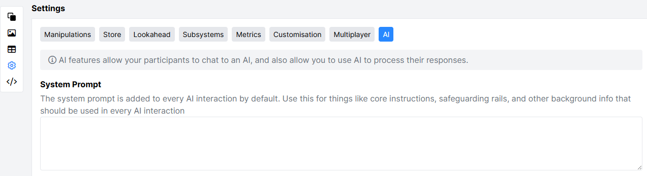
The prompt you enter will be used by every AI in your task by default. To disable the system prompt for a specific AI component, open Additional Settings on the component and toggle on the 'Ignore System Prompt' setting.
Using AI components in screen and Task previews or live experiments consumes credits from your OpenAI or Gemini subscription.
Some AI plans have a limit on the number of credits you can use. If you use all of your credits the AI model will stop producing any output and your Task will not work as hoped. If this happens, you will see an error message.
To fix this, please add more credits to your AI subscription directly with OpenAI or Gemini.
Please make sure you have enough credits on your subscription before launching your experiment on Gorilla!
Samples that use this component:
This sample will not work in preview - it is provided only to demonstrate how to set up a basic AI chat box. A GIF of how it looks when working is shown below.
To get access to the AI components, email subscriptions@gorilla.sc.
AI Instructions
Enter instructions to guide the AI's responses.
You can incorporate values from the spreadsheet or the Store into your prompt by using the syntax ${spreadsheet:column} or ${store:field}. For example, 'Ask whatever is listed in ${spreadsheet:question}'.
API Key
Enter your API Key for OpenAI.
Alternatively, you can add your API key to your account to use it securely. Go to My Account and click API Keys. Click Add API Key. Enter a name for your API Key into the API Key Name field, and enter your API key itself into the API Key Secret field:
Press Save. Your API key is now saved to your account. To use it, enter the API Key Name inside angled brackets, e.g. <OpenAI>, into the API Key setting of the component.
Model
Select which OpenAI model you want to use.
Default (for AI components created from 26th February 2026): GPT-5.2.
Default (for AI components created before 26th February 2026): GPT-4o Mini.
Options:
Selecting Custom Model opens a text box where you can specify an OpenAI model not listed in the dropdown menu. A list of models is available in OpenAI's documentation. Find the model you want, click it to open its dedicated page, then scroll down to 'Snapshots' and enter the model name in the format shown there (i.e. in lowercase with hyphens). The Snapshots section also contains the names of specific timestamped versions of the model which you can use to ensure consistent performance.
Disable Streaming
Toggle this setting on to disable streaming. Some OpenAI models do not support streaming - if your AI model is not responding, try toggling this setting on and see if that fixes the problem.
Ignore System Prompt
Toggle this setting on if you want this AI to ignore the system prompt you specified in Settings -> AI (see Pro Tip box above).
AI components are available by request as a premium add-on to any Gorilla subscription. To get access, email subscriptions@gorilla.sc.
If you don't have a subscription but would like to inquire about access to the AI components, email info@gorilla.sc.
Access a Google Gemini AI model from within your task. Use in combination with a AI Chat Box component to let your participants chat with the AI, or use with Trigger - AI to process participants' responses.
Adding a system prompt
To add a system prompt that should be used in every AI interaction within your task, click Settings on the left-hand sidebar and select AI:
The prompt you enter will be used by every AI in your task by default. To disable the system prompt for a specific AI component, open Additional Settings on the component and toggle on the 'Ignore System Prompt' setting.
Using AI components in screen and Task previews or live experiments consumes credits from your OpenAI or Gemini subscription.
Some AI plans have a limit on the number of credits you can use. If you use all of your credits the AI model will stop producing any output and your Task will not work as hoped. If this happens, you will see an error message.
To fix this, please add more credits to your AI subscription directly with OpenAI or Gemini.
Please make sure you have enough credits on your subscription before launching your experiment on Gorilla!
Samples that use this component:
This sample will not work in preview - it is provided only to demonstrate how to set up a basic AI chat box. A GIF of how the ChatGPT version of this sample looks when working is shown below.
To get access to the AI components, email subscriptions@gorilla.sc.
AI Instructions
Enter instructions to guide the AI's responses.
You can incorporate values from the spreadsheet or the Store into your prompt by using the syntax ${spreadsheet:column} or ${store:field}. For example, 'Ask whatever is listed in ${spreadsheet:question}'.
API Key
Enter your API Key for Google Gemini.
Alternatively, you can add your API key to your account to use it securely. Go to My Account and click API Keys. Click Add API Key. Enter a name for your API Key into the API Key Name field, and enter your API key itself into the API Key Secret field:
Press Save. Your API key is now saved to your account.
To use it, enter the API Key Name inside angled brackets, e.g. <OpenAI>, into the API Key setting of the component.
Model
Select which Gemini model you want to use. Default: Gemini 2.5 Flash Lite. Options:
Ignore System Prompt
Toggle this setting on if you want this AI to ignore the system prompt you specified in Settings -> AI (see Pro Tip box above).
AI components are available by request as a premium add-on to any Gorilla subscription. To get access, email subscriptions@gorilla.sc.
If you don't have a subscription but would like to inquire about access to the AI components, email info@gorilla.sc.
Send instructions to an AI model under certain conditions: for example, at the start of the screen, when a response is received, or after a certain amount of time has elapsed. Must be used in combination with either the AI (ChatGPT) or AI (Gemini) components.
The Trigger - AI component on its own will not advance the screen. You will need to add a method of advancing the screen, for example by toggling on the 'Emit Response' setting or by adding a Time Limit.
Using AI components in screen and Task previews or live experiments consumes credits from your OpenAI or Gemini subscription.
Some AI plans have a limit on the number of credits you can use. If you use all of your credits the AI model will stop producing any output and your Task will not work as hoped. If this happens, you will see an error message.
To fix this, please add more credits to your AI subscription directly with OpenAI or Gemini.
Please make sure you have enough credits on your subscription before launching your experiment on Gorilla!
Triggers
The type of event or data for the trigger to monitor. When this event/data occurs, the trigger will take its action. Options:
Additional triggers are available only when the Trigger component is added to an object that includes an Audio or Video component:
Time (ms)
(When using Trigger: Time Elapsed) The length of time after screen start that must elapse before the trigger takes its action.
Response
(When using Trigger: Response) The response value that will cause the trigger to take its action. Default: (Any Response), meaning that any response value will cause the trigger to take its action.
Tag
(When using Trigger: Response Tag) The response tag that will cause the trigger to take its action.
Accuracy
(When using Triggers: Response, Response Tag, Response Accuracy) The accuracy value of the response that will cause the trigger to take its action. This can be set to "Correct", "Incorrect" or "Timed Out".
Condition
(When using Trigger: Reaction Time) The comparison operation (condition) to use when determining if the reaction time is in the desired range. This can be set to
Threshold (ms)
(When using Trigger: Reaction Time) The reaction time value to compare to (using the comparison operation defined in the Condition setting above).
Include Actions
(When using Triggers: Response, Response Accuracy, Response Tag, Reaction Time)
Toggle this setting on to include responses of the Action response type in the responses considered by the Trigger. Examples of Actions are the incremental responses logged by the Compound Responses component, or the continuously logged data from the Slider component when the 'Continuous Polling' setting is toggled on.
Filter
Toggle this setting on to run the Trigger's required event/data through additional filtering. This allows you to trigger an action only if additional criteria are satisfied. For example, you could look up the contents of a field in the Store and trigger the action only if that Field is equal to a certain value.
Field
(Only available when 'Filter' is toggled on)
The Store field to look at for the filter.
Condition
(Only available when 'Filter' is toggled on)
The comparison operation (condition) to use when determining if the store field satisfies the filtering criteria. This can be set to
Value
(Only available when 'Filter' is toggled on)
The value to compare the Store field to (using the comparison operator defined in the Filter's Condition setting above).
Self Only
(When using Trigger: Response Accuracy) Toggle this setting on to restrict the responses considered by the Trigger to the responses generated by the object the Trigger is attached to.
Target
The object that should be targeted by the Trigger's action. Default: (Self), meaning that the Trigger will target the object it is attached to. By changing the Target, you can attach a Trigger to one object, but have it activate or deactivate another object.
Include Metric
Toggle this setting on to add a metric (= additional row of recorded data) to the participant's data file when the Trigger takes its action.
Metric
(Only available when 'Include Metric' is toggled on)
The value you want to record in the Response column of the participant's data when the Trigger takes its action.
Prompt
Enter the prompt you want to send to the AI model when the Trigger takes its action.
You can incorporate values from the spreadsheet or the Store into your prompt by using the syntax ${spreadsheet:column} or ${store:field}. For example, 'Multiply the value in ${store:response} by 2 and return the result'.
The final prompt that generated the AI's response will be recorded in the Context column of your data.
Save to Store
Set the name of a field in the Store where you want to save the AI's answer to your prompt.
Emit Response
Toggle this setting on to record a response in your data when the AI returns its answer to your prompt.
Tag
Select the response tag you want to use for the response recorded when the AI returns its answer to your prompt.
This funtionality is deprecated and will not appear unless previously set in a task.
Please use the Trigger - Visible or Trigger - Active components instead.
Delays the onset of this object. By default, all objects will be visible at the start of the screen. Adding this component allows you to control when they appear. This will also work with non-visual stimuli too (e.g. audio)
Pre-display Time (ms)
Amount of time from the start of the screen to delay for before displaying.
This functionality is deprecated and will not appear unless previously set in a task.
Please use the Save Data component instead.
The Save Data on Response component can be used to add or update a value in the store when a particular response is triggered. For example, this can be used to award points for correct answers, and subtract points for incorrect answers. To award points based on response accuracy, a Scorer component will also be needed.
Destinations
List of locations to save responses to.
Response: Set the response for the component to listen for. This can be entered directly into the component, or bound to the spreadsheet, a manipulation or the Store.
Accuracy: Choose accuracy of response from the dropdown menu
Operation: Select whether the value should be added or subtracted.
Value: Set the value to be added or subtracted. This can be entered directly into the component, bound to the spreadsheet or retrieved from the store.
Field: Save this to a chosen field in the store.