Objects Guide
- Content
- Questions
- Control
Overview
In Questionnaire Builder 2, you add functionality to the pages in your questionnaire by adding Objects. Objects can be either some static content (e.g. some text, an image, a video) or a question (e.g. a text entry, a dropdown, and so on).
This guide lists all the different types of objects you can create. Browse the menu, or click the image examples below to be taken directly to the relevant page for each question type.
Comment Box
Consent Form
Date Entry
Dropdown
Email Entry
Height Entry
Multiple Choice
Multiple Choice Grid
Number Entry
Ranking Scale
Rating Scale
Slider
Text Entry
Time Entry
Weight Entry
Audio
The Audio object allows you to present participants with a single audio file to listen to.
If you want your participants to be able to pause, rewind and seek within the audio file, use the Audio component in Task Builder 2.
First, upload your audio file(s) by going to the Stimuli tab and clicking 'Add Stimuli'. On the Audio object, use the 'choose...' button to select the audio file to play on this screen.
To vary the audio file between participants, click the link icon to the right of the Audio File setting. You can then specify a different audio file for each condition by binding to a Manipulation, or play different audio files for different participants by binding to previous responses or binding to the Store.
For some more information about file size and supported formats, have a look at the information in our Technical Checklist.
Samples that use this object
There are currently no samples that use this object.
Basic Settings:
Audio File
The audio file to play. Use the 'choose...' button to select one specific audio file to play, or click the binding icon to have the audio file change in different conditions (by binding to a Manipulation), or based on previous responses (by binding to a response or to the Store).
Button Label
Text for the 'Play' button.
Max Plays
Maximum allowed number of plays. Leave blank for unlimited.
Allow advance without playing
If set, the screen can advance even if the audio hasn't played.
Additional Settings: (click 'Show Additional Settings' to show)
Conditional
Control the conditions under which this object should be shown or hidden. For more information on this, visit the conditional logic support page.
Default State
If conditional, set whether this object should be shown or hidden by default.
Conditions
If conditional, the conditions under which this object should be shown or hidden.
Visibility
Select, from the dropdown, whether this object should be shown or hidden under the condition.
Field
Set the field to use for this condition.
Comparison
Select the type of comparison, from the dropdown, to make for this condition.
Response
Set the response value to compare to the field in this condition.
Remove Spacing
By default, Gorilla will add spacing between this object and the next object on the page. Toggle this setting on to remove this spacing.
Image
The Image object allows you to display a single image to your participants.
First, upload your image file(s) by going to the Stimuli tab and clicking 'Add Stimuli'. On the Image object, use the 'choose...' button to select one specific image to display on this screen.
To vary the image between participants, click the link icon to the right of the Image setting. You can then specify a different image file for each condition by binding to a Manipulation, or display different images to different participants by binding to previous responses or binding to the Store.
For some more information about file size and supported formats, have a look at the information in our Technical Checklist.
Samples that use this object
Basic Settings:
Image
The image file to display. Use the 'choose...' button to select one specific image to display, or click the binding icon to have the image change in different conditions (by binding to a Manipulation), or based on previous responses (by binding to a response or to the Store).
Max Height (px)
Set the maximum height of the image, in pixels.
Image Align
Use this setting to align the image to the left, center or right.
Additional Settings: (click 'Show Additional Settings' to show)
Conditional
Control the conditions under which this object should be shown or hidden. For more information on this, visit the conditional logic support page.
Default State
If conditional, set whether this object should be shown or hidden by default.
Conditions
If conditional, the conditions under which this object should be shown or hidden.
Visibility
Select, from the dropdown, whether this object should be shown or hidden under the condition.
Field
Set the field to use for this condition.
Comparison
Select the type of comparison, from the dropdown, to make for this condition.
Response
Set the response value to compare to the field in this condition.
Remove Spacing
By default, Gorilla will add spacing between this object and the next object on the page. Toggle this setting on to remove this spacing.
Text
Text objects are used to display Markdown-formatted text on the page.
For example, you can use # before text to create a heading, or insert <br/><br/> between lines of text to create a paragraph break. You can also use HTML within a Text object to add custom styling, such as changing text colour.
Type the text you want to display directly into the Text box, using Markdown codes to apply formatting. You can incorporate values drawn from other sources (piped text) by using the following syntax:
| Value | Syntax |
|---|---|
| Participant's response to a previous question | ${response:ObjectID} |
| Values set by Manipulations | ${manipulation:ManipulationName} |
| Values from Store fields (including scores) | ${store:FieldName} |
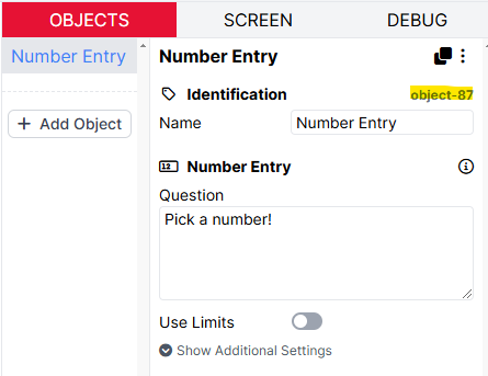
For incorporating the participant's response to a previous question, you can find the ObjectID at the top right of the question object. Here, the ObjectID of the Number Entry object is object-87:
Samples that use this object
Patient Health Questionnaire (PHQ-9)
Generalised Anxiety Disorder (GAD 7)
Basic Settings:
Text
The markdown-formatted text that will be displayed to participants on the screen. Use the syntax ${response:ObjectID}, ${manipulation:ManipulationName}, or ${store:FieldName} to incorporate previous responses, values from Manipulations, or values from the Store.
Base Text Size (px)
Set the size of the text, in pixels.
Text Align
Use this to align the text to the left, center or right.
Additional Settings: (click 'Show Additional Settings' to show)
Conditional
Control the conditions under which this object should be shown or hidden. For more information on this, visit the conditional logic support page.
Default State
If conditional, set whether this object should be shown or hidden by default.
Conditions
If conditional, the conditions under which this object should be shown or hidden.
Visibility
Select, from the dropdown, whether this object should be shown or hidden under the condition.
Field
Set the field to use for this condition.
Comparison
Select the type of comparison, from the dropdown, to make for this condition.
Response
Set the response value to compare to the field in this condition.
Remove Spacing
By default, Gorilla will add spacing between this object and the next object on the page. Toggle this setting on to remove this spacing.
Video
The Video object allows you to present participants with a single video file to watch.
If you want your participants to be able to pause, rewind and seek within the video file, use the Video component in Task Builder 2.
First, upload your video file(s) by going to the Stimuli tab and clicking 'Add Stimuli'. On the Video object, use the 'choose...' button to select the video file to play on this screen.
To vary the video file between participants, click the link icon to the right of the Video setting. You can then specify a different video file for each condition by binding to a Manipulation, or play different video files for different participants by binding to previous responses or binding to the Store.
For some more information about file size and supported formats, have a look at the information in our Technical Checklist.
Samples that use this object
There are currently no samples that use this object.
Basic Settings:
Video
The video to display. Use the 'choose...' button to select one specific video file to play, or click the binding icon to have the video file change in different conditions (by binding to a Manipulation), or based on previous responses (by binding to a response or to the Store).
Button Label
Text for the 'Play' button.
Muted
Whether to play the video muted.
Max Plays
Maximum number of times this video can be played (does not apply if controls are active). Leave blank for unlimited.
Allow advance without playing
Toggle this setting on to let the participant advance to the next page even if the video hasn't played.
Additional Settings: (click 'Show Additional Settings' to show)
Conditional
Control the conditions under which this object should be shown or hidden. For more information on this, visit the conditional logic support page.
Default State
If conditional, set whether this object should be shown or hidden by default.
Conditions
If conditional, the conditions under which this object should be shown or hidden.
Visibility
Select, from the dropdown, whether this object should be shown or hidden under the condition.
Field
Set the field to use for this condition.
Comparison
Select the type of comparison, from the dropdown, to make for this condition.
Response
Set the response value to compare to the field in this condition.
Remove Spacing
By default, Gorilla will add spacing between this object and the next object on the page. Toggle this setting on to remove this spacing.
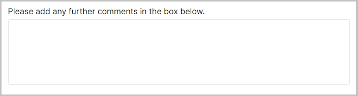
Comment Box
A large text area enables a large text input area for a participant to write open responses and longer answers to questions.

Samples that use this object
Generic Pilot Feedback Questionnaire
Basic Settings:
Question
Type the question text for this object here.
Number of rows
Enter a number in this field to adjust the height of the Comment Box. This doesn't limit the amount of characters participants can write, it only adjusts the size.
Use Input Restrictions
Toggle this setting on to optionally set minimum and maximum character limits on the response entered into the component.
Min Characters (Optional)
(Only available when 'Use Input Restrictions' is toggled on)
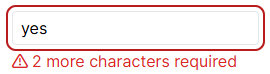
Minimum number of characters required. If the participant tries to submit a response with fewer than the specified number of characters, the screen will not advance, and they will see the warning message 'X more characters required'.
If this setting is left blank, the participant can enter only 1 character (or 0, if the Optional setting is toggled on) and still submit their response.
Max Characters (Optional)
(Only available when 'Use Input Restrictions' is toggled on)
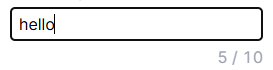
Maximum number of characters that can be entered. When the participant starts typing, a character count will appear showing how many characters they have typed and the maximum number.
If the participant reaches the maximum number of characters and keeps typing, no further characters will appear in the text box.
If this setting is left blank, the participant can enter as many characters as they like.
Additional Settings: (click 'Show Additional Settings' to show)
Optional
When toggled on, participants can skip the question and leave it unanswered.
Conditional
Control the conditions under which this question should be shown or hidden. For more information on this, visit the conditional logic support page.
Default State
If conditional, set whether this question should be shown or hidden by default.
Conditions
If conditional, the conditions under which this question should be shown or hidden.
Visibility
Select, from the dropdown, whether this question should be shown or hidden under the condition.
Field
Set the field to use for this condition.
Comparison
Select the type of comparison, from the dropdown, to make for this condition.
Response
Set the response value to compare to the field in this condition.
Remove Spacing
By default, Gorilla will add spacing between this object and the next object on the page. Toggle this setting on to remove this spacing.
Save To Store
Toggle this setting on to save this response to a field in the Store. Learn more about the Store in the Binding Guide.
Destinations
The list of destinations where this response will be Stored.
Save
Choose 'Value' from the dropdown so that the participant's input in the Comment Box gets saved to the Store.
To
Set the field in the Store which you would like to save the response to.
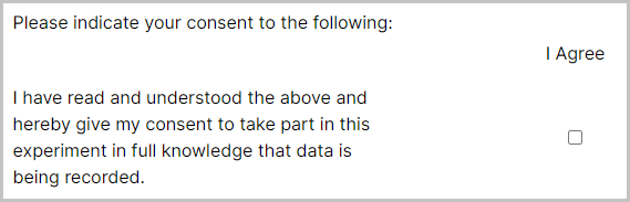
Consent Form
The Consent Form is a special version of the Multiple Choice Grid object, with some default settings filled in to make it a useful template for collecting consent from participants.

Samples that use this object
Tutorials that use this object
Branching from a Consent Form (Score) - shows how to send participants down different paths in the experiment if they consent or do not consent
Basic Settings:
Question
Type the question text for this object here.
Questions/Statements (rows)
List of questions/statements for this consent form's rows. By default, this will contain one statement with some default consent text.
Response
The response value for this question/statement - this is the response that will actually be stored.
Label
(Only available when 'Use separate Responses and Labels' is toggled on)
The label for this question/statement - this is what will be shown to the participant. You can use Markdown to format this text. Labels are not included in your data.
Right-hand Label
(Only available when 'Use right-hand Labels' is toggled on)
An optional label which will sit to the right of the options for this question/statement. Labels are not included in your data.
Response Options (columns)
List of options for this consent form's columns. By default, this will contain one option with the Response 'consent' and the Label 'I Agree'.
Response
The response value for this option - this is the response that will actually be stored.
Label
(Only available when 'Use separate Responses and Labels' is toggled on)
The label for this option - this is what will be shown to the participant. You can use Markdown to format this text. Labels are not included in your data.
Allow multiple answers per row
Toggle this setting on to allow multiple answers to be selected using checkboxes. By default, this will be set, as the convention is for consent forms to use checkboxes rather than radio buttons.
Additional Settings: (click 'Show Additional Settings' to show)
Use separate Responses and Labels
Toggle this setting on to specify separate labels (displayed to the participant) and responses (shown in your data). By default, this will be toggled on.
Use right-hand Labels
Toggle this setting on to specify labels to display to the right of each row of options.
Use Mobile Layout
When to use mobile-friendly layout for this question.
Randomise Row Order
Randomises the order of row options within the consent form.
Show separating line between rows
Toggle this setting on to display a horizontal line between rows.
Optional
When toggled on, participants can skip the question and leave it unanswered. If you allow it to be left unanswered, the response field in your data could be either empty (if the participant has chosen not to answer this question) or include a 1 (if the participant ticked that question).
Conditional
Control the conditions under which this question should be shown or hidden. For more information on this, visit the conditional logic support page.
Default State
If conditional, set whether this question should be shown or hidden by default.
Conditions
If conditional, the conditions under which this element should be shown or hidden.
Visibility
Select, from the dropdown, whether this question should be shown or hidden under the condition.
Field
Set the field to use for this condition.
Comparison
Select the type of comparison, from the dropdown, to make for this condition.
Response
Set the response value to compare to the field in this condition.
Remove Spacing
By default, Gorilla will add spacing between this object and the next object on the page. Toggle this setting on to remove this spacing.
Save To Store
Toggle this setting on to save this response to a field in the store. Learn more about the Store in the Binding Guide.
Destinations
The list of destinations where this response will be Stored.
Save
Choose, from the dropdown, which of this question's response fields to save to the Store. If you have only one checkbox, the only option will be the combination of the Question label and the Response Option label. If you have several Questions and several Response Options, all combinations will appear here and you can choose one.
To
Set the field in the Store which you would like to save the response to.
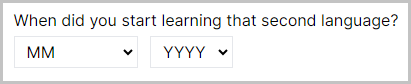
Date Entry
The Date Entry object adds 3 dropdown menus: 'Day', 'Month' and 'Year', which participants can use to specify a date. A use case for this object may be to ask participants their date of birth. The settings can be used to collect the date in months and years only, which is useful to collect GDPR compliant age data.

Samples that use this object
Language Experience Questionnaire
Basic Settings:
Question
Type the question text for this object here.
Convert to Age
Toggle this setting on to interpret the participant's input as a birth date and store the number of years, months and days between that date and the current date.
Convert to Months
(Only available when 'Convert to Age' is toggled on)
Toggle this setting on to interpret the participant's input as a birth date and store the number of months only.
Month & Year Only
Toggle this setting on to hide the dropdown menu for 'Day'. This allows you to collect a date from the participant without a day. Or, collect participant ages that are accurate to years and months, but without effectively storing dates of birth (which are de-anonymising).
Additional Settings: (click 'Show Additional Settings' to show)
Optional
When toggled on, participants can skip the question and leave it unanswered.
Conditional
Control the conditions under which this question should be shown or hidden. For more information on this, visit the conditional logic support page.
Default State
If conditional, set whether this question should be shown or hidden by default.
Conditions
If conditional, the conditions under which this question should be shown or hidden.
Visibility
Select, from the dropdown, whether this question should be shown or hidden under the condition.
Field
Set the field to use for this condition.
Comparison
Select the type of comparison, from the dropdown, to make for this condition.
Response
Set the response value to compare to the field in this condition.
Remove Spacing
By default, Gorilla will add spacing between this object and the next object on the page. Toggle this setting on to remove this spacing.
Save To Store
Toggle this setting on to save this response to a field in the Store. Learn more about the Store in the Binding Guide.
Destinations
The list of destinations where this response will be Stored.
Save
Choose, from the dropdown, which of this question's response fields (Day, Month or Year) to save to the Store. If you want to branch based on age, consider using Multiple Choice or Number Entry instead.
To
Set the field in the Store which you would like to save the response to.
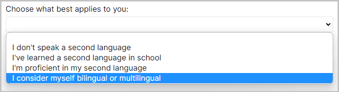
Dropdown
A simple dropdown menu where participants select an answer from a list of options you have provided. This is useful when you wish participants to select an answer from a set of pre-defined options.

Samples that use this object
Language Experience Questionnaire
Basic Settings:
Question
Type the question text for this object here.
Use separate Responses and Labels
Toggle this setting on to specify separate labels (displayed to the participant) and responses (shown in your data).
Options
Add the list of options you wish to provide for this question.
Response
The response value for this option - this is the response that will actually be stored.
Label
(Only available when 'Use separate Responses and Labels' is toggled on)
The label for this option - this is what will be shown to the participant. Labels are not included in your data.
Exclude from randomisation
(Only available when 'Randomise Order' is toggled on)
Toggle this setting on to exclude this option from randomisation. This option will remain in its current position in the order while other options are randomised around it.
Allow 'Other'
Toggle this setting on to add an "Other" option to the dropdown, with a conditional text box response when selected.
'Other' option label
(Only available when 'Allow "Other"' is toggled on)
Label for your 'Other' option, which participants will see.
Randomise Order
Randomises the order of options within the dropdown.
Additional Settings: (click 'Show Additional Settings' to show)
Optional
When toggled on, participants can skip the question and leave it unanswered.
Conditional
Control the conditions under which this question should be shown or hidden. For more information on this, visit the conditional logic support page.
Default State
If conditional, set whether this question should be shown or hidden by default.
Conditions
If conditional, the conditions under which this question should be shown or hidden.
Visibility
Select, from the dropdown, whether this question should be shown or hidden under the condition.
Field
Set the field to use for this condition.
Comparison
Select the type of comparison, from the dropdown, to make for this condition.
Response
Set the response value to compare to the field in this condition.
Remove Spacing
By default, Gorilla will add spacing between this object and the next object on the page. Toggle this setting on to remove this spacing.
Save To Store
Toggle this setting on to save this response to a field in the Store. Learn more about the Store in the Binding Guide.
Destinations
The list of destinations where this response will be Stored.
Save
Choose, from the dropdown, which of this question's response fields to save to the Store.
To
Set the field in the Store which you would like to save the response to.
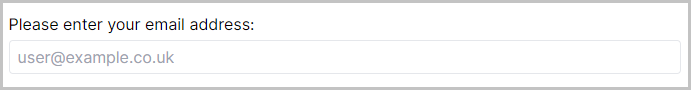
Email Entry
A text box where participants can enter a single email address. If a participant enters text not in the format of an email address, the box will be highlighted in red and the participant must correct this before proceeding.

Basic Settings:
Question
Type the question text for this object here.
Additional Settings: (click 'Show Additional Settings' to show)
Optional
When toggled on, participants can skip the question and leave it unanswered.
Conditional
Control the conditions under which this question should be shown or hidden. For more information on this, visit the conditional logic support page.
Default State
If conditional, set whether this question should be shown or hidden by default.
Conditions
If conditional, the conditions under which this question should be shown or hidden.
Visibility
Select, from the dropdown, whether this question should be shown or hidden under the condition.
Field
Set the field to use for this condition.
Comparison
Select the type of comparison, from the dropdown, to make for this condition.
Response
Set the response value to compare to the field in this condition.
Remove Spacing
By default, Gorilla will add spacing between this object and the next object on the page. Toggle this setting on to remove this spacing.
Save To Store
Toggle this setting on to save this response to a field in the Store. Learn more about the Store in the Binding Guide.
Destinations
The list of destinations where this response will be Stored.
Save
Choose, from the dropdown, which of this question's response fields to save to the Store.
To
Set the field in the Store which you would like to save the response to.
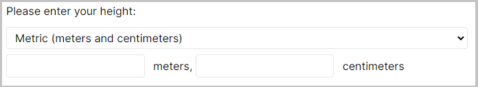
Height Entry
The Height Entry object adds a dropdown to your questionnaire where a participant can select from Imperial or Metric measurements. If the participant selects Imperial, number entry boxes for feet and inches will appear. If the participant selects Metric, number entry boxes for meters and centimeters will appear.

Basic Settings:
Question
Type the question text for this object here.
Additional Settings: (click 'Show Additional Settings' to show)
Optional
When toggled on, participants can skip the question and leave it unanswered.
Conditional
Control the conditions under which this question should be shown or hidden. For more information on this, visit the conditional logic support page.
Default State
If conditional, set whether this question should be shown or hidden by default.
Conditions
If conditional, the conditions under which this question should be shown or hidden.
Visibility
Select, from the dropdown, whether this question should be shown or hidden under the condition.
Field
Set the field to use for this condition.
Comparison
Select the type of comparison, from the dropdown, to make for this condition.
Response
Set the response value to compare to the field in this condition.
Remove Spacing
By default, Gorilla will add spacing between this object and the next object on the page. Toggle this setting on to remove this spacing.
Save To Store
Toggle this setting on to save this response to a field in the Store. Learn more about the Store in the Binding Guide.
Destinations
The list of destinations where this response will be Stored.
Save
Choose, from the dropdown, which of this question's response fields to save to the Store.
To
Set the field in the Store which you would like to save the response to.
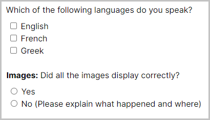
Multiple Choice
A list of pre-defined options that a participant can choose from. If multiple answers are allowed, the options will be presented as a Checklist. If only one option can be chosen by participants, they will be displayed as Radio buttons.

Samples that use this object
Generic Pilot Feedback Questionnaire
Basic Settings:
Question
Type the question text for this object here.
Use separate Responses and Labels
Toggle this setting on to specify separate labels (displayed to the participant) and responses (shown in your data).
Allow 'Other'
Toggle this setting on to add an "Other" option to the list, with a conditional text box response when selected.
'Other' option label
(Only available when 'Allow "Other"' is toggled on)
Label for your "Other" option, which participants will see.
Hide text entry
(Only available when 'Allow "Other"' is toggled on)
Toggle this setting on to hide the text box that usually appears by default when the 'Other' option is selected.
Override other selections
(Only available when 'Allow "Other"' and 'Allow multiple answers' are both toggled on)
Toggle this setting on to have the 'Other' option automatically deselect all other choices when the participant selects it, even if multiple answers are allowed.
Options
Add the list of options you wish to provide for this question.
Response
The response value for this option - this is the response that will actually be stored.
Label
(Only available when 'Use separate Responses and Labels' is toggled on)
The label for this option - this is what will be shown to the participant. Labels are not included in your data.
Exclude from randomisation
(Only available when 'Randomise Order' setting is toggled on)
Toggle this setting on to exclude this option from randomisation. This option will remain in its current position in the order while other options are randomised around it.
Allow multiple answers
Toggle this setting on to allow multiple answers to be selected using checkboxes. By default, only a single answer can be selected using radio buttons.
Randomise Order
Randomises the order of multiple choice options.
Additional Settings: (click 'Show Additional Settings' to show)
Optional
When toggled on, participants can skip the question and leave it unanswered.
Conditional
Control the conditions under which this question should be shown or hidden. For more information on this, visit the conditional logic support page.
Default State
If conditional, set whether this question should be shown or hidden by default.
Conditions
If conditional, the conditions under which this question should be shown or hidden.
Visibility
Select, from the dropdown, whether this question should be shown or hidden under the condition.
Field
Set the field to use for this condition.
Comparison
Select the type of comparison, from the dropdown, to make for this condition.
Response
Set the response value to compare to the field in this condition.
Remove Spacing
By default, Gorilla will add spacing between this object and the next object on the page. Toggle this setting on to remove this spacing.
Save To Store
Toggle this setting on to save this response to a field in the Store. Learn more about the Store in the Binding Guide.
Destinations
The list of destinations where this response will be Stored.
Save
If your question is set up to allow multiple answers, you can select which answer to save to the Store. Responses will be saved as 1 if the answer was ticked, and 0 if it was not ticked.
If your question only allows a single answer, you can select whether you want this answer to be saved as the Response (i.e. the actual answer the participant selected), or Quantised (i.e., the number corresponding to the answer's position in the list of response options).
To
Set the field in the Store which you would like to save the response to.
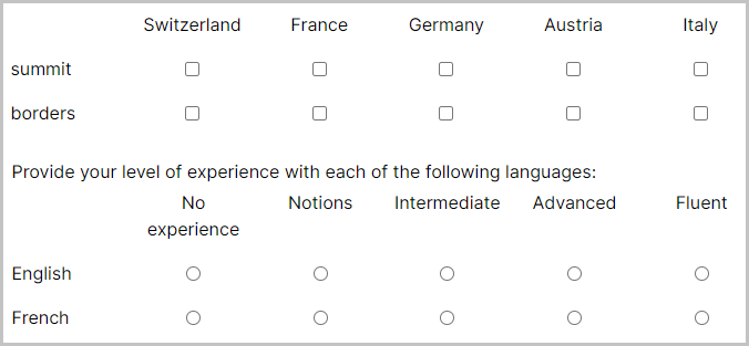
Multiple Choice Grid
Pick responses from a list of options using radio buttons or checkboxes, arranged in a grid.

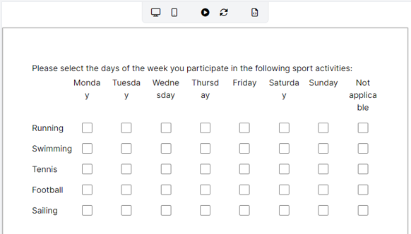
If you have a lot of response options, or your response options are quite long, the Multiple Choice Grid layout can be undesirable. For example, in the image below, the response options are difficult to read:
To resolve this issue, you will need to select the 'Always' option from the Use Mobile Layout setting. This layout tends to look much better in cases where the questions/statements are long and/or there are several response options, as shown in the image below:
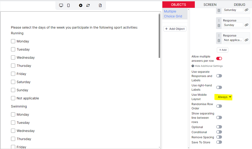
This setting just changes the visual layout of the question. Participants will still be able to complete your questionnaire on other devices such as computers and laptops.
Samples that use this object
Language Experience Questionnaire
Barratt Impulsiveness Scale (BIS-11)
Basic Settings:
Question
Type the question text for this object here.
Questions/Statements (rows)
List of questions or statements for this multiple choice grid's rows.
Response
The response value for this question/statement - this is the response that will actually be stored.
Label
(Only available when 'Use separate Responses and Labels' is toggled on)
The label for this question/statement - this is what will be shown to the participant. You can use Markdown to format this text. Labels are not included in your data.
Exclude from randomisation
(Only available when 'Randomise Row Order' is toggled on)
Toggle this setting on to exclude this question/statement from randomisation. This question/statement will remain in its current position in the order while other questions/statements are randomised around it.
Right-hand Label
(Only available when 'Use right-hand Labels' setting is toggled on)
An optional label which will sit to the right of the options for this question/statement. Labels are not included in your data.
Response Options (columns)
Add the list of options you wish to provide for this multiple choice grid's columns.
Response
The response value for this option - this is the response that will actually be stored.
Label
(Only available when 'Use separate Responses and Labels' is toggled on)
The label for this option - this is what will be shown to the participant. You can use Markdown to format this text. Labels are not included in your data.
Allow multiple answers per row
Toggle this setting on to allow multiple answers to be selected using checkboxes. By default, only a single answer can be selected in each row using radio buttons.
Additional Settings: (click 'Show Additional Settings' to show)
Use separate Responses and Labels
Toggle this setting on to specify separate labels (displayed to the participant) and responses (shown in your data).
Use right-hand Labels
Toggle this setting on to specify labels to display to the right of each row of options.
Use Mobile Layout
When to use mobile-friendly layout for this question.
Randomise Row Order
Randomises the order of row options within the multiple choice grid.
Show separating line between rows
Toggle this setting on to display a horizontal line between rows.
Optional
When toggled on, participants can skip the question and leave it unanswered.
Conditional
Control the conditions under which this question should be shown or hidden. For more information on this, visit the conditional logic support page.
Default State
If conditional, set whether this question should be shown or hidden by default.
Conditions
If conditional, the conditions under which this question should be shown or hidden.
Visibility
Select, from the dropdown, whether this question should be shown or hidden under the condition.
Field
Set the field to use for this condition.
Comparison
Select the type of comparison, from the dropdown, to make for this condition.
Response
Set the response value to compare to the field in this condition.
Remove Spacing
By default, Gorilla will add spacing between this object and the next object on the page. Toggle this setting on to remove this spacing.
Save To Store
Toggle this setting on to save this response to a field in the Store. Learn more about the Store in the Binding Guide.
Destinations
The list of destinations where this response will be Stored.
Save
Choose, from the dropdown, which of this question's Statements (rows) to look at, so that its response option(s) chosen by the participant gets saved to the Store.
If your question is set up to allow multiple answers, you can select which answer to save to the Store. Responses will be saved as 1 if the answer was ticked, and 0 if it was not ticked.
If your question only allows a single answer, you can select whether you want this answer to be saved as the Response (i.e. the actual answer the participant selected), or Quantised (i.e., the number corresponding to the answer's position in the list of response options).
To
Set the field in the Store which you would like to save the response to.
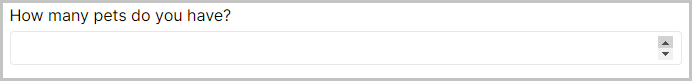
Number Entry
Enter a single number. Limits can be set on the minimum and maximum values for this number.

Samples that use this object
There are currently no samples that use this object.
Basic Settings:
Question
Type the question text for this object here.
Use Limits
Allows the entered number to be clamped (restricted) to a range.
Minimum
(Only available when 'Use Limits' is toggled on)
Minimum value allowed for the number.
Maximum
(Only available when 'Use Limits' is toggled on)
Maximum value allowed for the number.
Additional Settings: (click 'Show Additional Settings' to show)
Optional
When toggled on, participants can skip the question and leave it unanswered.
Conditional
Control the conditions under which this question should be shown or hidden. For more information on this, visit the conditional logic support page.
Default State
If conditional, set whether this question should be shown or hidden by default.
Conditions
If conditional, the conditions under which this question should be shown or hidden.
Visibility
Select, from the dropdown, whether this question should be shown or hidden under the condition.
Field
Set the field to use for this condition.
Comparison
Select the type of comparison, from the dropdown, to make for this condition.
Response
Set the response value to compare to the field in this condition.
Remove Spacing
By default, Gorilla will add spacing between this object and the next object on the page. Toggle this setting on to remove this spacing.
Save To Store
Toggle this setting on to save this response to a field in the Store. Learn more about the Store in the Binding Guide.
Destinations
The list of destinations where this response will be Stored.
Save
Choose 'Value' to save the number participants entered to the Store.
To
Set the field in the Store which you would like to save the response to.
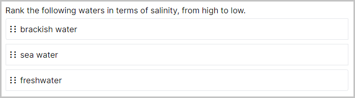
Ranking Scale
A set of response options presented in a vertical list created from a list of options you provide. Participants can drag and drop to change the order of the list to provide a ranking of all the options.

In short-form questionnaire data, the left-to-right order of the responses corresponds to the final top-to-bottom order the options were dragged into. In long-form questionnaire data, the number in the Key column corresponds to the final position the option was dragged into: 0 = top, 1 = second-from-top, and so on.
Samples that use this object
Basic Settings:
Question
Type the question text for this object here.
Use separate Responses and Labels
Toggle this setting on to specify separate labels (displayed to the participant) and responses (shown in your data).
Options
Add the list of options you wish to provide for this question.
Response
The response value for this option - this is the response that will actually be stored.
Label
(Only available when 'Use separate Responses and Labels' is toggled on)
The label for this option - this is what will be shown to the participant. Labels are not included in your data.
Exclude from randomisation
(Only available when 'Randomise Order' is toggled on)
Toggle this setting on to exclude this option from randomisation. This option will remain in its current position in the order while other options are randomised around it.
Randomise Order
Randomises the order in which options are initially presented on the screen.
Top Label
The label that will be shown to the top of the ranking.
Bottom Label
The label that will be shown to the bottom of the ranking.
Additional Settings: (click 'Show Additional Settings' to show)
Optional
When toggled on, participants can skip the question and leave it unanswered.
Conditional
Control the conditions under which this question should be shown or hidden. For more information on this, visit the conditional logic support page.
Default State
If conditional, set whether this question should be shown or hidden by default.
Conditions
If conditional, the conditions under which this question should be shown or hidden.
Visibility
Select, from the dropdown, whether this question should be shown or hidden under the condition.
Field
Set the field to use for this condition.
Comparison
Select the type of comparison, from the dropdown, to make for this condition.
Response
Set the response value to compare to the field in this condition.
Remove Spacing
By default, Gorilla will add spacing between this object and the next object on the page. Toggle this setting on to remove this spacing.
Save To Store
Toggle this setting on to save this response to a field in the store. Learn more about the Store in the Binding Guide.
Destinations
The list of destinations where this response will be Stored.
Save
Choose, from the dropdown, which of this question's response fields to save to the Store. To save the item that was dragged into a particular position, select the item that was originally listed in that position. For example, to save the item that was dragged into first position, select the response that was originally in first position.
To
Set the field in the Store which you would like to save the response to.
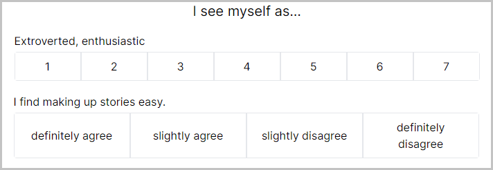
Rating Scale (Likert)
A set of Likert-style response options presented in a horizontal line. From these options, participants can choose a single response. This is often used when participants are asked to provide a rating based on an image or sentence.

Samples that use this object
Patient Health Questionnaire (PHQ-9)
Generalised Anxiety Disorder (GAD 7)
Basic Settings:
Question
Type the question text for this object here.
Use separate Responses and Labels
Toggle this setting on to specify separate labels (displayed to the participant) and responses (shown in your data).
Options
Add the list of options you wish to provide for this question.
Response
The response value for this option - this is the response that will actually be stored.
Label
(Only available when 'Use separate Responses and Labels' is toggled on)
The label for this option - this is what will be shown to the participant. Labels are not included in your data.
Add multiple questions/items
Allows you to repeat the same set of options for multiple items.
Items
(Only available when 'Add multiple questions/items' is toggled on)
List of items to show for the rating scale alongside your options.
Left Label
The label that will be shown to the left of the scale.
Right Label
The label that will be shown to the right of the scale.
Rating Item Size (px)
Size that will be used for the items in the rating scale.
Use Mobile Layout
When to use mobile-friendly layout for this question.
Additional Settings: (click 'Show Additional Settings' to show)
Optional
When toggled on, participants can skip the question and leave it unanswered.
Conditional
Control the conditions under which this question should be shown or hidden. For more information on this, visit the conditional logic support page.
Default State
If conditional, set whether this question should be shown or hidden by default.
Conditions
If conditional, the conditions under which this question should be shown or hidden.
Visibility
Select, from the dropdown, whether this question should be shown or hidden under the condition.
Field
Set the field to use for this condition.
Comparison
Select the type of comparison, from the dropdown, to make for this condition.
Response
Set the response value to compare to the field in this condition.
Remove Spacing
By default, Gorilla will add spacing between this object and the next object on the page. Toggle this setting on to remove this spacing.
Save To Store
Toggle this setting on to save this response to a field in the Store. Learn more about the Store in the Binding Guide.
Destinations
The list of destinations where this response will be Stored.
Save
Choose, from the dropdown, either the response or the quantised response of this question's response fields to save to the Store. The quantised response corresponds to the position of the response in your rating scale (from 1 to however many response options you have).
To
Set the field in the Store which you would like to save the response to.
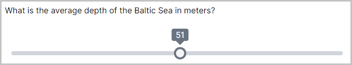
Slider
A simple slider, which allows participants to choose a value within the range you set. This object is useful if you require participants to give an answer between a range of values, or rate something on a scale.
The start position of the slider handle defaults to the middle of the slider. When using the "Fixed Start Position" setting, the slider handle will start at the position specified by "Starting value". When using the "Random Start Position" setting, the slider handle will start at a random position between the "Starting value (min)" and "Starting value (max)".

Samples that use this object
Basic Settings:
Question
Type the question text for this object here.
Minimum Value
Sets the minimum value on the slider. The default value is 0.
Maximum Value
Sets the maximum value on the slider. The default value is 100.
Fixed Start Position
Toggle this setting on to specify a fixed start position for the slider handle. By default, the slider handle will start in the middle of the range.
Starting value
(Only available when 'Fixed Start Position' is toggled on)
Set the start position for the slider handle.
Random Start Position
Toggle this setting on to randomise the start position for the slider handle.
Starting value (min)
(Only available when 'Random Start Position' is toggled on)
Set the minimum starting value. The actual value will be between this and the maximum value.
Starting value (max)
(Only available when 'Random Start Position' is toggled on)
Set the maximum starting value. The actual value will be between this and the minimum value.
Add Labels
Toggle this setting on to add labels to the ends of the slider.
Left-side label
(Only available when 'Add Labels' is toggled on)
Define the label to display to the left end of the slider.
Right-side label
(Only available when 'Add Labels' is toggled on)
Define the label to display to the right end of the slider.
Additional Settings: (click 'Show Additional Settings' to show)
Show tooltip
Toggle this setting on to show the current value above the slider in a tooltip (speech bubble).
Hide handle until click
Toggle this setting on to hide the slider handle until the participant first clicks the slider.
Step Size
Sets the step size for the slider. You can enter a whole number or a decimal value.
Allow Keyboard controls
Toggle this setting on to allow the participant to use the left/right arrow keys on the keyboard to move the slider handle.
Optional
When toggled on, participants can skip the question and leave it unanswered.
Conditional
Control the conditions under which this question should be shown or hidden. For more information on this, visit the conditional logic support page.
Default State
If conditional, set whether this question should be shown or hidden by default.
Conditions
If conditional, the conditions under which this question should be shown or hidden.
Visibility
Select, from the dropdown, whether this question should be shown or hidden under the condition.
Field
Set the field to use for this condition.
Comparison
Select the type of comparison, from the dropdown, to make for this condition.
Response
Set the response value to compare to the field in this condition.
Remove Spacing
By default, Gorilla will add spacing between this object and the next object on the page. Toggle this setting on to remove this spacing.
Save To Store
Toggle this setting on to save this response to a field in the Store. Learn more about the Store in the Binding Guide.
Destinations
The list of destinations where this response will be Stored.
Save
Choose 'Value' to save the slider position participants selected to the Store.
To
Set the field in the Store which you would like to save the response to.
Text Entry
The Text Entry object allows participants to enter a single line of text. It is useful if you wish to collect data from simple 'open', 'short-answer' questions. By toggling on the 'Add multiple questions/items', you will be able to create several single line response boxes with a label next to each one.

Tutorials that use this object
Basic Settings:
Question
Type the question text for this object here.
Add multiple questions/items
(Only available when 'Use Input Restrictions' is toggled off)
Allows you to create a series of text input boxes for multiple items, which can be labelled in the list of items (see setting below). If this is toggled on, make sure to define at least one item in the list of items. The label you have given will then appear next to the response box.
Items
(Only available when 'Add multiple questions/items' is toggled on)
List of items to show. A text input box will be provided alongside each item.
Use Input Restrictions
(Only available when 'Add multiple questions/items' is toggled off)
Toggle this setting on to optionally set minimum and maximum character limits on the response entered into the component.
Min Characters (Optional)
(Only available when 'Use Input Restrictions' is toggled on)
Minimum number of characters required. If the participant tries to submit a response with fewer than the specified number of characters, the page will not advance, and they will see the warning message 'X more characters required'.
If this setting is left blank, the participant can enter only 1 character (or 0, if the Optional setting is toggled on) and still submit their response.
Max Characters (Optional)
(Only available when 'Use Input Restrictions' is toggled on)
Maximum number of characters that can be entered. When the participant starts typing, a character count will appear showing how many characters they have typed and the maximum number.
If the participant reaches the maximum number of characters and keeps typing, no further characters will appear in the text box.
If this setting is left blank, the participant can enter as many characters as they like.
Additional Settings: (click 'Show Additional Settings' to show)
Optional
When toggled on, participants can skip the question and leave it unanswered.
Conditional
Control the conditions under which this question should be shown or hidden. For more information on this, visit the conditional logic support page.
Default State
If conditional, set whether this question should be shown or hidden by default.
Conditions
If conditional, the conditions under which this question should be shown or hidden.
Visibility
Select, from the dropdown, whether this question should be shown or hidden under the condition.
Field
Set the field to use for this condition.
Comparison
Select the type of comparison, from the dropdown, to make for this condition.
Response
Set the response value to compare to the field in this condition.
Remove Spacing
By default, Gorilla will add spacing between this object and the next object on the page. Toggle this setting on to remove this spacing.
Save To Store
Toggle this setting on to save this response to a field in the Store. Learn more about the Store in the Binding Guide.
Destinations
The list of destinations where this response will be Stored.
Save
Choose 'Value' to save participants' text entry response to the Store. If you have ticked 'Add multiple questions/items', you will be able to select which question's response you want to save.
To
Set the field in the Store which you would like to save the response to.
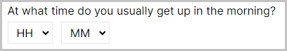
Time Entry
The Time Entry object adds 2 dropdown menus to the screen: 'Hour' and 'Minute', which participants can use to specify a time.

Samples that use this object
There are currently no samples that use this object.
Basic Settings:
Question
Type the question text for this object here.
Additional Settings: (click 'Show Additional Settings' to show)
Optional
When toggled on, participants can skip the question and leave it unanswered.
Conditional
Control the conditions under which this question should be shown or hidden. For more information on this, visit the conditional logic support page.
Default State
If conditional, set whether this question should be shown or hidden by default.
Conditions
If conditional, the conditions under which this question should be shown or hidden.
Visibility
Select, from the dropdown, whether this question should be shown or hidden under the condition.
Field
Set the field to use for this condition.
Comparison
Select the type of comparison, from the dropdown, to make for this condition.
Response
Set the response value to compare to the field in this condition.
Remove Spacing
By default, Gorilla will add spacing between this object and the next object on the page. Toggle this setting on to remove this spacing.
Save To Store
Toggle this setting on to save this response to a field in the Store. Learn more about the Store in the Binding Guide.
Destinations
The list of destinations where this response will be Stored.
Save
Choose, from the dropdown, which of this question's response fields (Hours or Minutes) to save to the Store.
To
Set the field in the Store which you would like to save the response to.
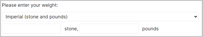
Weight Entry
The Weight Entry object adds a dropdown to your questionnaire where a participant can select from Imperial or Metric measurements. If the participant selects Imperial, number entry boxes for stone and pounds will appear. If the participant selects Metric, a number entry box for kilograms will appear.

Basic Settings:
Question
Type the question text for this object here.
Additional Settings: (click 'Show Additional Settings' to show)
Optional
When toggled on, participants can skip the question and leave it unanswered.
Conditional
Control the conditions under which this question should be shown or hidden. For more information on this, visit the conditional logic support page.
Default State
If conditional, set whether this question should be shown or hidden by default.
Conditions
If conditional, the conditions under which this question should be shown or hidden.
Visibility
Select, from the dropdown, whether this question should be shown or hidden under the condition.
Field
Set the field to use for this condition.
Comparison
Select the type of comparison, from the dropdown, to make for this condition.
Response
Set the response value to compare to the field in this condition.
Remove Spacing
By default, Gorilla will add spacing between this object and the next object on the page. Toggle this setting on to remove this spacing.
Save To Store
Toggle this setting on to save this response to a field in the Store. Learn more about the Store in the Binding Guide.
Destinations
The list of destinations where this response will be Stored.
Save
Choose, from the dropdown, which of this question's response fields to save to the Store.
To
Set the field in the Store which you would like to save the response to.
Early Exit Button
Add an early exit button to your page. Participants who click this button will leave your questionnaire without completing it. Their progress up to and including the current page will be saved and included in your data download.
The Early Exit Button also saves the value specified in the 'Exit Value' setting to a field in the Store. By default, the name of this field will be exit, but you can change this using the 'Save to field' setting. You can use the information saved in the exit field later in the experiment, for example to direct participants who exited early to a Reject node.
Ending the entire experiment using Early Exit
The default behaviour of the Early Exit Button will end the current node that the participant is in. Often, researchers want the Early Exit Button to end the entire experiment for the participant. To do this, a Branch node needs to be added to the experiment after each questionnaire where the Early Exit Button has been added. In each Branch node, you can then evaluate whether or not participants pressed the Early Exit Button in each questionnaire. Have a look at this example experiment to see how this can be configured. In this example, participants are branched to a Reject node, where the experiment will end if they exit at any point.
Samples that use this object
Basic Settings:
Button Label
Text you want to display on the 'Early Exit' button.
Exit Value
The value you want to save to the Store if the participant clicks the Early Exit Button.
Save to field
The field in the Store where you want to save the Exit Value.
Additional Settings: (click 'Show Additional Settings' to show)
Conditional
Control the conditions under which this object should be shown or hidden. For more information on this, visit the conditional logic support page.
Default State
If conditional, set whether this object should be shown or hidden by default.
Conditions
If conditional, the conditions under which this object should be shown or hidden.
Visibility
Select, from the dropdown, whether this object should be shown or hidden under the condition.
Field
Set the field to use for this condition.
Comparison
Select the type of comparison, from the dropdown, to make for this condition.
Response
Set the response value to compare to the field in this condition.
Remove Spacing
By default, Gorilla will add spacing between this object and the next object on the page. Toggle this setting on to remove this spacing.
Switch Button
Allows the participant to switch to another task/questionnaire attached via a Switch Node in the experiment tree. This can be useful if you want to use a questionnaire for task instructions and enable participants to navigate between these instructions and the task.
Samples that use this object
Switching between Informational Website and Questionnaire
Basic Settings:
Button Label
Text you want to display on the 'Switch' button.
Additional Settings: (click 'Show Additional Settings' to show)
Conditional
Control the conditions under which this object should be shown or hidden. For more information on this, visit the conditional logic support page.
Default State
If conditional, set whether this object should be shown or hidden by default.
Conditions
If conditional, the conditions under which this object should be shown or hidden.
Visibility
Select, from the dropdown, whether this object should be shown or hidden under the condition.
Field
Set the field to use for this condition.
Comparison
Select the type of comparison, from the dropdown, to make for this condition.
Response
Set the response value to compare to the field in this condition.
Remove Spacing
By default, Gorilla will add spacing between this object and the next object on the page. Toggle this setting on to remove this spacing.