Responsive Layouts
Overview
Allowing participants to use mobile devices as well as computers broadens the reach of your experiment. But how do you make sure your tasks display equally well across devices, and that participants are able to submit responses regardless of what device they're using?
Websites that look different depending on the viewer's device use responsive layouts. This page gives a brief guide to how responsive layouts work and how to implement them in Gorilla.
What are responsive layouts?
Ever tried visiting the same website from your computer and from your phone? You may notice that the layouts are different: on mobile, the page is narrower and the text is bigger. The page may also be adapted to make it easier to use on your phone - for example, avoiding hover text or keyboard input unless completely necessary.
It may seem like the layout automatically adapts to the device you're using. But behind the scenes, developers have actually created at least two separate versions of the website: one for viewing from computers, and one for viewing from mobiles.
And so, to give your task responsive layouts, you will have to do the same in Gorilla: create multiple versions of your task, each designed for participants using a different device type.
How do I know what device my participants are using?
Typical websites use a variety of methods to try and automatically detect what kind of device visitors are using. However, none of these methods are 100% reliable.
Getting the layout wrong for a typical website doesn't matter that much - the visitor might just need to zoom and pan to see the full content. But showing the wrong layout to a participant in an experiment could result in data loss. For example, if you send a task that requires keyboard responses to a participant using a mobile device, the onscreen keyboard may fail to show, making it impossible for them to respond.
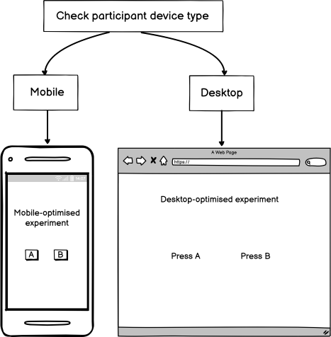
For this reason, Gorilla does not assign task layouts based on automatic device detection. Instead, we recommend that you ask participants directly what kind of device they are using, and then send them to the correct version of the task for their device.
How do I create responsive task layouts in Gorilla?
You can create responsive task layouts in two easy steps:
- Use our built-in customisation and device preview tools to create multiple versions of your task, each optimised for one type of device you expect your participants to use
- Ask participants early in the experiment what device type they are using, and then send them to the appropriate task version based on that information
This may sound complicated, but don't worry - the rest of this guide will show you how to easily create responsive layouts in your experiments, including pre-built examples that show you exactly what you need to do! Check out our specific advice on screen layout and positioning, collecting responses, and branching participants by device.
Screen Layout and Positioning
Questionnaire Builder 2
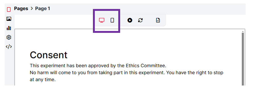
Within the Questionnaire Builder 2 tool, you can preview how your questionnaire will appear on different screen sizes using the device icons at the top of the page preview:
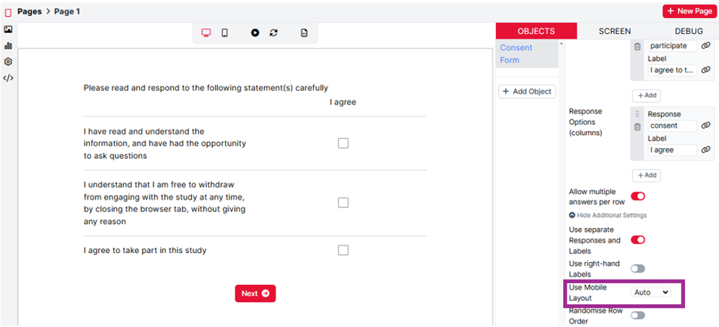
Within some questionnaire objects, such as Multiple Choice Grid and Rating Scale, there is an additional 'Use Mobile Layout' setting. This allows you to select when a mobile-friendly layout for your questions should be used. By selecting 'Auto' from the dropdown, the appearance of this question will automatically adjust to a mobile-friendly layout when participants are completing the questionnaire on a mobile device. There's an example of this in the Multiple Choice Grid below. When the Use Mobile Layout setting is set to Auto, the object will appear as a standard grid on desktops/laptops:
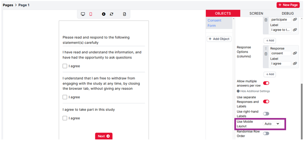
When the question is previewed on a mobile device, the appearance of the Multiple Choice Grid changes to better display the content on smaller screens:
Task Builder 2
Within the Task Builder 2 tool, you can preview how your task will appear on different screen sizes using the device icons at the top of the screen preview:
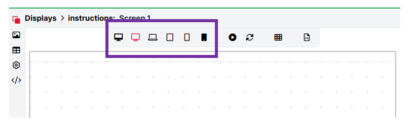
We have a dedicated Device Preview tutorial which shows how to use the developer tools in the browser to view how your task will appear on different device types.
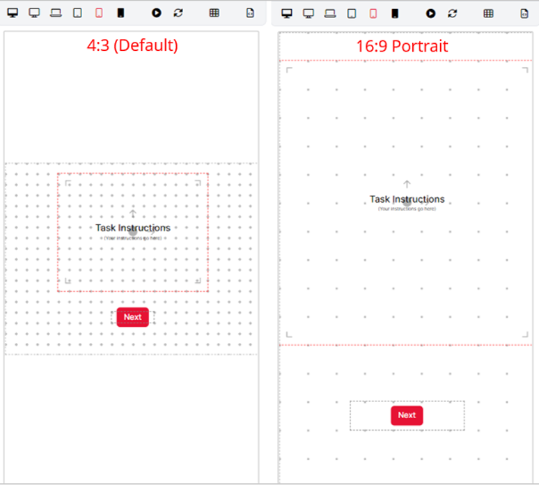
In tasks, by default, content is displayed on the screen within a 4:3 ratio landscape box called 'the Stage'. There is some more information about the Stage in our Layout and Positioning guide. It is possible to adjust this default layout via the Customisation Settings, where you can choose the base layout of your task. The 16:9 Portrait option is ideal for mobile devices in portrait. Comparing the layouts below, you can see how the vertical space is utilised in the 16:9 Portrait layout, allowing content to be better displayed on mobile devices.
The next thing to consider when designing your mobile-friendly task is how to collect responses from participants.
Collecting Responses
Task Builder 2
Another important factor when collecting data from mobile participants is how responses are collected/recorded within the task. Generally, we advise against collecting responses via keyboards on touch-screen devices such as mobiles and tablets. There are three main reasons for this:
- A popup keyboard often does not automatically appear when using a Keyboard Response component. This will prevent participants from giving responses at all.
- If a popup keyboard does automatically appear, responses collected will have a longer latency than those collected from a normal keyboard. The participant has to wait until the keyboard appears before making a response.
- The popup keyboard will obscure the screen, which may interfere with participants' ability to respond accurately e.g. if the keyboard is hiding stimuli on the screen.
Therefore, we recommend creating a mobile-optimised version of your task where participants are asked to respond via buttons on the screen instead. You can see an example of how this has been implemented in the mobile Stroop task linked below, where Text Button Responses have been used.
Once you have set up desktop and mobile versions of your tasks, you need to set up your experiment to send participants to the correct version for their device.
Branching Participants By Device
Once you have followed the tips in this guide to create a mobile-optimised version of your task/questionnaire, the next step is to add both the mobile version and the desktop version to an Experiment.
You can use a Branch node to send participants to the correct version of the task for their device.
See how this can be achieved in our Device-Type Branching Experiment.