Overview
Welcome to Gorilla Form Fields Reference Guide!
Here you will find documentation of classes that you can use to script custom components for Gorilla's new tools, including Task Builder 2, Multiplayer and Game Builder.
Navigate the menu to access documentation for general and tool-specific classes.
For more guidance on scripting in Gorilla's newest tools, visit our Scripting page.
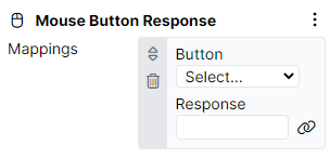
FormElementArray
Class FormElementArray creates an array of settings for an element.
Example Component
Mouse Button Response
Example Code
{
class: "FormElementArray",
field: "mappings",
label: "Mappings",
schema: {
elements: [
{
class: "FormElementDropDown",
field: "button",
label: "Button",
options: MouseButtonOptions
},
{
class: "FormElementBindableText",
field: "response",
label: "Response"
}
]
}
}
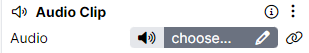
FormElementAsset
Class FormElementAsset creates a setting that allows choosing an asset to upload, e.g. image, video, audio file etc.
Example Component
Audio
Example Code
{
class: "FormElementAsset",
field: "audio",
label: "Audio",
type: 'audio'
},
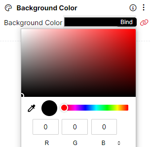
FormElementBindableColor
Class FormElementBindableColor adds an option to choose a colour for an object.
Example Component
Background Color
Example Code
{
class: "FormElementBindableColor",
field: "color",
label: "Background Color"
}
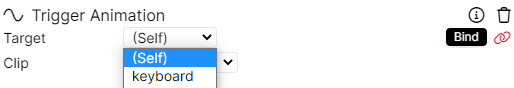
FormElementBindableEntity
Class FormElementBindableEntity creates an entity that can be bound to one of the existing objects.
Example Component
Trigger Animation
Example Code
{
class: "FormElementBindableEntity",
field: "target",
label: "Target",
allowSelf: true
}
FormElementBindableField
Class FormElementBindableField adds a field with a Set… button that, when clicked on, opens a binding settings window.
Example Component
Chat Box
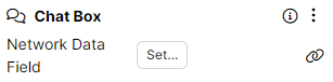
Example Code
{
class: "FormElementBindableField",
field: "networkDataField",
label: "Network Data Field",
networkOnly: true
}
FormElementBindableParagraph
Class FormElementBindableParagraph creates a paragraph field that can be typed in or bound to something.
Example Component
Markdown Text
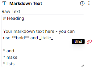
Example Code
{
class: "FormElementBindableParagraph",
field: "text",
label: "Raw Text",
rows: 8
}
FormElementBindableResponseTag
Class FormElementBindableResponseTag adds a response tag that can be either selected from a dropdown menu, created anew, or bound to something.
Example Component
Keyboard Response
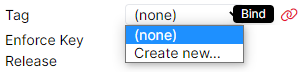
Example Code
{
class: "FormElementBindableResponseTag",
field: "tag",
label: "Tag"
}
FormElementBindableSpreadsheet
Class FormElementBindableSpreadsheet adds a dropdown with existing spreadsheets to choose from.
Example Component
Change Difficulty - Spreadsheet
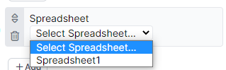
Example Code
{
class: "FormElementBindableSpreadsheet",
field: "spreadsheet",
label: "Spreadsheet",
}
FormElementBindableSpreadsheetColumn
Class FormElementBindableSpreadsheetColumn adds a dropdown with existing spreadsheet columns to choose from.
Example Component
Select Randomised Subset
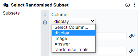
Example Code
{
class: "FormElementBindableSpreadsheetColumn",
field: "column",
label: "Column"
},
FormElementBindableTaskDisplayScreen
Class FormElementBindableTaskDisplayScreen adds a dropdown with existing Screens to choose from.
Example Component
Branch
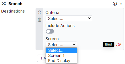
Example Code
{
class: "FormElementBindableTaskDisplayScreen",
label: "Screen",
field: "screen"
}
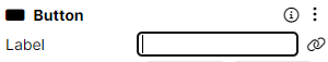
FormElementBindableText
Class FormElementBindableText creates a text field that can be typed in or bound to something.
Example Component
Button
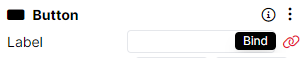
Example Code
{
class: "FormElementBindableText",
label: "Label",
field: "label"
}
FormElementBindableTextArea
Class FormElementBindableTextArea creates a text area that can be typed in or bound to something.
Example Component
Text
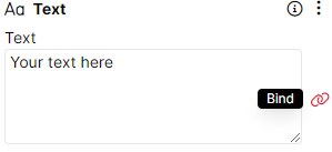
Example Code
{
class: "FormElementBindableTextArea",
field: "text",
label: "Text"
}
FormElementButtonBar
Class FormElementButtonBar creates a bar with clickable buttons to choose from.
Example Component
Advanced Positioning
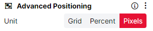
Example Code
{
class: "FormElementButtonBar",
field: "unit",
label: "Unit",
options: [
{ value: 'grid', label: 'Grid' },
{ value: 'percent', label: 'Percent' },
{ value: 'pixels', label: 'Pixels' }
],
}
FormElementCheckbox
Class FormElementCheckbox adds a checkbox that can be checked and unchecked for different effects.
Example Component
Move Offscreen
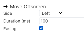
Example Code
{
class: "FormElementCheckbox",
field: "easing",
label: "Easing"
}
FormElementColor
Class FormElementColor adds a color picker that allows setting a color for an element.
Example Component
Text Color
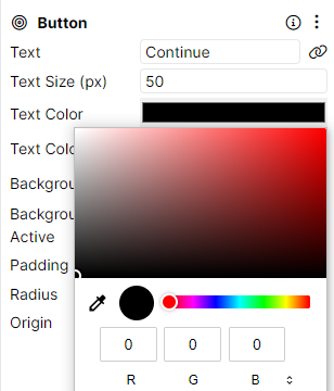
Example Code
{
class: "FormElementColor",
label: "Text Color",
field: "textColor"
}
FormElementCoordinates
Class FormElementCoordinates adds a setting that allows applying coordinates, e.g. for positioning, to an element.
Example Component
Fixation Cross
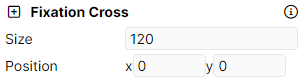
Example Code
{
class: 'FormElementCoordinates',
field: 'position',
label: 'Position',
}
FormElementDimensions
Class FormElementDimensions adds a setting that allows choosing dimensions for the element.
Example Component
Hotspot
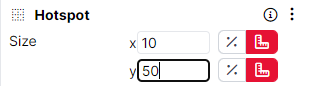
Example Code
{
class: "FormElementDimensions",
field: "size",
label: "Size"
}
FormElementDropDown
Class FormElementDropDown creates a dropdown with options to choose from.
Example Component
Keyboard Response
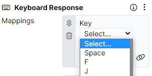
Example Code
{
class: "FormElementDropDown",
field: "key",
label: "Key",
options: KeyboardKeyOptions
}
FormElementEntity
Class FormElementEntity creates a new entity.
Example Component
Trigger Audio
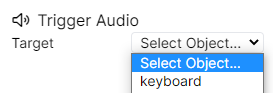
Example Code
{
class: "FormElementEntity",
field: "target",
label: "Target"
}
FormElementOperator
Class FormElementOperator creates a list of operators that can be applied to the entity that they are added to.
Example Component
Change Difficulty - Spreadsheet
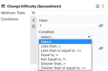
Example Code
{
class: "FormElementOperator",
field: "condition",
label: "Condition",
rows: 8
}
FormElementParagraph
Class FormElementParagraph creates a paragraph field that can be typed in.
Example Component
HTML
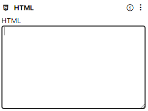
Example Code
{
class: "FormElementParagraph",
field: "html",
label: "HTML",
rows: 8
}
FormElementText
Class FormElementText creates a text field that can be typed in.
Example Component
Button
Example Code
{
class: "FormElementText",
label: "Label",
field: "label"
}
FormElementToggle
Class FormElementToggle adds a switch that can be turn on/off for different effects.
Example Component
Audio
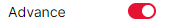
Example Code
{
class: "FormElementToggle",
field: "advanceOnFinish",
label: "Advance"
}
FormElementBindableMultiplayerPlayer
Class FormElementBindableMultiplayerPlayer adds a Player setting with a binding option.
Example Component
Multiplayer
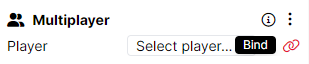
Example Code
{
class: "FormElementBindableMultiplayerPlayer",
field: "player",
label: "Player"
}
FormElementAnimation
Class FormElementAnimation creates an animation for Gorilla Game Builder tool.
Example Component
Animator
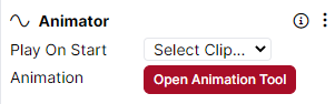
Example Code
{
class: "FormElementAnimation",
field: "clips",
label: "Animation"
}
FormElementAnimationClip
Class FormElementAnimationClip creates a separate animation clip within an animation in Gorilla Game Builder tool.
Example Component
Animator
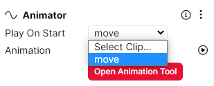
Example Code
{
class: "FormElementAnimationClip",
field: "playOnStart",
label: "Play On Start"
}