Allowing participants to use mobile devices as well as computers broadens the reach of your experiment. But how do you make sure your tasks display equally well across devices, and that participants are able to submit responses regardless of what device they're using?
Websites that look different depending on the viewer's device use responsive layouts. This page gives a brief guide to how responsive layouts work and how to implement them in Gorilla.
Ever tried visiting the same website from your computer and from your phone? You may notice that the layouts are different: on mobile, the page is narrower and the text is bigger. The page may also be adapted to make it easier to use on your phone - for example, avoiding hover text or keyboard input unless completely necessary.
It may seem like the layout automatically adapts to the device you're using. But behind the scenes, developers have actually created at least two separate versions of the website: one for viewing from computers, and one for viewing from mobiles.
And so, to give your task responsive layouts, you will have to do the same in Gorilla: create multiple versions of your task, each designed for participants using a different device type.
Typical websites use a variety of methods to try and automatically detect what kind of device visitors are using. However, none of these methods are 100% reliable.
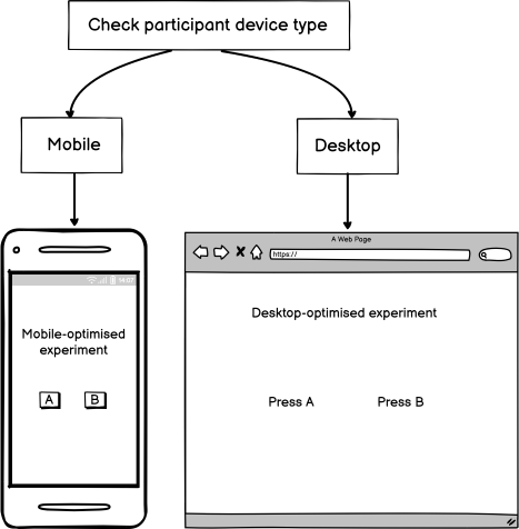
Getting the layout wrong for a typical website doesn't matter that much -- the visitor might just need to zoom and pan to see the full content. But showing the wrong layout to a participant in an experiment could result in data loss. For example, if you send a task that requires keyboard responses to a participant using a mobile device, the onscreen keyboard may fail to show, making it impossible for them to respond.
For this reason, Gorilla does not assign task layouts based on automatic device detection. Instead, we recommend that you ask participants directly what kind of device they are using, and then send them to the correct version of the task for their device.
You can create responsive task layouts in two easy steps:
This may sound complicated, but don't worry - we've put together a guide that shows you how to easily create responsive layouts in your experiments, including pre-built examples that show you exactly what you need to do!