Object-Component System
Introduction
The new generation of Gorilla task building tools all share a common architecture, which is based around an object-component system. The basic idea is that each element on the screen is an object made up of several components, each of which do different things.
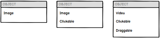
For example, imagine you want participants to give a response by clicking an image. You would create an object that contains an Image component, which displays an image, and a Click Response component, which registers a response when it's clicked on:
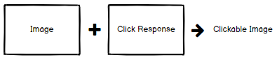
Crucially, if you then wanted to change the image for some text, you would simply swap the Image component for a Text component, but leave the Click Response component in place. As this example suggests, components can be visual, e.g. images and text, or behavioural, e.g. accepting click or keyboard responses. The idea is that you can build your screen elements out of these various building blocks, combining them together to get the behaviour that you want. This allows for great flexibility in creating fully customised functionality for your tasks!
Check out the list of topics in the menu to find out more.
Motivation
To see why this is useful, consider a more traditional approach where each element on the screen is a different type:
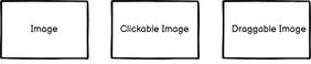
In this example, you can pick between a simple image, a clickable version, and a draggable version. This is nice and simple to get started with, but quickly poses some problems.
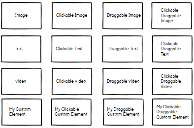
Imagine you wanted to add clickable text, or draggable text. Or you wanted your image to be clickable and draggable. Or you wanted to build your own custom element, but have it be clickable and draggable just like the built-in elements are? You would need to create a new element for each of these different combinations, even though many of them reuse the same functionality:
We quickly run into three key problems:
- Combinatorial Explosion - to cover all possible combinations of 6 functions, we need 16 element types: Text, ClickableText, DraggableText, Video, ClickableVideo, and so on. The more behaviours and abilities we implement, the worse it gets.
- Inflexible - what if you wanted an image that was clickable and draggable? How can you combine two different abilities on one element?
- Hard to extend - what if you wanted to add your own custom display element (e.g. a shape stimulus drawn from scratch using the HTML Canvas). You now need to replicate all the clicking and dragging functionality too in order to use them with your new element.
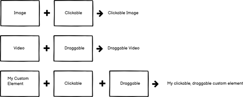
The solution to this is to disentangle these different behaviours and implement them as separate, standalone pieces...

...and then combine them together to get the combinations that we want:
Objects and Components
In all the tools, you will, in one way or another, lay objects out on the screen. In Task Builder 2 these might be stimuli images or response buttons, in the Game Builder these might be sprites or particle effects. Whatever they are, each individual one is an object.
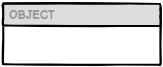
An object itself is an empty shell - it doesn't do anything on its own:
All functionality is implemented in components - these are the "separate, standalone pieces" we described in the Motivation section. An object can have any number of components, but only one of each type (e.g. you can't have two image components on one object - if you want two images, create two objects, each with an image component of its own):
In practice, most objects will have one "main" component (usually something visible, like text or an image) and then optionally some other components to add specific behaviours (such as animation or response handling). Therefore, when adding a new object, we offer a choice of common starting points (such as Image or Text). There's nothing special about these objects - they are simply an empty object with e.g. the Image component already added.
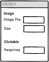
Each component then has its own set of configuration options, which you use to specify the settings that you want:
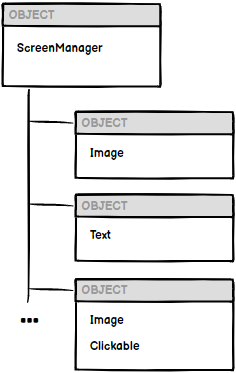
Screen Hierarchy
As well as components, objects can also have child objects which are attached at a lower level (this is more common in Game Builder):
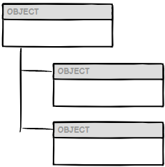
While the exact hierarchy varies across the different tools, a common theme is that each screen will consist of a single, top-level object (the "screen object"), with one or more child objects that represent the actual elements on the screen:
In Task Builder 2, you can access the Screen object by clicking on the separate Screen tab to the right of the main Objects tab. Here, you can add different, 'higher-level' components to the screen object that allow you to control certain overarching behaviours, such as scoring responses or adding a time limit to the screen. The child objects of the screen are then the various objects that you place (containing text, images, click responses, etc). You can access and configure these on the main Objects tab.
That concludes this overview - we suggest that the best way to get started is to follow our step-by-step guide to build your first task!