Questionnaire Builder 1 Widgets
- Content Widget:
- Response Widget:
- Layout Widget:
- Scripting in the Questionnaire Widget:
You're viewing the support pages for our Legacy Tool Questionnaire Builder 1 and, as such, the information may be outdated. Automatically upgrade your existing questionnaires to Questionnaire Builder 2, and check out our QB2 guides and our onboarding webinar for an overview of our new tools.
Overview
Welcome to the Questionnaire Builder 1 Widget Tooling Reference Guide.
Here you can find out information on how and when to use a particular Questionnaire Widgets. There are over 20 widgets available. Browse the list in the menu to find out more information about each one.
Questionnaires consist of blocks of Rich Text content (which can be a mixture of Markdown and/or HTML and Response widgets, which offer a range of ways for participants to be asked questions.
If you are looking for more information on questionnaires in general take a look at our How To: Questionnaire Builder 1 Guide.
Tooling Reference Guide Format:
For each Questionnaire Widget listed you will find a description of the Widget and an image example. This will be followed by a live Demo of the Widget. Finally a configuration settings box (like the one below) will list and explain all available configuration settings for the selected Widget.
Most widgets offer three common configuration settings:
This is the key that identifies this response in your metrics data. As the label or question for a widget may not directly identify which question it pertains to, the key gives you an opportunity to set the name of the response in your data.
Keys should be unique across the questionnaire - no two responses should have the same key. Keys will automatically be populated with generic values (response-1, response-2, ...) but you can change them to more meaningful values to make your data analysis easier.
If checked, the response to this question will also be written to the participant's embedded data, allowing you to retrieve and use it later in your experiment. To retrieve this data later within your experiment you must use the same key as specified above.
If checked, this question does not need to be answered in order to progress. By default, all questionnaire questions need to be responded to, but you can elect to allow some questions to go unanswered.
Click the Tutorial icon to view a Tutorial which explains how to set up and use the selected Questionnaire Widget.
Click the Example icon to view an example of a Sample which makes use of the selected Questionnaire Widget.
You're viewing the support pages for our Legacy Tool Questionnaire Builder 1 and, as such, the information may be outdated. Automatically upgrade your existing questionnaires to Questionnaire Builder 2, and check out our QB2 guides and our onboarding webinar for an overview of our new tools.
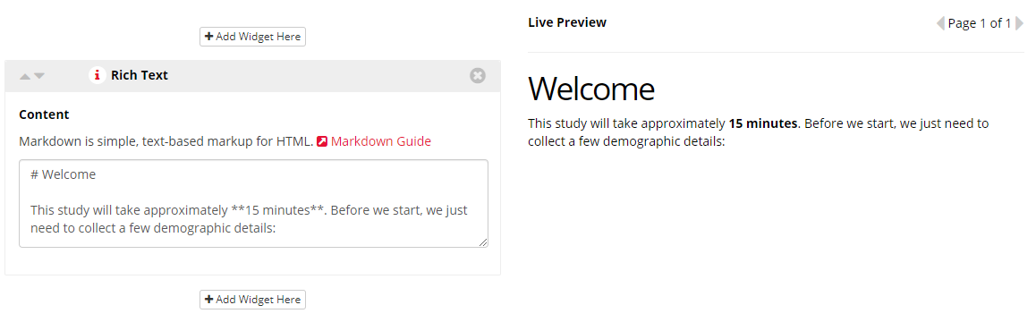
Rich Text Widget
Rich Text Widgets are the most common widget in questionnaires. Rich Text widgets are designed to be the main content block of your questionnaire, with the other widgets specific to individual responses.
You can use Rich Text Widgets in your questionnaires to add instructions and information text, etc. You can also use them in conjunction with embedded data to show participants their responses or scores. Read more about using embedded data in our walkthrough.
Rich Text Widgets support content written in Markdown and/or HTML. You can use them to add formatted text to your questionnaires, or embed your own HTML.
-- No Settings --
Click to view a Tutorial of the Rich Text Widget.
Click to view a classic consent form example which makes use of the Rich Text Widget.
You're viewing the support pages for our Legacy Tool Questionnaire Builder 1 and, as such, the information may be outdated. Automatically upgrade your existing questionnaires to Questionnaire Builder 2, and check out our QB2 guides and our onboarding webinar for an overview of our new tools.
Image
The Image widget allows you to add images to your questionnaire. Each image widget allows you to upload a single image, which is then hosted on Gorilla.
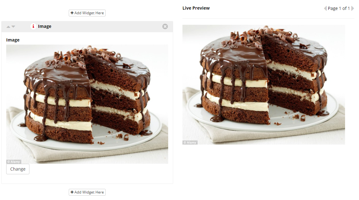
Once you've added an image, use the Change button to select a different one.
You're viewing the support pages for our Legacy Tool Questionnaire Builder 1 and, as such, the information may be outdated. Automatically upgrade your existing questionnaires to Questionnaire Builder 2, and check out our QB2 guides and our onboarding webinar for an overview of our new tools.
Consent Box Widget
The Consent widget is a simple checkbox which will prompt the participant to check it in order to proceed.
Use a Rich Text widget to contain your actual consent text.
If a participant attempts to advance to the next page without checking it a pop-up box will prompt them. If they do not wish to consent then they can navigate away from the page and they will continue to be marked as 'Live' on your participants page.
If you wish to know how many participants navigated away without giving consent we suggest making your consent questionnaire a 'stand-alone' questionnaire and use a Checkpoint Node in your experiment tree just after it. This way, in your metrics spreadsheet, you can distinguish participants who did not consent, from those who consented but didn't finish your experiment.
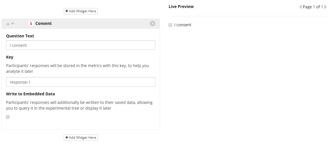
This text will be presented next to the consent checkbox.
This is the key that identifies this response in your metrics data. As the label or question for a widget may not directly identify which question it pertains to, the key gives you an opportunity to set the name of the response in your data.
Keys should be unique across the questionnaire - no two responses should have the same key. Keys will automatically be populated with generic values (response-1, response-2, ...) but you can change them to more meaningful values to make your data analysis easier.
If checked, the response to this question will also be written to the participant's embedded data, allowing you to retrieve and use it later in your experiment. To retrieve this data later within your experiment you must use the same key as specified above.
You're viewing the support pages for our Legacy Tool Questionnaire Builder 1 and, as such, the information may be outdated. Automatically upgrade your existing questionnaires to Questionnaire Builder 2, and check out our QB2 guides and our onboarding webinar for an overview of our new tools.
Text Entry Widget
The Text Entry widget allows participants to enter a single line of text. It uses a standard browser input element, but disables some standard browser behaviours that would be inappropriate for capturing responses in an experiment:
- Auto-correct
- Auto-complete
- Auto-capitalise
- Spell-check
All the above browser functions will be turned off when entering content into a Text Entry Widget. This means when participants are entering answers they will not be assisted by these browser technologies.
The Text Entry Widget is useful for when you wish to collect data from a simple 'open' 'short-answer' question such as in the example below.
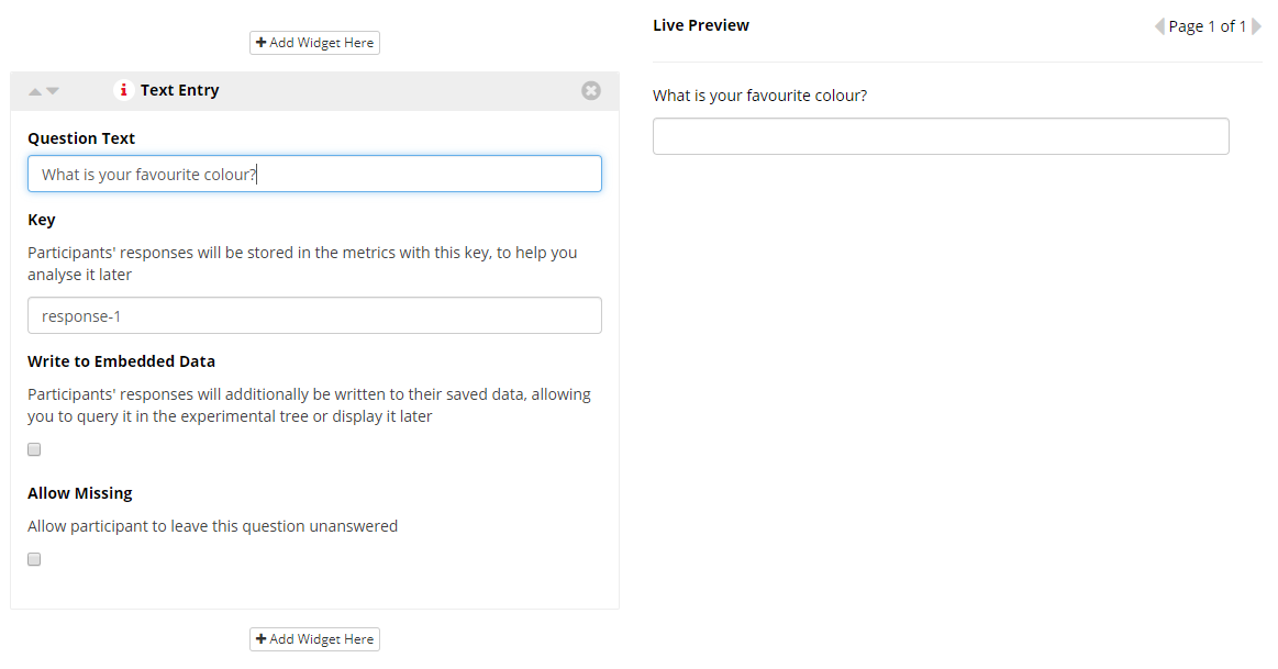
This text is presented directly above the text input box.
This is the key that identifies this response in your metrics data. As the label or question for a widget may not directly identify which question it pertains to, the key gives you an opportunity to set the name of the response in your data.
Keys should be unique across the questionnaire - no two responses should have the same key. Keys will automatically be populated with generic values (response-1, response-2, ...) but you can change them to more meaningful values to make your data analysis easier.
If checked, the response to this question will also be written to the participant's embedded data, allowing you to retrieve and use it later in your experiment. To retrieve this data later within your experiment you must use the same key as specified above.
If checked, this question does not need to be answered in order to progress. By default, all questionnaire questions need to be responded to, but you can elect to allow some questions to go unanswered.
You're viewing the support pages for our Legacy Tool Questionnaire Builder 1 and, as such, the information may be outdated. Automatically upgrade your existing questionnaires to Questionnaire Builder 2, and check out our QB2 guides and our onboarding webinar for an overview of our new tools.
Comment Box Widget
A large text area which allows the participant to enter an arbitrary amount of text.
The Comment Box Widget additionally prevents all standard browser auto-functions. Specifically these are:
- Auto-correct
- Auto-complete
- Auto-capitalise
- Spell-check
All the above browser functions will be turned off when entering content into a Comment Box Widget. This means when participants are entering answers they will not be assisted by these browser technologies.
The Comment Box Widget is useful for when you wish to collect data from an 'open' 'long-answer' question such as in the example below.
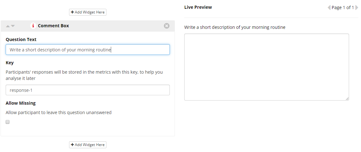
This text is presented directly above the text input box.
This is the key that identifies this response in your metrics data. As the label or question for a widget may not directly identify which question it pertains to, the key gives you an opportunity to set the name of the response in your data.
Keys should be unique across the questionnaire - no two responses should have the same key. Keys will automatically be populated with generic values (response-1, response-2, ...) but you can change them to more meaningful values to make your data analysis easier.
If checked, this question does not need to be answered in order to progress. By default, all questionnaire questions need to be responded to, but you can elect to allow some questions to go unanswered.
You're viewing the support pages for our Legacy Tool Questionnaire Builder 1 and, as such, the information may be outdated. Automatically upgrade your existing questionnaires to Questionnaire Builder 2, and check out our QB2 guides and our onboarding webinar for an overview of our new tools.
Dropdown Widget
A simple dropdown menu where participants select an answer from a list of options you have provided.
The Dropdown Widget is useful when you wish the participant to select an answer to your question from a set of pre-defined options.
When using the Dropdown Widget you will get an additional row in your metrics - alongside the standard entry under the 'Question Key' & 'Response' columns - which represents the quantised version of your participant's answer. Quantised numbering starts at 1, corresponding to the first option you enter.
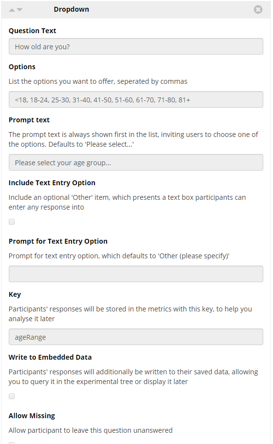
This text is presented directly above the dropdown box. This is often reserved for the question you wish the participant to answer in the preceding dropdown box.
Type here the list of options you want to offer. Be sure each option is separated by commas.
Default = 'Please select...'
The 'prompt text' is the initial text shown on the dropdown box before it is pressed, inviting users to choose one of the options.
If Checked adds an 'Other' dropbox to the end of your dropbox options. When the participant selects this option they will be presented with a text entry box participants into which they can enter any response.
Type here the Prompt for the text entry option. Default = 'Other (please specify)'.
This is the key that identifies this response in your metrics data. As the label or question for a widget may not directly identify which question it pertains to, the key gives you an opportunity to set the name of the response in your data.
Keys should be unique across the questionnaire - no two responses should have the same key. Keys will automatically be populated with generic values (response-1, response-2, ...) but you can change them to more meaningful values to make your data analysis easier.
If checked, the response to this question will also be written to the participant's embedded data, allowing you to retrieve and use it later in your experiment. To retrieve this data later within your experiment you must use the same key as specified above.
Note: If you wish to overwrite the standard numbering with your own scoring use the embedded data key 'yourKeyNameHere-quantised'. Check out the Walkthrough: Scripting in QB1 for more information on this.
If checked, this question does not need to be answered in order to progress. By default, all questionnaire questions need to be responded to, but you can elect to allow some questions to go unanswered.
Click to view a Tutorial of the Dropdown Widget.
Click to view a classic demographics questionnaire example which makes use of the Dropdown Widget.
You're viewing the support pages for our Legacy Tool Questionnaire Builder 1 and, as such, the information may be outdated. Automatically upgrade your existing questionnaires to Questionnaire Builder 2, and check out our QB2 guides and our onboarding webinar for an overview of our new tools.
Checklist Widget
A set of checkboxes is created from the options you list, from these your participants can pick as many as they like.
Each checkbox that the participant selects from the checklist will come through in the metrics as an individual response in its own row.
Note: Bear in mind that this widget allows multiple responses, therefore it would not be appropriate for questions where you need to collect only one response from participant. When you need participants to only select one response, use the Radio Button or Dropdown widgets instead.
This text is presented directly above the checkboxes.
Options
Type here the list of options you want to offer. Be sure each option is separated by commas.
Include Text Entry Option
If Checked adds an 'Other' checkbox to the end of your list of checkbox options. When the participant selects this option they will be presented with a text entry box participants into which they can enter any response.
Prompt for Text Entry Option
Type here the Prompt for the text entry option. Default = 'Other (please specify)'.
This is the key that identifies this response in your metrics data. As the label or question for a widget may not directly identify which question it pertains to, the key gives you an opportunity to set the name of the response in your data.
Keys should be unique across the questionnaire - no two responses should have the same key. Keys will automatically be populated with generic values (response-1, response-2, ...) but you can change them to more meaningful values to make your data analysis easier.
Minimum no. of Responses
Require a minimum number of responses. Please enter as a numerical digit i.e. 1, 2 etc.
If set, the participant will not be allowed to proceed unless they select at least the minimum number of responses.
Note: When setting the minimum number of responses your value must be lower than the total number of items entered into the Options setting of your Checklist Widget. Setting a number higher than the available options will prevent the participant from completing this question and advancing through your questionnaire.
Note: The 'Include Text Entry Option', if checked by a participant, does count towards their minimum number of responses.
Write to Embedded Data
If checked, the response to this question will also be written to the participant's embedded data, allowing you to retrieve and use it later in your experiment.
To retrieve this data later within your experiment you must use the same Key as specified above with the addition of '-optionNumber'. Where optionNumber is a numerical integer referring to a specific item in your Options list.
i.e. MyChecklistWidgetKeyName-1 will return the value stored in the first item of your options list.
If the participant has checked this item. Then the value stored and returned will match the option text. If the participant did not check this item the value stored and returned will be 0.
Click to view a Tutorial of the Checklist Widget.
You're viewing the support pages for our Legacy Tool Questionnaire Builder 1 and, as such, the information may be outdated. Automatically upgrade your existing questionnaires to Questionnaire Builder 2, and check out our QB2 guides and our onboarding webinar for an overview of our new tools.
Checklist (Grid)
The Checklist (Grid) Widget creates a grid of multiple questions and answer options to choose from. For each question, the participant can select as many options as they like.
The Checklist (Grid) widget is useful for when you want to provide participants with the same answer options over multiple questions, and you want to allow participants to select multiple responses for each question. If you want to instead force your participant to select only one response for each question, you should instead use the Radio Buttons (Grid) Widget.
When using the Checklist (Grid) widget you will get an additional row in your metrics - alongside the standard entry under the 'Question Key' & 'Response' columns - which represents the quantised version of your participant's answer. Quantised numbering starts at 1, corresponding to the first option you enter in the options field.
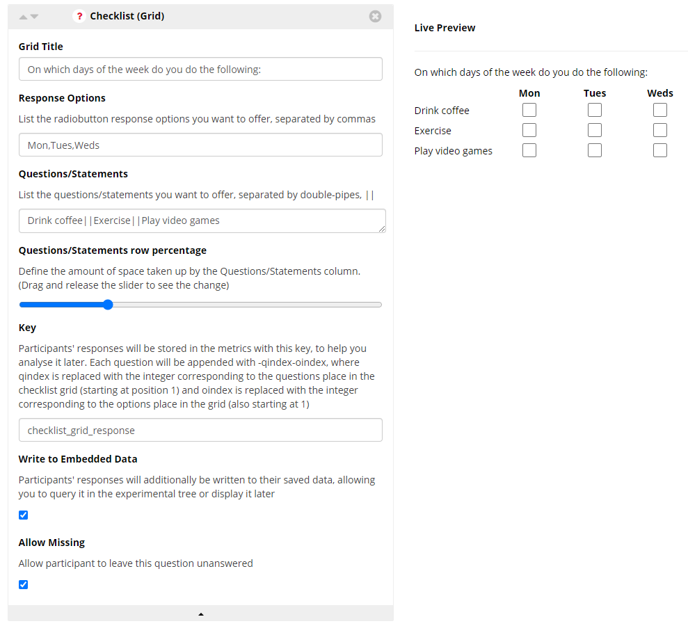
This text is presented directly above the checklist grid.
Response Options
Type here the list of response options you want to offer. Be sure each option is separated by commas.
Questions/Statements
Type here the list of questions/statements you want to offer, separated by double-pipes: ||.
Note: Double-pipes separators || are for separating questions from one another. Do not put the || before the 1st or after the last questions in your Grid widget. The || should only be put between the question and not before the 1st or after the last questions because Gorilla would interpret this as if there were additional questions at the beginning/end of your question list. This would result in an error occurring saying ‘Please answer all the questions’ even though supposedly all the questions were answered.
Questions/Statements row percentage
Define the amount of space taken up by the Questions/Statements column. (Drag and release the slider to see the change).
Key
Insert the key name that participants' responses will be stored in the metrics with to help you analyse it later. Each question key will be appended with -qindex-oindex, where qindex is replaced with the integer corresponding to the question's place in the checklist grid (starting at position 1), and oindex is replaced with the integer corresponding to the selected option's place in your entered list of options (starting at position 1).
Write to Embedded Data
If checked, a participant's response to this question will be written to the participant's embedded data, allowing you to retrieve and use it later in your experiment.
To retrieve this data later within your experiment you must use the same key as specified above.
Note: If you wish to overwrite the standard numbering with your own scoring use the embedded data key 'yourKeyNameHere-qindex-oindex-quantised'. Check out the Walkthrough: Scripting in QB1 for more information on this.
Allow Missing
If checked, the participant does not need to answer these questions in order to progress.
Click to view a Tutorial of the Checklist (Grid) widget!
You're viewing the support pages for our Legacy Tool Questionnaire Builder 1 and, as such, the information may be outdated. Automatically upgrade your existing questionnaires to Questionnaire Builder 2, and check out our QB2 guides and our onboarding webinar for an overview of our new tools.
Radio Buttons Widget
A set of radio buttons is created from the list of options you provide, of which the participant can only pick one.
The Radio Button Widget is useful for questions with 'mutually exclusive' answers. i.e. where you want to force your participant to select only one option.
When using the Radio Button Widget you will get an additional row in your metrics - alongside the standard entry under the 'Question Key' & 'Response' columns - which represents the quantised version of your participants answer. Quantised numbering starts at 1, corresponding to the first option you enter in the options field.
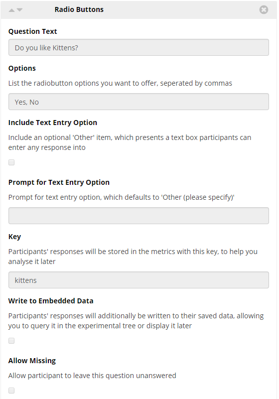
This text is presented directly above the radio buttons.
Options
Type here the list of options you want to offer. Be sure each option is separated by commas.
Include Text Entry Option
If Checked adds an 'Other' radio button to the end of your list of radio button options. When the participant selects this option they will be presented with a text entry box participants into which they can enter any response.
Prompt for Text Entry Option
Type here the Prompt for the text entry option. Default = 'Other (please specify)'.
This is the key that identifies this response in your metrics data. As the label or question for a widget may not directly identify which question it pertains to, the key gives you an opportunity to set the name of the response in your data.
Keys should be unique across the questionnaire - no two responses should have the same key. Keys will automatically be populated with generic values (response-1, response-2, ...) but you can change them to more meaningful values to make your data analysis easier.
Write to Embedded Data
If checked, a participants response to this question will be written to the participant's embedded data, allowing you to retrieve and use it later in your experiment.
To retrieve this data later within your experiment you must use the same key as specified above.
Note: If you wish to overwrite the standard numbering with your own scoring use the embedded data key 'yourKeyNameHere-quantised'. Check out the Walkthrough: Scripting in QB1 for more information on this.
Allow Missing
If checked, the participant does not need to answer this question in order to progress.
Click to view a Tutorial of the Radio Button Widget.
Click to view a classic demographics questionnaire example which makes use of the Radio Button Widget.
You're viewing the support pages for our Legacy Tool Questionnaire Builder 1 and, as such, the information may be outdated. Automatically upgrade your existing questionnaires to Questionnaire Builder 2, and check out our QB2 guides and our onboarding webinar for an overview of our new tools.
Radio Buttons (Grid)
The Radio Buttons (Grid) Widget creates a grid of multiple questions and answer options to choose from.
The Radio Buttons (Grid) widget is useful for when you want to provide participants with the same answer options over multiple questions, e.g. you want them to select an option from a scale from '1-least agree' to '5-most agree' for multiple statements. This widget allows to replicate a very common questionnaire layout used in many classic questionnaires, such as the Autism Spectrum Quotient (AQ).
When using the Radio Button (Grid) widget you will get an additional row in your metrics - alongside the standard entry under the 'Question Key' & 'Response' columns - which represents the quantised version of your participant's answer. Quantised numbering starts at 1, corresponding to the first option you enter in the options field.
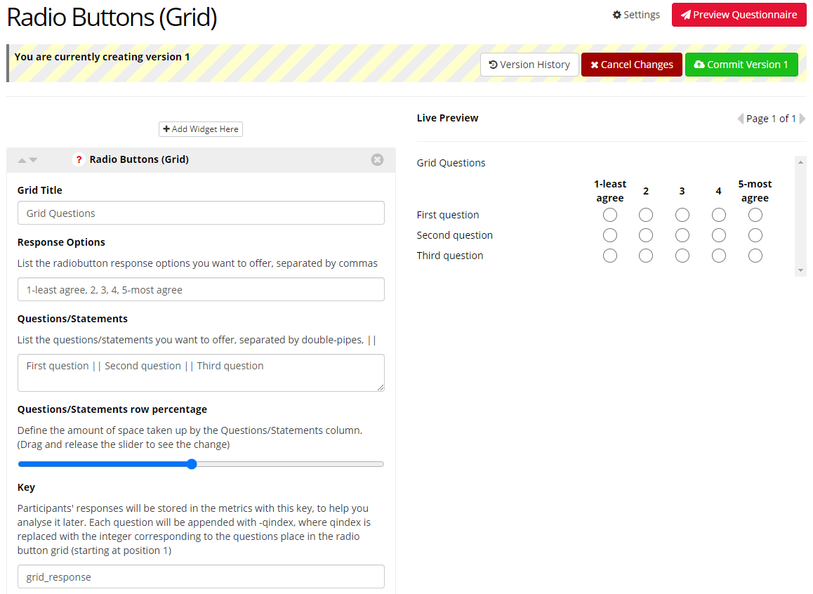
This text is presented directly above the radio buttons grid.
Response Options
Type here the list of response options you want to offer. Be sure each option is separated by commas.
Questions/Statements
Type here the list of questions/statements you want to offer, separated by double-pipes: ||.
Note: Double-pipes separators || are for separating questions from one another. Do not put the || before the 1st or after the last question in your Grid widget. The || should only be put between the questions and not before the 1st or after the last questions because Gorilla would interpret this as if there were additional questions at the beginning/end of your question list. This would result in an error occurring saying ‘Please answer all the questions’ even though supposedly all the questions were answered.
Questions/Statements row percentage
Define the amount of space taken up by the Questions/Statements column. (Drag and release the slider to see the change).
Key
Insert the key name that participants' responses will be stored in the metrics with to help you analyse it later. Each question key will be appended with -qindex, where qindex is replaced with the integer corresponding to the question's place in the radio button grid (starting at position 1).
Write to Embedded Data
If checked, a participant's response to this question will be written to the participant's embedded data, allowing you to retrieve and use it later in your experiment.
To retrieve this data later within your experiment you must use the same key as specified above.
Note: If you wish to overwrite the standard numbering with your own scoring use the embedded data key 'yourKeyNameHere-qindex-quantised'. Check out the Walkthrough: Scripting in QB1 for more information on this.
Allow Missing
If checked, the participant does not need to answer these questions in order to progress.
Click to view a Tutorial of the Radio Buttons (Grid) widget!
You're viewing the support pages for our Legacy Tool Questionnaire Builder 1 and, as such, the information may be outdated. Automatically upgrade your existing questionnaires to Questionnaire Builder 2, and check out our QB2 guides and our onboarding webinar for an overview of our new tools.
Mixed Entry Widget
The Mixed Entry Widget consists of a Text Entry widget and a set of radio buttons, which are created from the list of options you provide. Of these the participant can either enter a value into the text entry or pick an option from the radio buttons.
The Mixed Entry Widget is useful for questions where you wish the participant to enter an open (unprompted) value or else select an option from a set of fixed options.
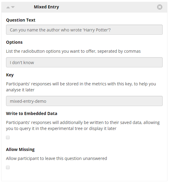
This text to presented directly above the Text Entry box.
Options
Type here the list of options you want to offer as Radio Buttons. Be sure each option is separated by commas.
This is the key that identifies this response in your metrics data. As the label or question for a widget may not directly identify which question it pertains to, the key gives you an opportunity to set the name of the response in your data.
Keys should be unique across the questionnaire - no two responses should have the same key. Keys will automatically be populated with generic values (response-1, response-2, ...) but you can change them to more meaningful values to make your data analysis easier.
Write to Embedded Data
If checked, a participants response to this question will be written to the participant's embedded data, allowing you to retrieve and use it later in your experiment.
To retrieve this data later within your experiment you must use the same key as specified above.
Allow Missing
If checked, the participant does not need to answer this question in order to progress.
Click to view a Tutorial of the Mixed Entry Widget.
Click to view a classic demographics questionnaire example which makes use of the Mixed Entry Widget.
You're viewing the support pages for our Legacy Tool Questionnaire Builder 1 and, as such, the information may be outdated. Automatically upgrade your existing questionnaires to Questionnaire Builder 2, and check out our QB2 guides and our onboarding webinar for an overview of our new tools.
Date Entry Widget
The Date Entry Widget adds a set of 3 dropdown menus for, 'Day', 'Month' and 'Year' which the participant can use to specify a date. Responses can be shown in the metrics as the date your respondent enters, or the years, months, and days that have passed from the date specified to the date they respond to the Questionnaire. This time passed can also be shown in months alone.
The Date Entry Widget is useful when you wish participants provide their date of birth or the date of an event.
The Date Entry Widget settings can also be used to collect months and years only, which is useful to collect GDPR compliant age data.
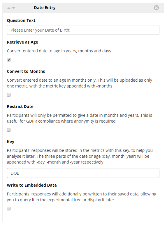
The text presented directly above the date entry dropdowns.
Retrieve as Age
If checked, a participant’s response to this question will be recorded as the time from this date to the time the participant completes the questionnaire in years, months and days. If asking for date of birth, this would be age.
Convert to Months
If checked, a participant’s response to this question will be recorded as the time from this date to the time the participant completes the questionnaire in months only. If asking for date of birth, this would be age.
Restrict Date
If checked, the ‘day’ dropdown will be removed, so participants will only be able to give the date in months and years. Because date of birth is considered Personally Identifying Information, this gives you a measure of age while remaining GDPR compliant.
This is the key that identifies this response in your metrics data. As the label or question for a widget may not directly identify which question it pertains to, the key gives you an opportunity to set the name of the response in your data.
Keys should be unique across the questionnaire - no two responses should have the same key. Keys will automatically be populated with generic values (response-1, response-2, ...) but you can change them to more meaningful values to make your data analysis easier.
Write to Embedded Data
If checked, a participants response to this question will be written to the participant's embedded data, allowing you to retrieve and use it later in your experiment.
To retrieve this data later within your experiment you must use the same Key as specified above with the addition of the type of data you wish to retrieve. This will be one of the following: '-day', ‘-month’ , ‘-year’, ‘-inmonths’.
i.e. MyDateWidgetKeyName-day will return the value stored as the response to the dropdown corresponding to day.
Click to view a Tutorial of the Date Entry Widget.
Click to view a classic demographics questionnaire example which makes use of the Date Entry Widget.
You're viewing the support pages for our Legacy Tool Questionnaire Builder 1 and, as such, the information may be outdated. Automatically upgrade your existing questionnaires to Questionnaire Builder 2, and check out our QB2 guides and our onboarding webinar for an overview of our new tools.
Time Entry Widget
The Time Entry Widget adds a set of 2 dropdown menus for 'Hour' and 'Minute' which the participant can use to specify a time.
The Time Entry Widget is useful when you wish participants to specify a time in a 24 hour clock.
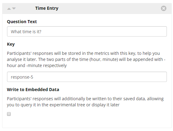
This text to presented directly above the time entry dropdowns.
This is the key that identifies this response in your metrics data. As the label or question for a widget may not directly identify which question it pertains to, the key gives you an opportunity to set the name of the response in your data.
Keys should be unique across the questionnaire - no two responses should have the same key. Keys will automatically be populated with generic values (response-1, response-2, ...) but you can change them to more meaningful values to make your data analysis easier.
Write to Embedded Data
If checked, a participants response to this question will be written to the participant's embedded data, allowing you to retrieve and use it later in your experiment.
To retrieve this data later within your experiment you must use the same key as specified above.
Click to view a Tutorial of the Time Entry Widget.
You're viewing the support pages for our Legacy Tool Questionnaire Builder 1 and, as such, the information may be outdated. Automatically upgrade your existing questionnaires to Questionnaire Builder 2, and check out our QB2 guides and our onboarding webinar for an overview of our new tools.
Height Entry Widget
The Height Entry Widget adds a dropdown menu and numerical entry boxes, which allows participants to enter their height using either metric (meters and centimetres, m and cm) or imperial units (feet and inches, ft and ").
The participant is first offered the choice of their preferred units, imperial or metric, using the dropdown menu. Then based on their selection they will be offered two fields to enter their height:
- Imperial: If the participant selected imperial units then two entry boxes for feet and inches will appear.
- Metric: If the participant selected the metric option then two entry boxes for meters and centimetres will appear.
The Height Entry Widget is useful for cases where you wish the participant to enter their height using either of the standardised measurement options. This can be particularly useful if you wish to branch participants based on their answer.
This text is presented directly above the dropdown box. This is often reserved for the question you wish the participant to answer in the preceding Height Entry fields.
This is the key that identifies this response in your metrics data. As the label or question for a widget may not directly identify which question it pertains to, the key gives you an opportunity to set the name of the response in your data.
Keys should be unique across the questionnaire - no two responses should have the same key. Keys will automatically be populated with generic values (response-1, response-2, ...) but you can change them to more meaningful values to make your data analysis easier.
Write to Embedded Data
If checked, a participants response to this question will be written to the participant's embedded data, allowing you to retrieve and use it later in your experiment.
To retrieve the stored embedded data later within your experiment you must use the same key as specified above with the addition of one of 3 suffixes: -unit , -first or -second. These suffixes allow you to retrieve the unit chosen, the value entered in the first entry field, and the value entered in the second entry field respectively.
For example, if the participant choose metric from the dropdown and then entered 1 meter 70cm into the two fields, the embedded data retrieved would be as follows:
- keyName-unit = metric
- keyName-first = 1
- keyName-second = 70
For more information on using embedded data from the Height Entry Widget please view the Embedded Data Walkthrough.
Allow Missing
If checked, the participant does not need to answer this question in order to progress.
Click to view a Tutorial of the Height Entry Widget.
You're viewing the support pages for our Legacy Tool Questionnaire Builder 1 and, as such, the information may be outdated. Automatically upgrade your existing questionnaires to Questionnaire Builder 2, and check out our QB2 guides and our onboarding webinar for an overview of our new tools.
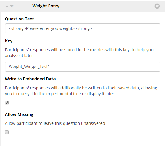
Weight Entry Widget
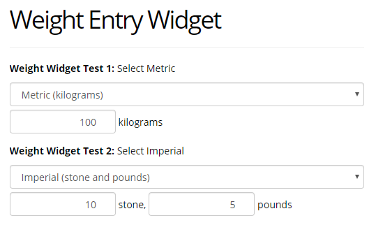
The Weight Entry Widget adds a dropdown menu and numerical entry boxes, which allows participants to enter their weight using either metric (kilograms, kg) or imperial units (stone and ounces, st. and lb.).
The participant is first offered the choice of their preferred units, imperial or metric, using the dropdown menu. Then based on their selection they will be offered two fields to enter their weight:
- Imperial: If the participant selected imperial units then two entry boxes for stone and ounces will appear.
- Metric: If the participant selected the metric option then one entry box for kilograms will appear.
The Weight Entry Widget is useful for cases where you wish the participant to enter their weight using either of the standardised measurement options. This can be particularly useful if you wish to branch participants based on their answer.
Weight Entry Widget Set Up:
Two Weight Entry Widgets viewed as a participant:
This example highlights the difference between the metric and imperial unit selection.
This text is presented directly above the dropdown box. This is often reserved for the question you wish the participant to answer in the preceding Weight Entry fields.
This is the key that identifies this response in your metrics data. As the label or question for a widget may not directly identify which question it pertains to, the key gives you an opportunity to set the name of the response in your data.
Keys should be unique across the questionnaire - no two responses should have the same key. Keys will automatically be populated with generic values (response-1, response-2, ...) but you can change them to more meaningful values to make your data analysis easier.
Write to Embedded Data
If checked, a participants response to this question will be written to the participant's embedded data, allowing you to retrieve and use it later in your experiment.
To retrieve the stored embedded data later within your experiment you must use the same key as specified above with the addition of one of 3 suffixes: -unit , -first or -second. These suffixes allow you to retrieve the unit chosen, the value entered in the first entry field, and the value entered in the second entry field respectively.
For example, if the participant choose metric from the dropdown and then entered 8 stone 10 ounces into the two fields, the embedded data retrieved would be as follows:
- keyName-unit = metric
- keyName-first = 8
- keyName-second = 10
For more information on using embedded data from the Weight Entry Widget please view the Embedded Data walkthrough.
Allow Missing
If checked, the participant does not need to answer this question in order to progress.
Click to view a Tutorial of the Weight Entry Widget.
You're viewing the support pages for our Legacy Tool Questionnaire Builder 1 and, as such, the information may be outdated. Automatically upgrade your existing questionnaires to Questionnaire Builder 2, and check out our QB2 guides and our onboarding webinar for an overview of our new tools.
Email Entry Widget
The Email Entry Widget creates a text entry box with an email prompt, into which the participant can enter an email address.
The Email Entry Widget will require that the participant enter text in the form of the prompt i.e. 'something@somethingelse', however it will not be able to verify if the email is real/correct or not.
The Email Entry Widget is useful when you wish to collect email address for contact purpose in your questionnaire.
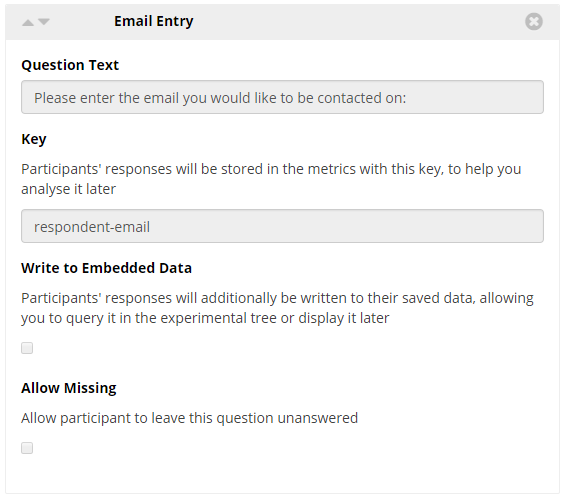
Question Text
This text to presented directly above the Email Entry box.
This is the key that identifies this response in your metrics data. As the label or question for a widget may not directly identify which question it pertains to, the key gives you an opportunity to set the name of the response in your data.
Keys should be unique across the questionnaire - no two responses should have the same key. Keys will automatically be populated with generic values (response-1, response-2, ...) but you can change them to more meaningful values to make your data analysis easier.
Write to Embedded Data
If checked, a participants response to this question will be written to the participant's embedded data, allowing you to retrieve and use it later in your experiment.
To retrieve this data later within your experiment you must use the same key as specified above.
Allow Missing
If checked, the participant does not need to answer this question in order to progress.
Click to view a Tutorial of the Email Entry Widget.
Click to view a classic demographics questionnaire example which makes use of the Email Entry Widget.
You're viewing the support pages for our Legacy Tool Questionnaire Builder 1 and, as such, the information may be outdated. Automatically upgrade your existing questionnaires to Questionnaire Builder 2, and check out our QB2 guides and our onboarding webinar for an overview of our new tools.
Slider Widget
A simple slider, which allows the participant to choose a value from a range. The range defaults to 0 - 100.
The Slider Widget is useful for questions which require a participant to give an answer between a range of values or to rate something on a scale.
Note: If you wish to retrieve participants' responses later in the experiment using embedded data, use the Rating Scale/Likert instead.
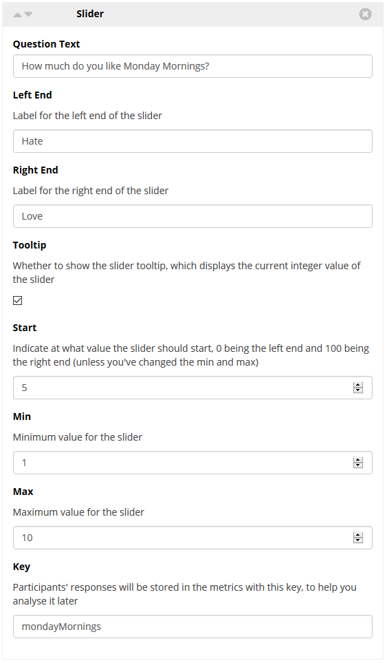
This text is presented directly above the slider.
Left End
Label for the left end of the slider.
Right End
Label for the right end of the slider.
Tooltip
If checked a tooltip, which displays the integer value of the sliders current position, will be shown above the slider.
Start
Enter a value of the position the slider should start at.
This value must be between the Min and Max values assigned to the slider. The default values of the slider are Min = 0, and Max= 100, in which case if we want the slider to start in the centre we would assign Start the value of 50.
Min
Set the minimum value for the slider. This is the value of the left end of the slider.
Max
Set the maximum value for the slider. This is the value of the right end of the slider.
This is the key that identifies this response in your metrics data. As the label or question for a widget may not directly identify which question it pertains to, the key gives you an opportunity to set the name of the response in your data.
Keys should be unique across the questionnaire - no two responses should have the same key. Keys will automatically be populated with generic values (response-1, response-2, ...) but you can change them to more meaningful values to make your data analysis easier.
Click to view a Tutorial of the Slider Widget.
You're viewing the support pages for our Legacy Tool Questionnaire Builder 1 and, as such, the information may be outdated. Automatically upgrade your existing questionnaires to Questionnaire Builder 2, and check out our QB2 guides and our onboarding webinar for an overview of our new tools.
Rating Scale/Likert Widget
A set of items arranged in a horizontal line is created from the list of options you provide, from these the participant can choose only one response.
There are two main styles used in setting up the likert:
Style 1 can be useful in cases where a participant has been presented a stimuli and now needs to respond with the correct option or word-association.
Style 2 is useful when you wish to have a participant rate something on a scale, like with a slider, but you also wish to use the 'embedded data' function.
When using the Rating Scale/Likert Widget you will get an additional row in your metrics - alongside the standard entry under the 'Question Key' & 'Response' columns - which represents the quantised version of your participants answer. Quantised numbering starts at 1, corresponding to the first option you enter.
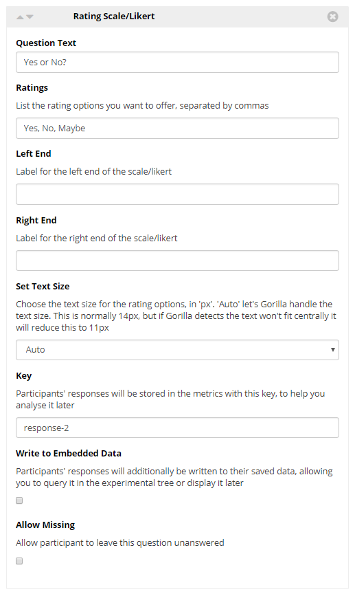
This text is presented directly above the rating scale/likert.
Rating
Type here the list of options you want to offer. Be sure each option is separated by commas.
Left End
Label for the left end of the scale/likert
Right End
Label for the right end of the scale/likert
Set Text Size
Allows you to manually select the text size of the rating options. Sizes offered are: 11px, 12px, and 14px.
Note: Auto gives a size of 14px, unless this will not fit on screen, at which point it will reduce to 11px.
This is the key that identifies this response in your metrics data. As the label or question for a widget may not directly identify which question it pertains to, the key gives you an opportunity to set the name of the response in your data.
Keys should be unique across the questionnaire - no two responses should have the same key. Keys will automatically be populated with generic values (response-1, response-2, ...) but you can change them to more meaningful values to make your data analysis easier.
Write to Embedded Data
If checked, a participants response to this question will be written to the participant's embedded data, allowing you to retrieve and use it later in your experiment.
To retrieve this data later within your experiment you must use the same key as specified above.
Note: If you wish to overwrite the standard numbering with your own scoring use the embedded data key 'yourKeyNameHere-quantised'. Check out the Walkthrough: Scripting in QB1 for more information on this.
Allow Missing
If checked, the participant does not need to answer this question in order to progress.
Click to view a Tutorial of the Rating Scale/Likert Widget.
Click to view a classic 'Big 5 Personality TIPI' Example which makes use of the Rating Scale/Likert Widget.
You're viewing the support pages for our Legacy Tool Questionnaire Builder 1 and, as such, the information may be outdated. Automatically upgrade your existing questionnaires to Questionnaire Builder 2, and check out our QB2 guides and our onboarding webinar for an overview of our new tools.
Ranking Widget
The Ranking Widget creates a list of sortable text objects from the options you provide. Participants can drop and drag the options to rearrange or sort them into any order.
The Ranking Widget is useful for cases where you wish to create a participant to rank a list of options into an order.
The final order the participant chooses will be written to the participants metrics.
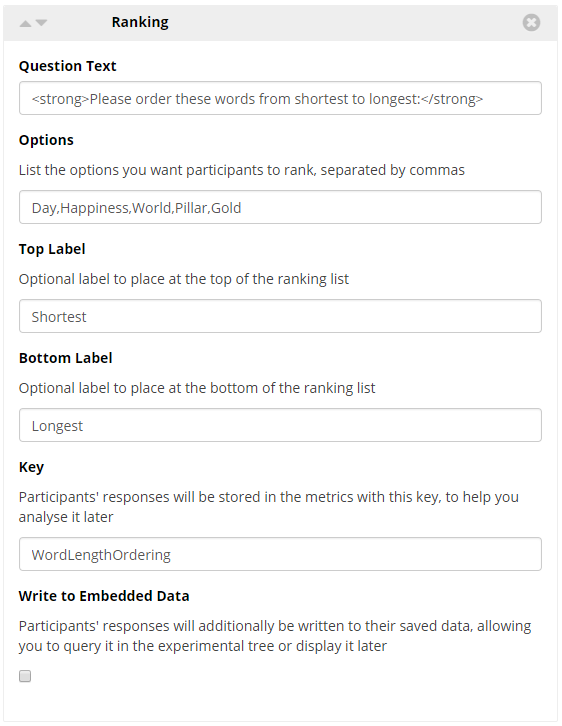
This text is presented directly above the dropdown box. This is often reserved for the question you wish the participant to answer in the preceding dropdown box.
Options
Type here the list of options you want to offer. Be sure each option is separated by commas.
Top Label
Type here the name of the label to be presented at the top of your options list.
Bottom Label
Type here the name of the label to be presented at the bottom of your options list.
This is the key that identifies this response in your metrics data. As the label or question for a widget may not directly identify which question it pertains to, the key gives you an opportunity to set the name of the response in your data.
Keys should be unique across the questionnaire - no two responses should have the same key. Keys will automatically be populated with generic values (response-1, response-2, ...) but you can change them to more meaningful values to make your data analysis easier.
Write to Embedded Data
If checked, a participants response to this question will be written to the participant's embedded data, allowing you to retrieve and use it later in your experiment.
To retrieve the stored embedded data later within your experiment you must use the same key as specified above with the addition of -# where # represents the ranking position you would like to retrieve.
For example, to retrieve the item currently stored in position 1 of a Ranking Widget use 'myKeyName-1' as the name for your embedded data. For position 2 use 'myKeyName-2'.
For more information on using embedded data from the Ranking Widget please view the Embedded Data section of the Ranking Widget Tutorial (linked below).
Click to view a Tutorial of the Ranking Widget.
You're viewing the support pages for our Legacy Tool Questionnaire Builder 1 and, as such, the information may be outdated. Automatically upgrade your existing questionnaires to Questionnaire Builder 2, and check out our QB2 guides and our onboarding webinar for an overview of our new tools.
Switch Button Widget
The Switch Button Widget adds a 'Switch' button to your questionnaire page, which allows the participant to switch to the corresponding Switch Node Task or Questionnaire in your experiment.
Note: The Switch Button Widget is a special Widget that must be used in conjunction with a Switch Node within your Experiment Tree in order to make use of its functionality.
- You must include a Switch Widget in both Questionnaires or Tasks tethered to your Switch Node if you wish your participants to be able to switch freely between the questionnaires and/or tasks.
- You must include a Switch Widget on every page of your Questionnaire that you wish your participant to be able to switch from.
- The Switch Button Widget will only function when used in conjunction with a Switch Node within your Experiment Tree.
The typical use case for using the Switch Widget and Switch Node is to provide information or instructions to a participant which can be available at any time while they are answering a questionnaire or completing a task. Check out the demos and examples below in the links at the bottom of this page to see this in action.
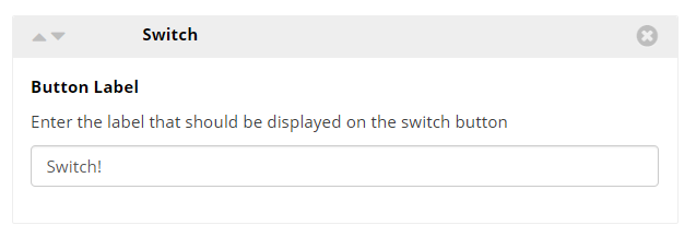
You can change the text that appears on the switch button by adding a name to this field.
Click to view a Tutorial of the Switch Button Widget and Switch Node.
Click to view an Example which makes use of the Switch Button Widget and Switch Node.
You're viewing the support pages for our Legacy Tool Questionnaire Builder 1 and, as such, the information may be outdated. Automatically upgrade your existing questionnaires to Questionnaire Builder 2, and check out our QB2 guides and our onboarding webinar for an overview of our new tools.
Early Exit Button
The Early Exit Button Widget adds an exit button to your questionnaire page, which allows the participant to leave the questionnaire without finishing it. This ends the questionnaire immediately and participant will not see any further pages of that questionnaire. Instead, the participant will advance to the next Node in your Experiment Tree.
When a participant clicks the Early Exit Button a piece of embedded data with the default name response-1 is generated. This embedded data can then be used in your experiment Tree Branch Nodes to branch participants who have chosen to exit your task early via the early exit button.
- Edit the Zone configuration settings to customise the name of the embedded data.
Use Case: The typical use case for a Early Exit Widget is to offer participants an option to withdraw from your experiment at any time. Further to this, the embedded data can be used to easily branch participants who withdraw to a Reject Node. Learn more in our guide about embedded data and branching.
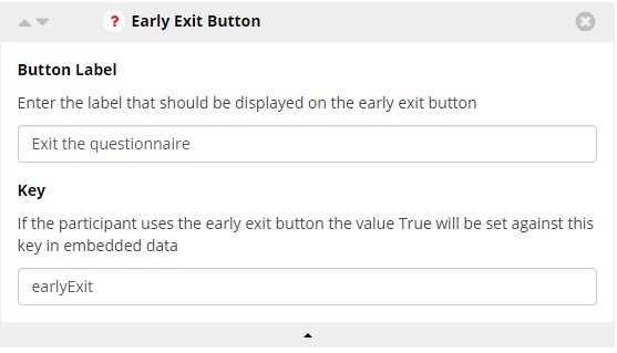
You can change the text that appears on the exit button by adding a name to this field.
Key
Key that the embedded data will be stored as. If the participant uses the early exit button the value True will be set against this key in embedded data.
Click to view an Example of the Early Exit Button Widget
You're viewing the support pages for our Legacy Tool Questionnaire Builder 1 and, as such, the information may be outdated. Automatically upgrade your existing questionnaires to Questionnaire Builder 2, and check out our QB2 guides and our onboarding webinar for an overview of our new tools.
Page Break Widget
A Page Break Widget allows you to separate out your questions across multiple pages.
All widgets after the page break will be shown on the next page.
As you can see in the example below. The Page Break Widget is a Layout Widget which means unlike other widgets the configuration options are not located in the Page Break Widget itself.
Locate the configurations settings in the questionnaire builder main Settings, under the Options Menu.
Configuration Settings:
- Locate these in the main Settings Options,
Next Button Label
Default = 'Next'
Rename the Next button Label.
Show Back Button
Checking this Box will enable the Back Button to appear on your pages. This will allow participants to go to the previous page.
If enabled only a participant's final response will be recorded: e.g. if they initially answer a question with the response 'cat', and then go back and change it to 'dog', only 'dog' will be recorded in your metrics spreadsheet.
Back Button Label
Default = 'Back'
Rename the Back button Label. (note: you must have also checked the 'Show Back Button' option in order to see this button.)
Click to view a Tutorial of the Page Break Widget.
You're viewing the support pages for our Legacy Tool Questionnaire Builder 1 and, as such, the information may be outdated. Automatically upgrade your existing questionnaires to Questionnaire Builder 2, and check out our QB2 guides and our onboarding webinar for an overview of our new tools.
Script Widget
The Script Widget is an advanced-user widget which allows you to write your own code to do post-processing on your questionnaire data. The script widget will accept code written in Typescript, a programming language based on JavaScript.
The Script Widget is useful for cases where you wish to create a scoring system - or overwrite the standard quantised scoring - from your participants questionnaire answers and then write these scores to your metrics spreadsheet.
In order to access a participants questionnaire answers within the script widget, you must make sure to have checked the 'write to embedded data' configuration option on every questionnaire widget you wish to interact with.
To learn more about how to use the Gorilla Script Widget check out the Walkthrough: Scripting in QB1.
Also take a look at the Gorilla API to find out how to interact with Gorilla in your scripts.
-- No Settings --
Click to view a Tutorial of the Script Widget.
Click to view a classic Big 5 Personality questionnaire example which makes use of the Script Widget.